
A welcoming office comes down to five things done well: acoustic privacy, daylight-led lighting, a mix of settings for different tasks, genuine biophilic elements, and clear arrival signage that tells people where they stand. Post-occupancy evaluations and repeated studies of biophilic workplaces back all five, and the payoff is measurable, from double-digit satisfaction gains to lower sick days and better retention. Get these right first; decoration is secondary.
Table of Contents
Quick checklist: 8 practical ways to make an office welcoming
Office managers rarely need more theory. They need a list they can act on before Friday. This one draws on the evidence covered in detail further down, condensed into moves you can start this week.
- Add real plants, not plastic ones — biophilic buildings show sustained satisfaction gains with indoor environmental quality.
- Push desks toward daylight — natural light is consistently rated the top wellbeing factor by employees.
- Fit acoustic screens near shared desks — reduces noise complaints without a full refit.
- Clear surface clutter and add proper storage — visual calm reduces low-level stress.
- Install a welcome panel and directional signage — orients visitors and staff from the first minute.
- Stock a decent kitchen or breakout corner — small comforts signal the business values people.
- Introduce one quiet, bookable room — gives people somewhere to think without headphones on.
- Rotate artwork or use a calm, zone-appropriate palette — adds warmth without visual noise.
Each item costs little on its own. Together, they change how a space feels within days.
Biophilia and greenery: practical ways to bring nature in
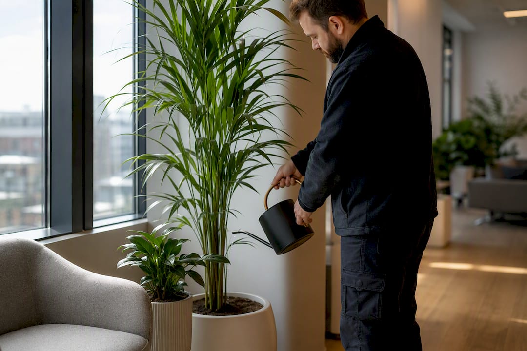
The strongest evidence for greenery comes from a repeated cross-sectional study of a biophilic building, which tracked staff in a fully biophilic office over two years. That is not a one-off honeymoon effect; it held up on a second measurement a year later.
You do not need a living wall to benefit. Options scale by budget:
- Desk plants (low cost, low maintenance, easy to rotate)
- Larger floor plants near windows or reception
- A green wall or planted divider used as an acoustic and visual buffer
- Natural materials (timber, stone finishes) where live plants are impractical
Pro Tip: If nobody in the office has a green thumb, a maintained plant-hire contract removes the risk of dead leaves undoing the whole effort. Dying plants read worse than no plants at all.
Lighting and daylight: maximise natural light, add layered lighting
WorldGBC guidance recommends prioritising daylight first and layering task, surrounding and background lighting on top, with task areas typically sitting around 300 to 500 lux. Employees consistently rate access to natural light and outside views as the single most important factor in workplace wellbeing, ahead of pay-scale perks and office extras.
Practical fixes that don’t need an electrician on day one:
- Move desks away from deep floor plates towards windows where possible
- Add adjustable task lamps rather than relying on overhead strips alone
- Zone lighting controls by area so unused zones can dim or switch off
- Fit anti-glare film or blinds on south-facing screens rather than cutting daylight altogether
- Switch to LEDs with dimming to cut running costs while keeping brightness where it’s needed
Acoustics and privacy: create quiet, predictable spaces for deep work
Neuroinclusive post-occupancy research finds that acoustic comfort, visual calm and spatial choice matter to neurodivergent and neurotypical staff alike. Noise, not desk size, is the most common workplace complaint in open-plan offices, and it’s also the cheapest to underestimate.
Desk orientation plays a bigger role than most managers assume. Research on visual exposure and desk positioning links reduced satisfaction to desks with exposed backs or too many others constantly in view, which means layout alone can lift or lower perceived welcome before you spend a penny on materials.
Interventions worth budgeting for:
- Acoustic booths or pods for calls and focused work
- Free-standing screens between back-to-back desks
- Absorptive ceiling tiles or wall panels in high-traffic zones
- Reorienting desks so backs face walls, not walkways
Pro Tip: Trial temporary, moveable acoustic screens before committing to a fixed fit-out. It’s a cheap way to test whether a zone actually needs treatment before you spend on permanent materials.
Layout and varied settings: offer choice and make it easy to use
Choice only works if people can find and use it without asking permission. A brilliant quiet room hidden behind three unmarked doors gets ignored; a visible, well-signed one gets booked daily. The Welcoming Workplace project argues that knowledge workers need genuine spaces for recuperation and contemplation, not just more desks, and links this directly to retention, particularly among older staff.
A simple three-step audit gets you moving:
- Walk the floor and log what’s missing — note where people huddle in corridors because there’s no proper collaborative space, and where people put headphones on because there’s no quiet option.
- Make low-cost reconfigurations first — repurpose an underused meeting room as a quiet zone, or free up a corner for informal collaboration, before ordering new furniture.
- Pilot, gather feedback, then scale — run the change for a month, ask staff what worked, and only invest in permanent fit-out once the pattern of use is proven.
Arrival experience, wayfinding and interior signage
First impressions form in the lobby, not the boardroom. A visitor who can’t tell where reception is, or a new starter unsure which floor houses their team, starts the day slightly on edge, and that feeling colours everything that follows. Clear wayfinding signage fixes this at source.
Interior signage that earns its place includes:
- A welcome or reception panel that sets tone on arrival
- Meeting room name and availability signs
- Directional signage to lifts, toilets and breakout spaces
- Accessible signage (braille, tactile, high-contrast) for genuinely inclusive wayfinding
- Branded graphics that reinforce identity without shouting
Materials matter for longevity. Vinyl decals scuff quickly in high-traffic corridors; engraved or printed rigid panels last years rather than months. For anything mounted at height, near glass, or wired for illumination, professional installation is worth the spend, since a poorly fitted sign undermines the polish it’s meant to add.
Amenities and kitchens: small comforts that boost welcome
Kitchens and breakout corners get judged harder than any other room in the building, because everyone visits them daily and notices the same broken kettle for months. Inexpensive upgrades close that gap fast:
- Decent coffee and tea, restocked reliably rather than left to run dry
- A mix of high and low seating so people can perch briefly or settle in
- Clear labelling for allergens and shared food, supporting genuine inclusion
- Position seating near a window where the floor plan allows it
Maintenance matters as much as the initial spend. A grubby microwave undoes a freshly painted breakout wall within a week, so build cleaning into the same schedule as the rest of the office rather than treating it as an afterthought.
Colour, art and scent: tasteful touches to add warmth without distraction
Palette should shift by zone: calmer, muted tones near focus areas; slightly bolder accents near social or collaborative spaces. Rotating artwork every few months keeps a space feeling tended rather than stale, and commissioning local or staff-submitted pieces adds a layer that stock prints never manage. Scent needs far more caution than colour. Diffused fragrance can trigger migraines or sensitivities that colour never will, so check before installing any scent system, and always offer an unscented alternative.
Do: rotate art, test colours on a small wall first, keep scent optional. Don’t: flood open-plan areas with strong fragrance, or pick colour schemes without asking the people who’ll sit under them daily.
Prioritise, budget and measure: a short roadmap with costs and metrics
Not every fix needs the same budget or timeline. Sequencing intelligently matters more than spending heavily upfront.
- Quick wins (days, low cost): plants, decluttering, signage refresh, kitchen restock.
- Medium investment (weeks, moderate cost): task lighting, acoustic screens, a repurposed quiet room.
- Longer-term projects (months, higher cost): daylight-led desk reconfiguration, permanent acoustic treatment, full signage and wayfinding overhaul.
The biophilic study referenced earlier recorded productivity gains of around 13% at twelve months and 9% at twenty-four months after nature-linked interventions, a rare case where “soft” workplace changes produced a hard, repeatable number.
Measure with a short staff survey before and after each phase, a simple room-utilisation check on bookable spaces, and a basic post-occupancy-style walkthrough. Building-level data or IoT monitoring can support the business case for further investment once quick wins prove the approach.
Incorporating ergonomic furniture for comfort and health
Furniture is where welcome and wellbeing overlap most directly, because a chair that hurts by 3pm undoes every plant and lighting fix in the building. Ergonomic seating with adjustable lumbar support, seat depth and armrest height should be the baseline, not the upgrade offered only to people who complain.
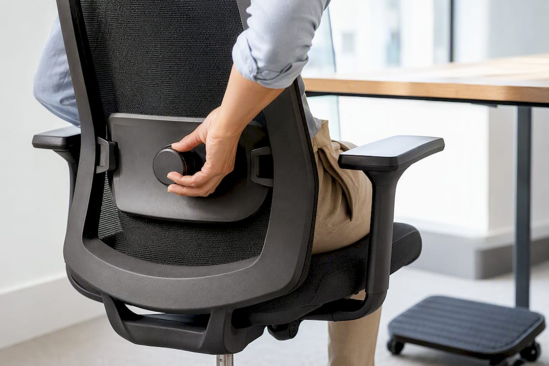
Sit-stand desks matter less as a status symbol and more as a genuine health tool: alternating posture through the day reduces the fatigue that builds from static sitting. They don’t need to go everywhere at once. Fitting a handful in shared or hot-desk zones lets people test the benefit before a wider rollout.
Monitor arms and keyboard trays deserve the same attention as chairs. Screens fixed too low force a forward neck tilt that causes far more discomfort than most managers realise until someone asks for a physio referral. Adjustable arms cost little relative to the chair budget and solve this in minutes per desk.
Communal and breakout furniture needs its own ergonomic thinking. Soft seating that’s genuinely comfortable for a twenty-minute break differs from desk seating built for eight-hour focus, and mixing the two roles usually produces furniture that’s mediocre at both.
Fit-out decisions made early are far cheaper to get right than to correct later. The UKGBC’s guidance on health, wellbeing and productivity notes that acoustic and thermal issues baked in at fit-out stage tend to recur and cost more to fix retrospectively than to prevent from the start. Ergonomic furniture follows the same logic: buy once, buy properly adjustable, and avoid the repeat spend of replacing chairs nobody could adjust in the first place.
Promoting inclusivity and accessibility in office design
Accessibility is not a compliance checkbox tacked onto the end of a fit-out. It shapes whether a meaningful share of staff and visitors can use the space at all, and it overlaps heavily with the acoustic and lighting work covered earlier.
Wheelchair access needs genuine attention beyond the doorway: clear turning space at desks, height-adjustable surfaces, and corridors wide enough for two-way movement rather than single-file compromise. Lifts and accessible toilets need to sit on the main route, not tucked down a corridor that requires asking for directions.
Neurodivergent staff benefit from the same interventions that improve the office generally. The neuroinclusive research cited earlier found that acoustic comfort, visual calm and the ability to choose a quieter or busier setting mattered equally to neurodivergent and neurotypical employees, which means designing for accessibility rarely means designing a separate, parallel space. A dimmable, low-noise quiet room serves someone with sensory sensitivity and someone who simply needs to concentrate on a report.
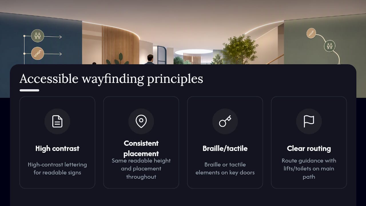
Signage plays a direct role here too. High-contrast lettering, consistent placement at a readable height, and braille or tactile elements on key doors turn wayfinding from a guessing game into something genuinely usable for people with visual impairments. It’s advisable to include accessible signage considerations from the start rather than retrofitting later, as retrofitted accessible signage rarely matches the rest of the scheme.
Inclusive design also means giving people a say. A short consultation with staff who have accessibility needs, run before a refit rather than after, tends to surface practical issues that no generic checklist catches, from door weight to the glare off a particular finish.
Encouraging personalisation of workspaces by employees
A desk with a photo, a plant, or a football scarf pinned to a screen divider is not clutter. It is a sign that someone feels enough ownership over the space to make it theirs, and that ownership correlates with how settled people feel in a job generally.
Rigid, no-personal-items policies tend to backfire. They save on visual tidiness but cost something harder to measure: the sense that the desk belongs to the company rather than the person sitting at it. A better balance sets light boundaries, no permanent alterations to shared fixtures, nothing that blocks fire exits or sightlines, while leaving genuine room for individual touches.
Hot-desking complicates this, since nobody personalises a desk they’ll lose tomorrow. Lockers or personal storage cubbies solve part of the problem, letting people keep a mug, a cardigan or a keepsake nearby even without a fixed desk. Some offices go further with small personal display shelves near assigned zones, giving hot-desk teams a fixed point of identity even if the chair itself moves daily.
Team areas benefit from the same logic at a larger scale. A shared noticeboard, a rotating photo wall, or a space for team wins and shout-outs gives a department the same sense of ownership an individual gets from a personalised desk. It costs little and tends to outlast most other decor choices, because people keep it updated themselves.
The goal isn’t a free-for-all. It’s permission, clearly stated, so people don’t feel they’re breaking a rule every time they bring in a plant from home.
Designing for effective collaboration and social interaction
Collaboration space fails most often for a simple reason: it gets treated as leftover space rather than designed space. A cluster of soft chairs dropped into a corridor corner rarely gets used for anything beyond waiting.
Genuine collaborative zones need the same attention to acoustics as focus areas, just tuned differently. A booth or semi-enclosed area with some sound absorption lets a team talk through a problem without either disturbing neighbours or feeling exposed to the whole floor. Fully open collaboration spaces work best for short, informal exchanges; anything longer benefits from at least partial enclosure.
Furniture arrangement drives use more than furniture quality. Round or oval tables invite conversation across a group in a way rectangular boardroom tables rarely manage. Moveable, lightweight furniture lets a space flex between a two-person catch-up and an eight-person workshop without needing a separate room for each.
Informal social spaces deserve equal billing alongside formal meeting rooms. The corridor conversation, the kitchen chat, the five minutes near the coffee machine, these produce a disproportionate share of the small coordination that keeps teams aligned. Positioning breakout seating somewhere people naturally pass through, rather than somewhere they have to detour to reach, makes those informal exchanges far more likely to happen at all.
Visibility matters too, in a positive sense this time. Glass-fronted meeting rooms or open collaboration corners let people see that a space is active and welcoming, rather than mysterious and closed off. That visibility, paired with clear signage showing what each space is for, removes the hesitation that stops people from simply walking in and using it.
Implementing technology to enhance convenience and connectivity
Reliable Wi-Fi throughout the building sounds obvious, yet dead zones near breakout areas or quiet rooms are common enough to undermine every other design choice in that spot. If a space designed for focus work has patchy signal, people will avoid it regardless of how good the acoustics or lighting are.
Meeting room booking systems, whether a simple shared calendar or a dedicated screen outside each room, remove the low-grade friction of wandering the floor hunting for a free space. Pair this with room-status indicators (occupied, free, booked) so people can tell at a glance without opening a door mid-conversation.
Charging infrastructure deserves the same thought as seating. Desks, breakout furniture and collaboration booths all need accessible power and, ideally, wireless charging pads in social areas, since a great sofa nobody can use because their laptop is dying gets abandoned fast.
Digital signage and welcome screens at reception can display visitor check-in details, meeting schedules or simple orientation information, reducing the awkward wait at an empty desk. This pairs naturally with the physical wayfinding signage covered earlier; digital and static signage work best as a combined system rather than competing formats.
Sensor-based occupancy data, where budgets allow, gives office managers real evidence of which zones get used and which sit empty, supporting exactly the kind of measurement approach recommended for prioritising future spend. It turns “we think the quiet room isn’t used much” into an actual number worth acting on.
Maintaining cleanliness and air quality for wellbeing
Cleanliness is the fastest thing to notice and the fastest thing to undermine trust when it slips. A well-lit, beautifully planted office with an overflowing bin by the door loses most of its impact in the first ten seconds.
Air quality sits less visibly but matters more for sustained comfort. The biophilic building study referenced earlier recorded sustained high satisfaction with air quality alongside its productivity gains, reinforcing that ventilation and plant-supported air quality aren’t cosmetic extras but part of what made that space work over two years, not just on opening day.
Practical maintenance routines matter as much as the initial spec:
- Schedule kitchen and breakout cleaning daily, not weekly, since these areas show wear fastest
- Service ventilation and air handling units on a set calendar rather than reactively
- Keep desk plants and any green wall on a maintenance contract so they never become the neglected feature that undermines the rest of the design
- Empty and clean bins in high-traffic zones more than once a day if footfall justifies it
None of this needs to be expensive. It needs to be scheduled and owned by someone specific, rather than left as a vague hope that things stay tidy on their own.
Publisher perspective: PromoSigns on signage’s role in welcome
Signage on its own doesn’t make an office welcoming, and we’d never claim otherwise. What it does is make every other intervention legible: a beautifully lit quiet room means nothing if nobody can find it, and a fresh reception plant display loses impact if the visitor is already lost. Case studies show signage working best as the finishing layer, not the headline act, and evidence backs that up consistently.
The mistake to avoid is over-branding. A reception wall shouting the company logo at every angle reads as insecure, not confident. Good signage is functional first, inclusive always (proper contrast, sensible height, tactile elements where needed), and branded second.
**
Another option: PromoSigns for professional signage and installation
If you’ve tackled acoustics, daylight and greenery but arrival still feels flat, signage is the piece worth finishing the job. Promosigns designs and installs interior wayfinding, welcome panels, meeting room signs and branded graphics for London offices, using durable materials that hold up under daily traffic rather than scuffed vinyl within a season.
We work directly with office managers, property developers and workplace planners to fit signage around an existing scheme rather than dictating one, and we handle installation ourselves so panels go up level, properly lit where illumination is involved, and finished on schedule. Maintenance support is available afterwards too, so signage doesn’t become the thing that ages faster than everything else in the room. Explore our office branding and interior signage service to see current options, or get in touch for a quote on wayfinding, welcome panels or a full signage refresh for your workplace.
Sources
- A repeated cross-sectional study of a biophilic building’s effects on workers’ perception of indoor environmental quality, health, well-being and productivity – CentAUR
- Health, Wellbeing & Productivity in Offices – World Green Building Council
- Welcoming Workplace project – Royal College of Art
- Neuroinclusive workplace design study – POE (neuroinclusive case study)
- Study on visual control, desk orientation and perceived environment – PLOS ONE
Recommended
- Branding tips for offices: boost culture & engagement
- Updating Office Signage: Key Reasons and Best Practices
- Signage for Office Interiors: 2025 Guide for London Businesses
- Office Signage Ideas for London Businesses and Events: 2025 Trends
