
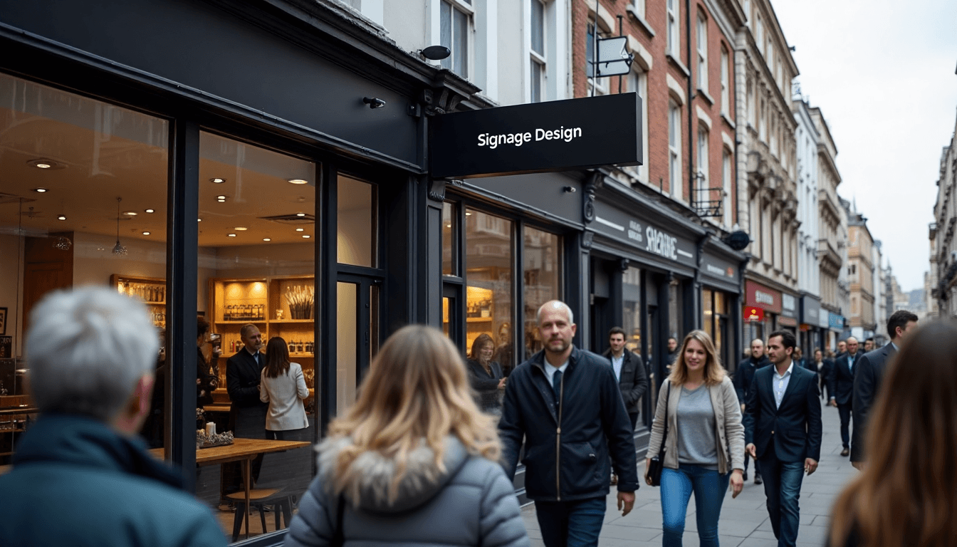
Signage may seem simple, but in London’s crowded streets, every detail can make or break a brand’s visibility. Here is the shocker. A sign’s size should be at least seven percent of the intended viewing distance for it to be easily recognised. Most businesses miss this golden detail altogether. Smart design is not just about pretty graphics. It is about outsmarting visual noise and capturing glances that translate into loyal customers.
Table of Contents
Table of Contents
- Understanding Your Audience And Sign Location
- Choosing Colours, Fonts And Visuals That Stand Out
- Best Practices For Clear Messaging And Readability
- Adapting Signage For Different Business Needs In London
Quick Summary
| Takeaway | Explanation |
|---|---|
| Understand Your Audience | Tailor signage designs to the demographic profiles of your target customers, considering factors like age and cultural background for effective visual communication. |
| Strategic Sign Placement | Position signs at key decision points and consider environmental factors to enhance navigational effectiveness and visibility in urban settings. |
| Prioritise Readability | Use high-contrast colours and sans-serif fonts to ensure legibility from a distance, while maintaining proper sizing relative to viewing distance for clarity. |
| Adapt to Environmental Context | Design signage that integrates seamlessly with local architectural styles and withstands varying lighting conditions to enhance its functionality. |
| Leverage Colour Psychology | Select colours that resonate with your brand and effectively capture attention, as specific colours provoke different emotional responses and engagement levels. |
Understanding Your Audience and Sign Location
Successful graphic design for signage demands a nuanced understanding of your target audience and strategic location placement. Businesses in London must recognise that effective signage goes far beyond aesthetic appeal—it requires a deep comprehension of visual communication principles and environmental context.
Demographic Insights and Visual Communication
Understanding your audience’s demographic profile is fundamental to creating impactful signage. Research from academic studies reveals that audience demographics significantly influence visual perception and communication effectiveness. Age, cultural background, and educational level play crucial roles in how individuals interpret visual information.
For London businesses, this means developing signage that speaks directly to their specific customer base. A boutique in Shoreditch might require a dramatically different design approach compared to a professional service firm in the City. Colour psychology becomes paramount—research indicates that colour selection dramatically influences viewer attention and subjective preferences, with certain colours like red consistently attracting more visual engagement.
Strategic Signage Placement and Wayfinding
Location is not merely a physical attribute but a critical strategic consideration in signage design. Strategic placement research demonstrates that positioning signage at key decision points—such as intersections or areas where multiple paths converge—dramatically enhances navigational effectiveness.
This principle is particularly relevant for London businesses operating in complex urban environments. Consider foot traffic patterns, sightlines, and potential visual obstructions. A well-placed sign can capture attention more effectively than an aesthetically perfect sign positioned incorrectly. For businesses looking to expand their signage strategy, our comprehensive guide on projecting signs offers detailed insights into maximising visibility.
Environmental Context and Design Adaptation
Environmental context demands adaptive design strategies. Urban settings like London present unique challenges—varying lighting conditions, architectural diversity, and high visual competition require signage that can dynamically communicate across different contexts.
Consider factors such as natural light exposure, surrounding architectural styles, and potential visual noise from competing signage. A sign must not only be visually appealing but also functional across different times of day and environmental conditions. Businesses should prioritise designs that maintain legibility and impact whether viewed in bright midday sunlight or during evening hours with artificial illumination.
By integrating audience understanding, strategic placement, and environmental adaptability, businesses can transform graphic design for signage from a mere visual element into a powerful communication tool that effectively attracts, informs, and engages potential customers.
Below is a comparison table summarising how audience demographics and location can influence signage design strategy for London businesses.
| Factor | Retail Boutique (Shoreditch) | Professional Firm (City) |
|---|---|---|
| Target Audience | Young, trend-focused, diverse | Professionals, older age groups |
| Colour Palette | Bold, vibrant, attention-grabbing | Conservative, muted, authoritative |
| Font Style | Modern, creative (Sans-serif or custom) | Clean, classic (Sans-serif, Serif) |
| Placement Focus | Window displays, projecting signs | Main entrance, internal wayfinding |
| Key Design Priority | Stand out, reflect brand personality | Build trust, convey reliability |
Choosing Colours, Fonts and Visuals That Stand Out
Creating signage that captures attention requires a strategic approach to visual design. The interplay of colours, fonts, and visual elements can transform an ordinary sign into a powerful communication tool that instantly engages potential customers.

Colour Psychology and Visual Impact
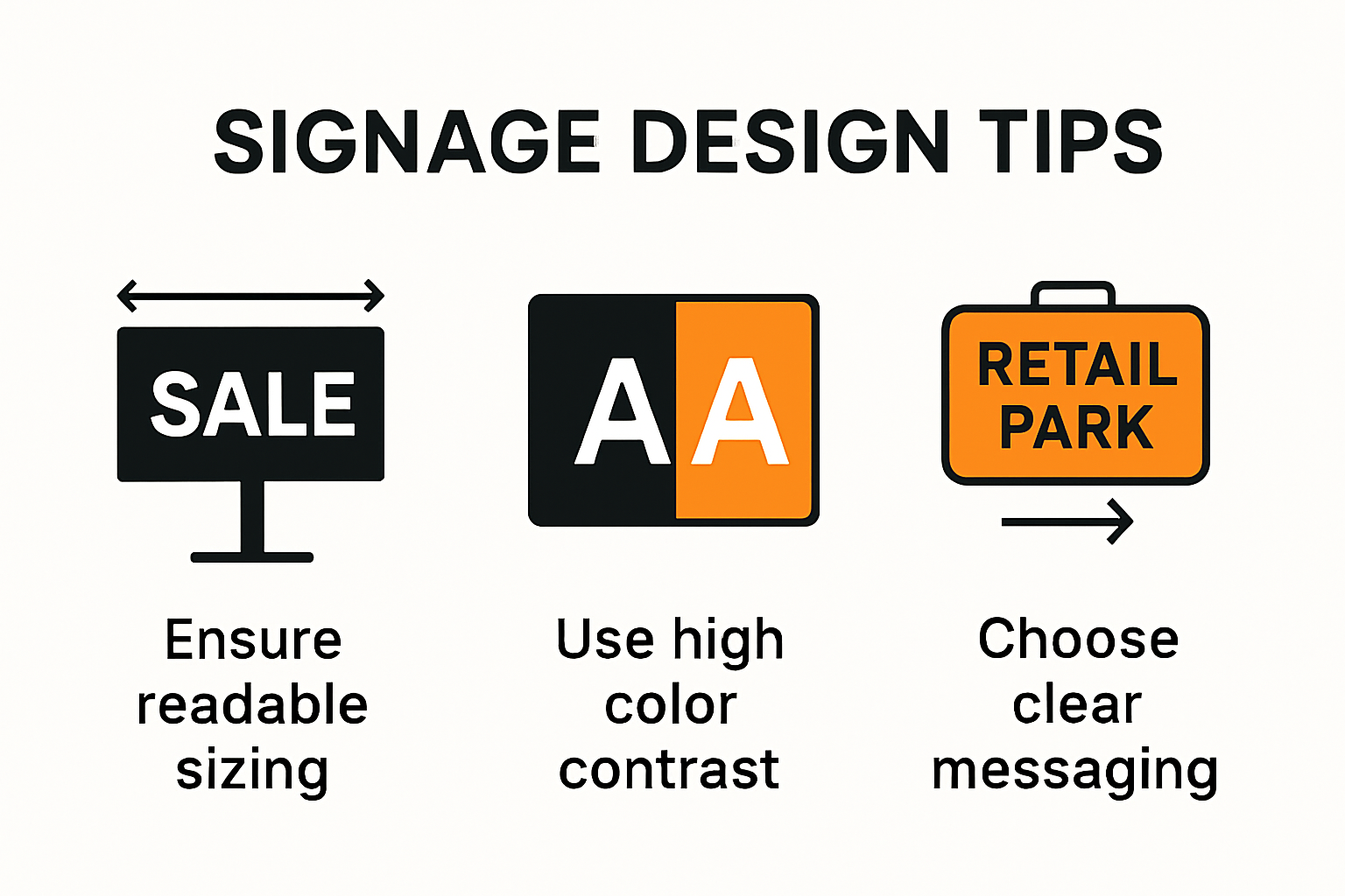
Research demonstrates that high-contrast colour combinations are crucial for signage legibility. Black text on a white background or white text on a black background dramatically improves readability, especially in challenging lighting conditions. Colour selection goes beyond mere aesthetics—it communicates brand personality and triggers specific emotional responses.
Scientific studies reveal fascinating insights into colour psychology. For instance, red can be particularly effective in capturing consumer attention, especially when used strategically in sale signage or important messaging. Businesses should carefully consider their colour palette, ensuring it aligns with their brand identity while maximising visual engagement.
Typography and Readability
Font selection is a critical component of effective signage design. Research from design experts consistently demonstrates that sans-serif fonts offer superior legibility, particularly when viewed from a distance. Clean, simple typefaces ensure that your message remains clear and accessible to a wide audience.
When selecting fonts, consider factors such as size, weight, and spacing. Larger fonts draw more attention, while appropriate letter spacing improves readability. For businesses looking to elevate their visual branding, our comprehensive guide to modern visual displays provides additional insights into creating impactful design strategies.
Visual Composition and Design Principles
Beyond colour and typography, the overall visual composition plays a crucial role in sign effectiveness. Consider the hierarchy of information—key messages should be most prominent, with supporting details strategically placed. Negative space is equally important, preventing visual clutter and allowing the core message to breathe.
Visual elements such as logos, icons, and graphic accents can enhance communication when used judiciously. However, restraint is key. Overly complex designs can overwhelm viewers and dilute the primary message. The goal is to create a visual experience that is both memorable and instantly comprehensible.
Successful signage design is an art of balance—combining technical precision with creative expression. By understanding the principles of colour psychology, typography, and visual composition, businesses can create signs that not only stand out but effectively communicate their brand message in the competitive urban landscape.
Here is a table summarising best practices for combining colour, font, and composition for standout signage.
| Design Element | Best Practice Example | Impact on Effectiveness |
|---|---|---|
| Colour Contrast | Black text on white, or white text on black | Maximises readability in varied lighting |
| Font Type | Sans-serif (e.g., Arial, Helvetica) | Ensures legibility from a distance |
| Font Size | Proportional to viewing distance (7% rule) | Clear messaging even from afar |
| Visual Hierarchy | Key message prominent; supporting details smaller | Guides viewer attention efficiently |
| Negative Space | Generous margins/spacing | Avoids clutter and improves focus |
| Graphics/Icons | Used sparingly to support message | Enhances quick comprehension |
Best Practices for Clear Messaging and Readability
Effective signage transcends visual appeal—it communicates a clear, concise message that can be quickly understood by viewers. Businesses must prioritise messaging clarity and readability to ensure their signs effectively convey information and capture audience attention.
Sizing and Distance Considerations
Research indicates that optimal signage readability depends critically on proper sizing relative to viewing distance. The recommended standard suggests that a sign’s size should represent at least 7% of the intended viewing distance. This proportion ensures information recognition accuracy and reduces comprehension time.
For London businesses operating in diverse urban environments, this means carefully calculating sign dimensions based on potential viewer proximity. A sign placed in a busy high street requires different sizing strategies compared to one positioned in a more spacious commercial district. Understanding these nuanced placement dynamics helps create signs that communicate effectively across varying spatial contexts.
Typography and Visual Contrast
Accessibility research highlights the importance of font selection in creating readable signage. Sans-serif fonts like Arial or Helvetica emerge as superior choices, particularly for viewers with visual impairments. These clean, straightforward typefaces facilitate quicker information processing and ensure broader accessibility.
Visual contrast plays an equally crucial role in messaging clarity. Communication design studies demonstrate that high-contrast colour combinations—such as dark text on light backgrounds or vice versa—significantly enhance legibility. Businesses should strategically select colour palettes that maximize readability while maintaining brand consistency.
Messaging Strategy and Information Hierarchy
Crafting a clear message requires a deliberate approach to information hierarchy. Key information must be prominently displayed, with supporting details positioned strategically. This means prioritising essential details and using visual cues like size, weight, and placement to guide viewer attention.
For businesses seeking to refine their signage communication strategy, our comprehensive retail sign design guide offers in-depth insights into creating impactful visual communication. The goal is to create signs that are not just visually appealing, but functionally effective—communicating crucial information at a glance.
Successful signage design is a nuanced balance of technical precision and creative communication. By understanding principles of sizing, typography, contrast, and information hierarchy, businesses can create signs that are not merely decorative elements, but powerful tools of visual communication that engage and inform their target audience.
Adapting Signage for Different Business Needs in London
London’s diverse business ecosystem demands a nuanced approach to signage design. Each industry and business type requires a tailored visual communication strategy that reflects its unique identity, operational context, and target audience.
Industry-Specific Signage Considerations
Design research suggests that understanding human preferences through systematic analytical methods can significantly enhance signage effectiveness. Different business sectors in London—from traditional retail establishments in Covent Garden to tech startups in Shoreditch—require distinct signage approaches that align with their brand identity and functional requirements.
Retail businesses might prioritise window displays and projecting signs that capture pedestrian attention, while professional services like law firms or financial institutions may require more understated, authoritative signage. Our comprehensive guide to shop sign types provides detailed insights into selecting the most appropriate signage solutions for various business contexts.
Architectural and Environmental Adaptation
Typeface legibility studies highlight the critical importance of selecting design elements that work harmoniously with architectural surroundings. London’s rich architectural landscape—spanning historical buildings in the City to modern developments in Canary Wharf—demands signage that respects and complements existing structural aesthetics.
Consider factors such as building material, colour palette, historical context, and local planning regulations. A sign in a Victorian-era building requires a markedly different design approach compared to one in a contemporary glass-fronted office complex. The goal is to create signage that feels integrated rather than intrusive.
Functional Versatility and Technological Integration
Modern London businesses require signage solutions that are not just visually appealing but functionally versatile. This means designing signs that can adapt to different lighting conditions, withstand urban environmental challenges, and potentially integrate digital technologies.
For businesses seeking robust outdoor signage solutions, our outdoor signage specialties offer comprehensive options that balance durability with aesthetic sophistication. Consider elements like weather resistance, illumination options, and potential for future technological upgrades.
Successful signage in London is more than a visual marker—it’s a strategic communication tool that reflects a business’s identity, respects its environment, and effectively engages its target audience. By understanding the nuanced requirements of different business types and urban contexts, companies can develop signage that is not just seen, but truly remembered.
Frequently Asked Questions
What factors should I consider when designing signage for my London business?
You should consider your target audience’s demographic insights, strategic signage placement, environmental context, and the visual impact of colours and fonts to ensure effective communication.
How can I choose the right colours for my signage?
Leverage colour psychology by selecting colours that resonate with your brand and capture attention. High-contrast combinations can enhance visibility and make your signage more readable.
What is the recommended size for signage in relation to viewing distance?
A sign’s size should ideally represent at least 7% of the intended viewing distance. This proportion ensures that the information is easily readable and recognisable from afar.
What are key design principles for effective signage messaging?
Prioritise clarity and readability by using high-contrast colours, sans-serif fonts, and a clear information hierarchy. Your key message should be prominent, with supporting details easily accessible.
Ready to Transform Your London Signage?
Are you struggling to make your signage noticeable in the busy buzz of London? You have just learned how environmental context, colour psychology, and sign placement can mean the difference between standing out and missing out. Many businesses fall into the trap of getting lost among city clutter. But imagine your sign not just surviving, but thriving amidst the noise. See how expert design, correct sizing, and the right message can actually drive customers through your door, rather than watching them walk by.
Do not let your brand go unnoticed this year. If you want visually striking, strategically placed signs that truly reflect your brand identity, speak to the specialists trusted by London, Essex, and Kent businesses. Discover how PromoSigns designs, produces, and installs custom illuminated shop signs and large format prints tailored to your audience and location. If your signage is ready for a new level of clarity and impact, contact our experts today to unlock a tailored plan for your business. Act now to ensure your next sign actually gets seen.
Recommended
- Custom Sign Design Process for London Businesses: 2025 Guide – PromoSigns.co.uk
- Signage for Office Interiors: 2025 Guide for London Businesses – PromoSigns.co.uk
- Retail Sign Design Tips 2025: Essential Guide for London Businesses – PromoSigns.co.uk
- Office Signage Ideas for London Businesses and Events: 2025 Trends – PromoSigns.co.uk
- Signage for Interior Designers: Trends and Solutions 2025 – PromoSigns.co.uk
- Event Signage Checklist 2025: Essential Guide for London Businesses – PromoSigns.co.uk
