
TL;DR:
- Effective signage increases visibility and attracts customers before they enter your premises. Proper design, including letter size, contrast, font choice, and placement, ensures signs are quickly readable from the appropriate distances. Regular testing, maintenance, and updates enhance sign effectiveness and reflect a professional brand image.
Effective signage is the most direct way to increase visibility with signage and attract customers before they ever set foot inside your premises. A well-designed sign works as a 24/7 marketing asset, communicating your brand identity and availability around the clock. The industry standard for sign readability requires 1 inch of letter height per 10 feet of viewing distance. Get that formula right, and your sign does the heavy lifting. Get it wrong, and passing customers simply will not see you.
Table of Contents
How to boost visibility with signs: core design principles
The most effective sign designs start with one rule: if it cannot be read quickly, it will not be read at all. Effective signage delivers its message in under 5 seconds using 5 words or fewer. That constraint forces clarity, which is exactly what passing pedestrians and drivers need.
Letter size and viewing distance
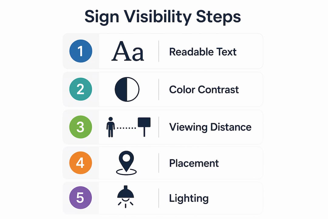
Letter height is the single most controllable factor in sign legibility. The industry standard sets 1 inch of capital letter height per 10 feet of viewing distance for pedestrian signs. For roadside signs, that ratio shifts to 1 inch per 25–50 feet of viewing distance. A sign intended to be read from 100 feet away needs capital letters at least 2–4 inches tall. Most business owners underestimate this and end up with signs that are illegible from the pavement.
Colour contrast and font choice
High-contrast colour pairings dramatically improve legibility. Dark text on a light background, or white text on a deep navy or black background, outperforms any decorative colour scheme. Sans-serif fonts such as Helvetica and Frutiger are the preferred choices for signage because their clean letterforms remain readable at distance and speed. Decorative or script fonts may look attractive up close, but they collapse into illegibility at 20 metres.
Visual hierarchy and whitespace
Visual hierarchy means the most important information is the largest and most prominent. Your business name should dominate. A supporting descriptor or call to action sits below it at a smaller size. Whitespace around text is not wasted space. It separates elements and prevents the eye from getting lost.
Key design principles for best signs for visibility:
- Letter height: 1 inch per 10 feet for pedestrian signs; 1 inch per 25–50 feet for roadside signs
- Contrast: dark on light or light on dark; avoid mid-tone combinations
- Font: sans-serif typefaces only for primary messaging
- Message length: 5 words or fewer for fast comprehension
- Whitespace: leave clear margins around all text and graphic elements
- Colour saturation: avoid clashing saturated hues that create visual vibration
Pro Tip: Avoid placing red text on a green background or blue text on an orange background. These complementary colour pairings create optical vibration that makes text actively harder to read, particularly for people with colour vision deficiencies.
Where should signs be placed for maximum impact?
Sign placement determines whether your signage works or simply exists. Signs placed at eye level, between 30 and 60 inches from the floor, maximise visibility for pedestrians because that range aligns with natural sightlines. Elevated signs serve a different purpose: they extend visibility to drivers and people approaching from a distance.

The most important placement principle is timing. Signs must appear before customers reach a decision point, such as an intersection or entrance, not after they have already passed it. A sign that appears too late cannot influence behaviour. Position your primary roadside sign so that drivers have at least 3–5 seconds of reading time before they need to turn or stop.
Placement priorities by sign type
- Primary roadside sign: Position at the approach to your premises, visible from both directions. Elevated height improves sightlines over parked vehicles and street furniture.
- Fascia or shopfront sign: Mount at eye level for pedestrians. Ensure it is unobstructed by awnings, trees, or neighbouring displays.
- Directional signs: Place at every decision point inside and outside the premises. Car parks, side entrances, and stairwells all need clear direction.
- Window graphics: Position in the lower two-thirds of the window to remain visible behind street-level obstructions.
- Illuminated signs: Install lighting that covers the full face of the sign without creating glare. Illuminated signage maintains visibility after dark and in poor weather.
Pro Tip: Conduct a drive-by test before committing to a permanent installation. Drive past your premises at normal road speed from both directions and note exactly when the sign becomes legible. This single test reveals obstructions, angle problems, and size issues that no desktop review will catch.
| Sign type | Recommended height | Primary audience | Key consideration |
|---|---|---|---|
| Roadside pylon | 3–6 metres | Drivers | Visible above parked vehicles |
| Fascia sign | 2.5–3.5 metres | Pedestrians | Unobstructed sightline |
| Directional sign | 1.5–2 metres | Pedestrians and drivers | Placed before decision points |
| Window graphic | Lower two-thirds of window | Pedestrians | Avoid blocking interior light |
| Illuminated sign | Matches fascia height | All audiences | No glare; even light distribution |
Signage placement best practices go beyond height and angle. Multi-directional visibility matters on corner plots and high-traffic junctions. If your premises sit on a corner, you need signage facing both streets.
What are cost-effective signage options to boost visibility quickly?
Not every visibility solution requires a large capital investment. Low-budget options such as car door magnets and yard signs generate high visibility at a low cost per impression compared to permanent architectural signage. They are particularly useful for new businesses testing messaging before committing to a permanent installation.
The key to affordable signage is a multi-sign approach. One large sign carrying your full brand identity, combined with smaller directional signs guiding customers on-site, distributes information across the customer journey without overloading any single sign. Trying to put everything on one board produces clutter and reduces comprehension.
Cost-effective signage options worth considering:
- Correx boards and foam PVC signs: Lightweight, printable, and weather-resistant for short-term outdoor use
- Vinyl banners: Fast to produce, easy to reposition, and effective for promotions or new openings
- Vehicle graphics: Turn a company van or car into a moving advertisement across your trading area. Vehicle graphics in London deliver repeated impressions across a wide geographic area
- Window graphics: Low-cost, high-impact use of existing glass frontage
- Magnetic car signs: Removable and reusable, ideal for sole traders and small fleets
For outdoor use in the UK, material durability is not optional. British weather subjects signage to UV exposure, rain, and temperature fluctuation year-round. Choosing weatherproof signage materials from the outset prevents premature fading, warping, and delamination. A sign that looks worn communicates the wrong message about your business.
| Signage option | Typical lifespan outdoors | Relative cost | Best use case |
|---|---|---|---|
| Vinyl banner | 1–2 years | Low | Promotions, events, new openings |
| Correx board | 6–12 months | Very low | Temporary directional or site signs |
| Aluminium composite panel | 5–10 years | Medium | Permanent fascia and directional signs |
| Illuminated LED sign | 7–10 years | Higher | 24/7 brand visibility, night trading |
| Vehicle graphics | 3–5 years | Medium | Mobile brand awareness across a wide area |
How to avoid common sign visibility mistakes
The most frequent signage errors are avoidable. Each one reduces the return on your investment and, in some cases, actively damages your brand perception.
- Too much information on one sign. Every additional word reduces reading speed. Stick to your business name, one descriptor, and one contact detail or call to action at most.
- Decorative fonts. Script and display typefaces are difficult to read at distance. Reserve them for logos only, never for primary sign copy.
- Low-contrast colour choices. Grey text on a white background, or brown text on a dark green background, fails in bright sunlight and at distance. Test your colour combination in full daylight before production.
- Ignoring local planning regulations. Many London boroughs have specific rules on sign size, illumination, and placement. Installing a non-compliant sign risks enforcement action and removal costs.
- Single-direction placement. A sign visible from only one approach misses a significant proportion of passing trade. Always assess visibility from every likely customer approach route.
- Poor lighting. A sign that is bright during the day but unlit at night loses half its working hours. Equally, poorly directed spotlights create glare that makes text harder to read than no lighting at all.
- Neglecting maintenance. A faded, dirty, or damaged sign signals neglect. Schedule regular cleaning and inspection, particularly after winter months.
“Legibility hinges on design clarity: simple, high-contrast colours and clean fonts surpass decorative elements every time.”
Drive-by testing catches the majority of these issues before they become expensive mistakes. Walk and drive past your sign at different times of day and in different weather conditions. What looks clear on a design screen often behaves differently in the real world.
What working with signage every day has taught us
The businesses that get the most from their signage treat it as a permanent member of the team, not a one-off purchase. A sign that communicates your brand 24/7 is doing sales work while you sleep. That framing changes how seriously business owners invest in getting it right.
The insight most owners miss is this: aesthetics and function are not in competition. A beautiful sign that cannot be read from 10 metres is a decoration, not a business tool. The best signage we see is always the result of someone asking “will a stranger understand this in 3 seconds?” before approving the design, not after installation.
Drive-by testing is the single step that separates good signage from great signage. We have seen businesses spend thousands on fabrication and installation, then discover the sign is obscured by a lamp post from the main approach. That test costs nothing and saves everything.
Signage also needs to evolve. A sign that suited your business in its first year may not reflect your brand accurately three years later. Revisiting your signage as part of your annual marketing review keeps your premises looking current and your messaging sharp.
— Promo
Promosigns: bespoke signage built for maximum visibility
Promosigns designs, manufactures, and installs high-impact signage for retail, hospitality, and corporate clients across London, Essex, and Kent. Every project starts with a consultation to understand your premises, your customers, and your visibility goals.
From illuminated fascia signs and 3D letters to outdoor signs that attract customers and weather-resistant hoardings, Promosigns delivers end-to-end solutions built to UK standards. Whether you need shop signs in Barnet or a full shopfront rebrand in central London, the team handles design, production, and professional installation. Get in touch to discuss your signage requirements and receive a tailored quote.
FAQ
What is the standard letter size for readable signs?
The industry standard is 1 inch of capital letter height per 10 feet of viewing distance for pedestrian signs. For roadside signs, the ratio extends to 1 inch per 25–50 feet of viewing distance.
How many words should a business sign contain?
Effective signage communicates its message in 5 words or fewer. This ensures fast comprehension by passing drivers and pedestrians who have only a few seconds to read the sign.
Where is the best place to position a shop sign?
Signs should be placed before customer decision points such as entrances and intersections, not after. Pedestrian-facing signs work best at 30–60 inches from floor level, aligned with natural sightlines.
Do illuminated signs make a measurable difference to visibility?
Illuminated signs extend visibility into evening and night hours, effectively doubling the active hours your signage works. They also remain legible in overcast conditions and heavy rain, which are common across the UK.
How often should business signage be updated or maintained?
Signage should be inspected and cleaned at least twice a year, with a full review of messaging and condition annually. Faded or damaged signs reduce brand credibility and signal poor upkeep to potential customers.
Recommended
- Choosing Outdoor Signage: A Step-by-Step Guide for 2025 – PromoSigns.co.uk
- How Lighting Affects Signage: Essential Guide for Businesses 2025 – PromoSigns.co.uk
- Graphic Design Tips for Signage: 2025 Guide for London Businesses – PromoSigns.co.uk
- Illuminated Signs Explained: A 2025 Guide for London Businesses – PromoSigns.co.uk
