
Signage in UK businesses is far more than decoration. It is a critical touchpoint for people with all kinds of abilities. Across public spaces, workplaces, and shops, one simple detail can change everything. A minimum contrast ratio of 4.5:1 between text and background colours is required by law to help visually impaired customers navigate safely. Oddly, most companies still treat accessibility as an afterthought, missing both legal requirements and the chance to truly welcome everyone. The real competitive advantage lies not in flashy signs but in those subtle choices that make every visitor feel included from the moment they walk in.
Table of Contents
Table of Contents
- Understanding Key Signage Accessibility Standards
- Essential Requirements For Different Business Types
- Adapting Signage For London Offices And Events
- [Office Wayfinding And Workplace Navigation
](#office-wayfinding-and-workplace-navigation)
- Event Signage And Professional Presentation
- Technology And Innovation In Signage Design
- Choosing Accessible Sign Materials And Designs
Quick Summary
| Takeaway | Explanation |
|---|---|
| Ensure high contrast for readability | Use a minimum contrast ratio of 4.5:1 between text and background to aid individuals with visual impairments. |
| Incorporate tactile elements for navigation | Include raised lettering and Braille to assist those with visual impairments in finding their way. |
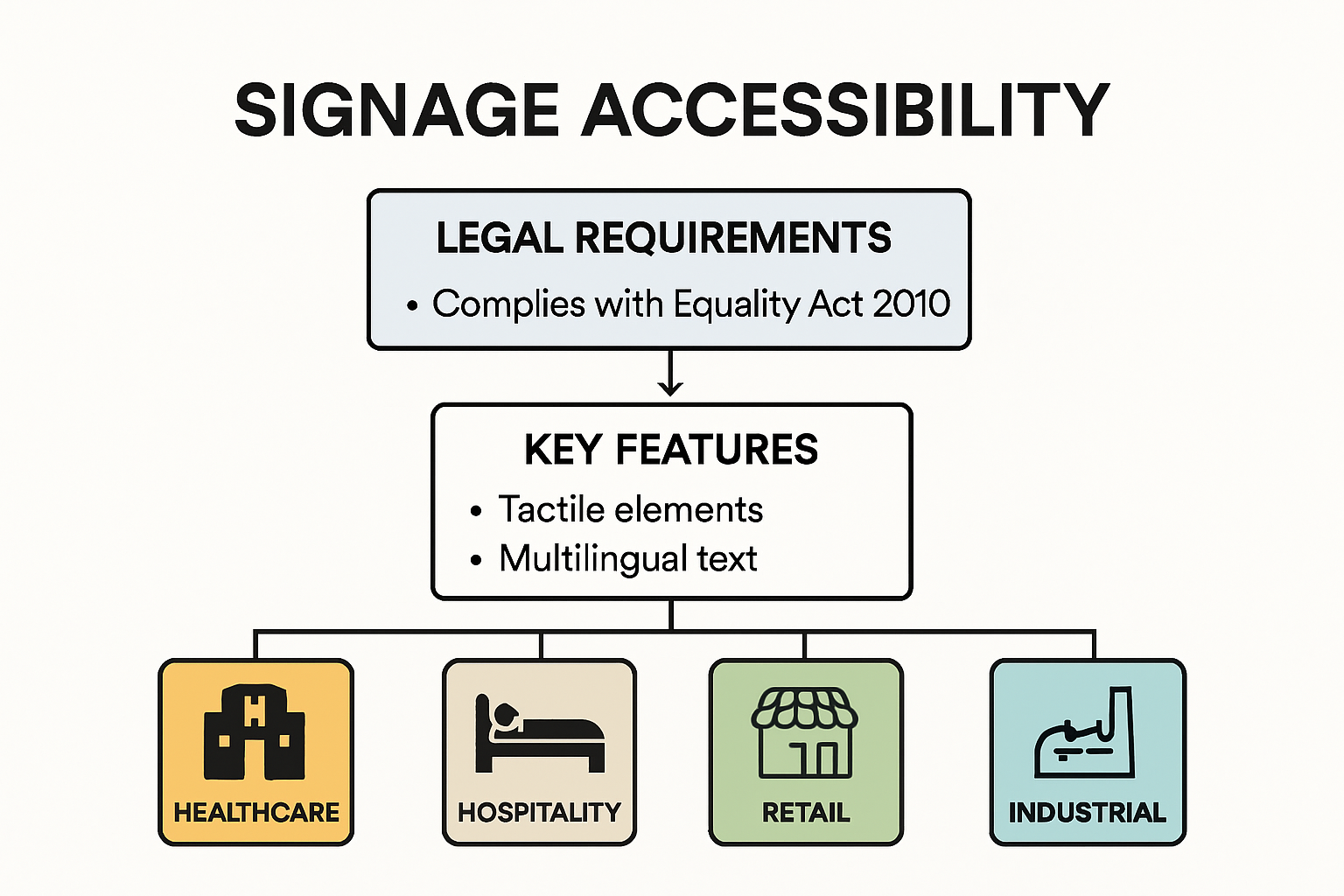
| Adhere to UK accessibility regulations | Follow the Equality Act 2010 mandates to create a welcoming environment for individuals with disabilities. |
| Tailor signage for various business types | Recognise that different environments like healthcare, hospitality, and industrial require unique signage approaches to meet accessibility needs. |
| Utilise technology for signage innovation | Integrate digital displays and interactive elements to enhance communication and accessibility in modern environments. |
Understanding Key Signage Accessibility Standards
Accessible signage represents a critical aspect of inclusive design for businesses, ensuring that every individual can navigate and interact with spaces regardless of their physical abilities. Research from the National Institutes of Health demonstrates that thoughtful signage design goes far beyond aesthetic considerations, serving as a fundamental communication tool for people with diverse needs.
Visual Contrast and Readability Standards
The foundation of effective accessible signage lies in visual clarity and contrast. Professional guidelines recommend specific colour contrast ratios to ensure maximum legibility for individuals with visual impairments. High contrast designs are essential, typically requiring a minimum contrast ratio of 4.5:1 between text and background colours. This means selecting colour combinations that provide sharp differentiation – such as dark text on a light background or vice versa.
Typography plays an equally crucial role in accessibility. Sans serif fonts with clean, simple letterforms are recommended, as they are easier to read from various distances and angles. Font sizes should be sufficiently large, with minimum recommendations ranging between 16 to 20 point sizes for optimal readability. Spacing between letters and lines also impacts comprehension, with experts suggesting generous letter spacing and line height to prevent visual confusion.
Tactile and Multilingual Signage Considerations
Beyond visual elements, accessibility encompasses tactile information for individuals with visual impairments. Raised lettering and Braille translations provide critical navigation assistance. International standards recommend placing tactile signage at consistent heights (typically between 1.2 to 1.6 metres) and ensuring characters are embossed between 0.8 to 1.5 millimetres to be easily discernible by touch.
Multilingual considerations are also paramount in our diverse business environments. Signs should accommodate multiple languages where appropriate, using clear, straightforward language and avoiding complex terminology. Comprehensive accessibility research emphasises the importance of providing information in formats that can be understood by the widest possible audience.
Regulatory Compliance and Best Practices
UK businesses must adhere to specific accessibility regulations, including the Equality Act 2010, which mandates reasonable adjustments for individuals with disabilities. This includes ensuring signage is clear, comprehensible, and provides essential wayfinding information. Compliance isn’t just a legal requirement but a demonstration of organisational commitment to inclusivity.
Best practices extend beyond minimum requirements. Innovative businesses are increasingly adopting universal design principles, creating signage that serves all users seamlessly. This might include incorporating pictograms alongside text, using simple iconography, and ensuring consistent design language across different sign types.
By prioritising accessibility in signage design, businesses create environments that welcome and support every individual, regardless of their physical capabilities. Check out our guide on modern signage design principles to learn more about creating inclusive visual communication strategies.
Essential Requirements for Different Business Types
Accessibility in signage is not a one-size-fits-all solution. Different business types require tailored approaches to ensure their signage meets both legal requirements and the specific needs of their diverse customer base. The UK Government Service Manual emphasizes the importance of considering accessibility from the initial design stage, a principle that extends directly to signage across various business environments.
Healthcare and Public Service Signage
Healthcare facilities and public service environments demand the highest levels of accessibility. The Accessible Information Standard provides comprehensive guidelines for ensuring communication is truly inclusive. In these settings, signage must go beyond basic visual information. Critical considerations include:
- Clear, high-contrast directional signs for patients with visual or cognitive impairments
- Multilingual options to support diverse patient populations
- Tactile and Braille information for wayfinding in medical facilities
- Consistent placement of signs at standardized heights for wheelchair users and individuals of varying heights
Restaurants and retail spaces require a different approach to accessibility. Signs must balance aesthetic appeal with functional clarity. This means creating signage that is not only informative but also intuitive for customers with different abilities. Menu boards, directional signs, and informational displays should use simple, clear language and incorporate visual cues that aid understanding.
Hospitality and Retail Environment Accessibility
Hospitality businesses face unique challenges in creating accessible signage. Hotels, restaurants, and entertainment venues must consider multiple user needs. This includes providing clear information about accessibility features, such as wheelchair access, hearing loop systems, and alternative communication methods. Visual menus with pictograms, clear room numbering systems, and comprehensive wayfinding solutions are crucial.
Key elements include:
- Large, readable fonts for menu boards and directional signs
- Colour-coded wayfinding systems
- Consistent sign placement and design language
- Alternative format information (e.g., QR codes linking to digital menus)
Industrial and Workplace Signage Requirements
To clarify the specific accessibility needs for different business types, the following table summarises the unique signage requirements and key considerations as discussed in the article.
| Business Type | Key Signage Requirements | Notable Considerations |
|---|---|---|
| Healthcare/Public Service | High-contrast directionals, tactile & Braille, multilingual options, standardised height | Highest accessibility needed, supports cognitive impairments |
| Hospitality (Hotels/Restaurants) | Large fonts, colour coding, clear language, alternative formats, visual menus | Balance of aesthetics & function, multi-language needs |
| Retail | Intuitive menu boards, visual cues, consistent design, readable fonts | Simple communication, supports broad customer base |
| Industrial/Workplace | Pictorial safety instructions, high-visibility warnings, audio/tactile alerts | Safety emphasis, universally understandable designs |
Industrial and workplace environments present the most complex accessibility challenges. Safety signage must be comprehensible to workers with diverse abilities, including those with visual, hearing, or cognitive impairments. This goes beyond standard accessibility guidelines and enters the realm of critical safety communication.
Workplace signage must address:
- Clear safety instructions with pictorial representations
- High-visibility warning signs
- Tactile and audio warning systems
- Colour-coded safety information that is universally understandable
The core principle remains consistent across all business types: accessibility is about creating an inclusive environment that allows every individual to navigate and interact with space confidently and independently. Learn more about our comprehensive signage design principles to understand how businesses can create truly inclusive visual communication strategies.
By recognizing the unique needs of different business environments, organisations can develop signage solutions that are not just compliant, but genuinely supportive of all users.
Adapting Signage for London Offices and Events
London’s dynamic business landscape demands sophisticated, adaptable signage solutions that meet the complex needs of modern workspaces and professional events. With diverse workforce demographics and increasingly inclusive design requirements, businesses must approach signage as a strategic communication tool that supports accessibility and professional branding.
Office Wayfinding and Workplace Navigation
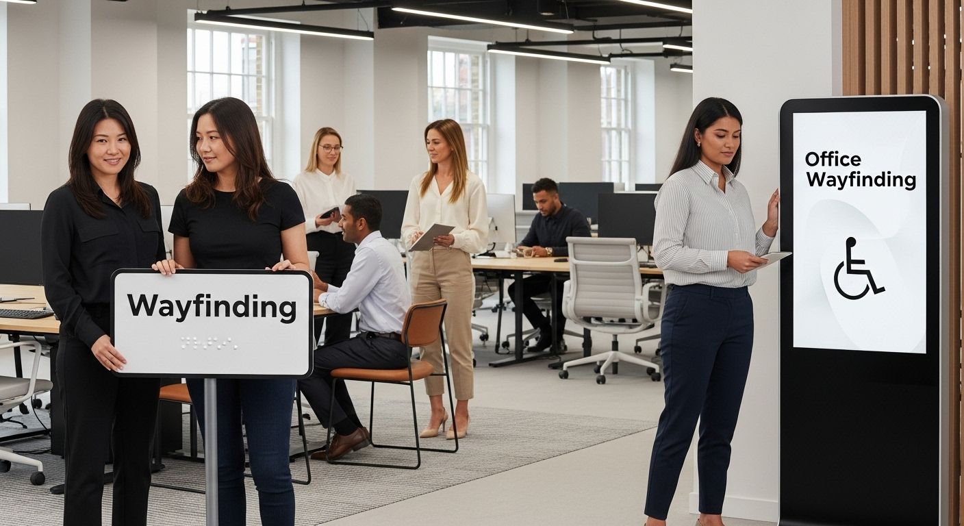
Modern office environments require intelligent signage systems that go beyond traditional directional markers. Adaptive signage technologies are transforming workplace communication, integrating digital displays that can be updated in real-time and accommodate multiple languages and accessibility needs. Interactive digital directories, for instance, can provide verbal instructions, adjust text size, and offer translation services for international teams.
Accessibility considerations in office signage are critical. This includes creating clear, high-contrast signage for room numbers, department indicators, and emergency exit routes. Tactile and Braille elements should be incorporated for colleagues with visual impairments, ensuring that every team member can navigate the workspace independently.
Event Signage and Professional Presentation
Events in London require a nuanced approach to signage that balances aesthetic appeal with functional clarity. Whether hosting conferences, trade shows, or corporate presentations, signage must communicate information efficiently while maintaining a professional aesthetic. Our comprehensive event signage guide provides detailed insights into creating impactful visual communication strategies.
Key elements of effective event signage include:
- Modular design systems that can be quickly reconfigured
- Multi-language information panels
- Clear directional markers with universal iconography
- Accessible height and placement considerations
- Integration of digital and physical signage elements
Technology and Innovation in Signage Design
Technological advancements are reshaping signage possibilities for London offices and events. Emerging solutions like augmented reality wayfinding, smart digital displays, and IoT-connected signage systems are creating more dynamic, responsive communication environments. These innovations allow for personalized navigation experiences, real-time updates, and enhanced accessibility features.
For instance, QR code integration can provide additional digital information, audio descriptions, or translation services directly from physical signage. This approach supports diverse user needs and creates a more inclusive communication ecosystem.
Considerations for technology-enhanced signage include:
- Compatibility with assistive technologies
- User-friendly interface design
- Robust accessibility features
- Seamless integration with existing workplace systems
Explore our innovative office signage solutions to understand how modern businesses are transforming their communication strategies. By embracing adaptive, inclusive signage design, organisations can create welcoming environments that support every individual’s navigation and information needs.
The future of office and event signage is not just about providing directions—it’s about creating comprehensive, accessible communication experiences that reflect the diversity and innovation of London’s professional landscape.
Choosing Accessible Sign Materials and Designs
Selecting appropriate materials and designs for accessible signage is a complex process that goes beyond aesthetic considerations. Research from materials science and design accessibility studies emphasizes the critical role that material selection plays in creating truly inclusive communication tools.
Material Performance and Sensory Considerations
The following table consolidates key guidelines for accessible sign materials and their essential performance features for sensory and practical needs.
| Material Feature | Importance for Accessibility | Recommended Approaches |
|---|---|---|
| Durability | Withstand environmental wear and tear | Use of acrylic/metals/polymers |
| Non-reflective/Matte Finish | Reduces glare, improves visual clarity | Matte coatings, non-gloss surfaces |
| Colour Integrity | Maintains high contrast over time | Fade-resistant materials |
| Texture & Tactile Compatibility | Enables Braille/raised lettering for touch navigation | Smooth, embossable surfaces |
| Maintenance Requirements | Ensures longevity and consistent accessibility | Easy-clean, resilient materials |
Intelligent material selection represents the foundation of effective accessible signage. Different environments demand specific material properties that support both visual and tactile information delivery. Considerations include durability, light reflection, texture, and long-term maintenance requirements.
Key material performance factors include:
- Resistance to environmental degradation
- Non-reflective surface finishes
- Ability to maintain colour integrity
- Smooth tactile surfaces for touch-based navigation
- Compatibility with embossing and Braille integration
Materials such as high-grade acrylic, powder-coated metals, and specialized polymers offer superior performance. These materials provide excellent contrast, minimal glare, and can be precisely engineered to support raised lettering and tactile elements. Matte finishes are particularly recommended, as they reduce visual interference and improve readability for individuals with varying visual capabilities.
Design Ergonomics and Sensory Accessibility
Design ergonomics play a crucial role in creating accessible signage. This involves carefully considering placement, height, angle, and interactive potential. Signs must be positioned at heights accessible to wheelchair users, children, and individuals of varying heights. Inclusive design principles mandate that signage communicates information through multiple sensory channels.
Multisensory design strategies include:
- Incorporating raised and embossed lettering
- Using high-contrast colour schemes
- Integrating Braille and tactile directional indicators
- Designing signs with clear, uncluttered visual hierarchies
- Ensuring sufficient spacing between characters and design elements
Technological Integration and Future Considerations
Emerging technologies are transforming material and design possibilities for accessible signage. Digital interfaces, augmented reality overlays, and smart materials are creating more dynamic, interactive communication experiences. QR codes, for instance, can provide additional digital information, audio descriptions, and translation services directly from physical signage.
Learn more about innovative signage design approaches to understand how advanced materials and design techniques are reshaping accessibility standards. The future of accessible signage lies in creating flexible, multisensory communication tools that adapt to diverse user needs.
Considerations for technology-enhanced materials include:
- Compatibility with assistive technologies
- Energy efficiency
- Durability and long-term performance
- Seamless integration with physical and digital environments
By prioritizing comprehensive material selection and design strategies, businesses can create signage solutions that are not just compliant, but genuinely inclusive and supportive of all individuals’ navigation and information needs.
Frequently Asked Questions
What is the required contrast ratio for accessible signage in the UK?
The law mandates a minimum contrast ratio of 4.5:1 between text and background colours to ensure readability for individuals with visual impairments.
How can businesses ensure their signage is accessible for individuals with disabilities?
Businesses should incorporate high contrast designs, tactile elements like Braille, and multilingual information to create inclusive and navigable signage that meets accessibility standards.
What are the best practices for signage in healthcare and public service environments?
Signage in these settings should include high-contrast directional signs, tactile and Braille information, and multilingual options to support patients with diverse needs and abilities.
Why is material selection important for accessible signage?
Choosing the right materials ensures durability, high contrast, and tactile compatibility. Non-reflective finishes improve visual clarity, while the ability to emboss text supports navigation for visually impaired users.
Make Your Business Truly Accessible with Custom Signage Solutions
Struggling to ensure your business signage meets UK accessibility guidelines? If you are concerned about meeting the legal requirement for high visual contrast, tactile elements for the visually impaired, or simply making sure your signs work for everyone, you are not alone. Many businesses risk excluding customers or even facing compliance issues by treating accessibility as an afterthought. Well-designed accessible signage is more than just a box to tick. It is a real opportunity to prove that everyone is welcome in your space, and it provides peace of mind, clarity and ease for every visitor.
Why not take the next step towards a more inclusive environment? Explore our wide range of shop signs, illuminated displays and large format printing, all custom designed to match the highest accessibility standards. We handle everything from design to installation across London, Essex, and Kent. For inspiration, visit our Main Website or discover how we deliver stunning results for modern workplaces with our office signage solutions. If you want advice or a quote, do not hesitate to contact us today. Now is the perfect time to make your business welcoming to everyone.
Recommended
- Signage Size Guidelines 2025: The Essential Guide for London Businesses – PromoSigns.co.uk
- Health and Safety Signage: Essential Guide for UK Businesses 2025 – PromoSigns.co.uk
- Signage for Compliance: Essential Guide for 2025 UK Businesses – PromoSigns.co.uk
- Retail Signage Compliance Guide 2025 for London Businesses – PromoSigns.co.uk
