
TL;DR:
- Effective wayfinding signs encompass physical, digital, environmental, and human elements to guide visitors confidently through complex spaces. Proper design, placement, and maintenance of these signs are essential to enhance user experience, reduce confusion, and support branding. Integrating both static and digital tools creates a cohesive system that improves navigation for diverse environments like campuses, hospitals, and retail centers.
Most people assume wayfinding signs are simple arrows pointing left or right. They are not. A well-designed wayfinding signage system shapes how confident visitors feel, how quickly they find what they need, and whether they leave with a positive impression of your space. Unclear wayfinding reduces hospitality perception and the likelihood of repeat visits. This article covers wayfinding signs explained in full: what they are, the different types, how to design them effectively, and how to plan and deploy a system that genuinely works for your visitors.
Table of Contents
Wayfinding signs explained: more than just directions
Wayfinding is the process by which people orient themselves and move through an environment with confidence. The term was coined by architect Kevin Lynch in the 1960s, but the discipline has grown far beyond street signs and corridor arrows. Today, wayfinding as a system encompasses physical signage, digital tools, environmental cues, and even staff positioning.
Understanding wayfinding signs means recognising that a sign is only one layer of a larger navigation ecosystem. The full system typically includes:
- Physical signage: Mounted, printed, or illuminated signs at decision points and thresholds
- Digital tools: Apps, interactive kiosks, and QR codes providing dynamic directions
- Environmental cues: Architecture, flooring patterns, lighting, and colour schemes that guide intuitively
- Staff assistance: Trained personnel at key points to assist when signs fall short
- Inclusive design: Braille, tactile elements, audio guides, and high-contrast formats for accessibility
Signs alone are insufficient without system integration. A retail development that invests in well-branded fascia signage but ignores internal zone markers will still leave shoppers lost and frustrated. The environments that benefit most from integrated wayfinding systems include hospitals, shopping centres, airports, university campuses, large office complexes, and multi-day events such as trade shows or festivals.
Wayfinding signage meaning goes beyond navigation speed. When visitors feel oriented and confident, they spend more time in your space, engage more with your offer, and form a more favourable view of your organisation. That is the real business case for getting your wayfinding system right.
Types of wayfinding signs and their functions
Not every sign in your building serves the same purpose. One of the most common mistakes in wayfinding signage planning is treating all signs as interchangeable. There are five core categories, each with a distinct job.
| Sign type | Primary function | Typical placement |
|---|---|---|
| Identification | Labels a place or zone | Entrance to rooms, departments, zones |
| Directional | Points the route to a destination | Corridors, junctions, car parks |
| Confirmational | Reassures the visitor they are on the right route | Post-turn positions, mid-route intervals |
| Informational | Provides context, maps, or instructions | Lobbies, receptions, visitor centres |
| Regulatory | Communicates rules, safety notices, legal requirements | Fire exits, restricted areas, hazard zones |
Each type requires different placement logic. Directional signs belong at decision points, the moments where a visitor must choose between two or more routes. Confirmational signs, by contrast, belong after the turn. Research on navigation shows that the brain actively resolves conflicting route memories, and without confirmation cues mid-route, anxiety builds rapidly. A single “You are heading to Hall B” sign placed thirty metres after a junction can eliminate that doubt entirely.

Identification signs are the most underused category. Many businesses label their main entrance clearly but leave internal zones unmarked, forcing visitors to guess or ask for help. Zone markers in a warehouse, department labels in a healthcare clinic, or area identifiers in an exhibition hall all reduce the cognitive load placed on visitors.
Consistency across all sign types is non-negotiable. If your directional signs use “Car Park” and your identification signs use “Parking Zone,” visitors will hesitate. Terminology must be agreed across the entire system before production begins.
Pro Tip: Map your visitor journey on foot before designing a single sign. Walk the route as a first-time visitor and note every moment of uncertainty. Those moments are exactly where signs need to be placed.
Design and implementation best practices
Good wayfinding sign design starts with the user, not the brand. Cognitive load is the invisible enemy of good navigation. Every unnecessary word, every competing visual element, and every inconsistent layout adds friction. Eye tracking studies in wayfinding confirm that signs must be clear, well-placed, and visually salient to guide users effectively without confusion.
The following principles form the foundation of effective design:
- Visual hierarchy: The destination name should dominate. Supporting information (floor number, distance, zone colour) comes second. Decorative elements come last.
- Font choice: Sans-serif typefaces such as Helvetica, Arial, or Johnston perform best at distance. Avoid script fonts entirely for wayfinding applications.
- Colour coding: Thematic colour coding aids orientation significantly. Municipal projects such as Kingston’s 2026 rollout used Uptown green, Midtown orange, and Waterfront blue to distinguish districts across 40 signs. The principle scales down to commercial buildings just as well.
- Contrast and accessibility: High contrast between text and background is required under UK accessibility standards. Braille and tactile indicators should be included on interior signs where relevant. You can review the full requirements in this compliance guide for UK businesses.
- Material selection: Outdoor signs must withstand UV exposure, rain, and temperature variation. Aluminium composite, powder-coated steel, and weatherproof vinyl are reliable choices. For indoor signs, brushed aluminium, acrylic, and PVC foam board each offer different aesthetic and durability trade-offs. A detailed breakdown is available in this signage materials guide.
Quality control during production is critical. The Kingston wayfinding project received significant public backlash due to typos and inconsistent design, which damaged trust in the entire system. Every proof must be checked by someone who has not been looking at it all day, and route logic must be verified on-site before installation begins.
Pro Tip: Never approve artwork without walking the physical route with printed mock-ups in hand. Errors that are invisible on screen become obvious when you are standing in the corridor holding the sign.
Digital integration is increasingly practical for larger spaces. QR codes linked to interactive maps, or augmented reality overlays accessible via smartphone, can supplement static signs at information-heavy decision points. They do not replace physical signs but extend what a static format can communicate.
Physical signs versus digital wayfinding tools
The debate between static signage and digital wayfinding is not really a debate. It is a question of which combination suits your environment and budget. Both have genuine strengths, and the best systems use both.
| Factor | Physical signage | Digital wayfinding |
|---|---|---|
| Visibility | Constant, no power required | Requires device or screen |
| Update flexibility | Requires reprinting or replacement | Real-time updates possible |
| Accessibility | Braille and tactile options available | Screen-reader and voice options |
| Cost | Higher upfront, lower ongoing | Lower upfront, ongoing licensing or maintenance |
| User familiarity | Universal | Varies by age and digital confidence |
| Reliability | High, no connectivity issues | Dependent on power and network |
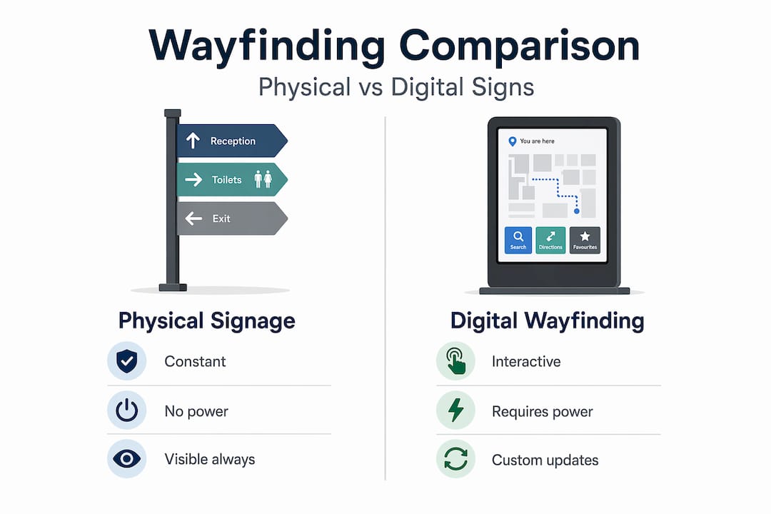
Yavapai College in Arizona deployed QR codes linked to the MazeMap app across its 700,000 square foot campus, allowing staff and visitors to access up-to-date floor plans on their phones. The physical signs remained in place for orientation and threshold identification. The digital layer handled the complexity that static signs struggle to communicate, namely multi-building navigation and real-time room changes.
For most commercial clients, the practical split works as follows:
- Use physical signs for all threshold identification, directional arrows, confirmational markers, and regulatory notices
- Use digital tools (QR codes, kiosks, or apps) at information-heavy points such as building entrances, reception desks, and large map displays
- Avoid digital-only wayfinding in environments with older visitor demographics or unreliable Wi-Fi
Environmental and architectural cues should also feed into your strategy. Flooring inlays, ceiling lighting zones, and colour-blocked wall panels can guide visitors intuitively without requiring them to read anything. This is particularly valuable in healthcare settings where cognitive load is already high.
Planning, deploying, and maintaining your system
A wayfinding project without a structured plan tends to result in gaps, duplications, and expensive reprints. The following sequence applies to projects of most sizes.
- Site assessment: Walk every visitor-facing route and document decision points, threshold crossings, dead ends, and areas of existing confusion. Include accessibility considerations from the start.
- User journey mapping: Define who your visitors are and what destinations they need to reach. A hospital visitor’s journey is different from a trade show attendee’s, even if the building is the same.
- Stakeholder engagement: Involve facilities managers, reception staff, and if possible, a sample of end users. Petaluma’s Lynch Creek Trail project completed sign installation within eight months by aligning community partners early, avoiding the delays that typically arise when stakeholders are consulted after design has begun.
- Sign schedule and production: Agree the full sign schedule (types, quantities, locations, and content) before any artwork is produced. Changes after production are costly and avoidable.
- Installation planning: Sequence installation logically. Entrance and identification signs first, then directional, then confirmational. Test the route on foot after each stage.
- Quality assurance: Built-in quality control across manufacturing and installation prevents the public relations problems that arise from visible errors. Assign a single sign-off authority for all final content approvals.
- Monitoring and upkeep: Signs fade, relocate, or become redundant when spaces change. Schedule a review every twelve months and after any significant fit-out or reconfiguration. Gather visitor feedback through brief surveys or observation to identify gaps the team may have missed.
Pro Tip: Photograph every installed sign with its GPS location recorded. This builds a visual audit trail that makes future updates and maintenance far faster to manage.
My take on what most businesses get wrong
I have worked on enough signage projects to know that wayfinding is the category most clients underestimate until they see the results of getting it wrong. The businesses that treat it as an afterthought, ordering a handful of arrows two weeks before opening, are the same ones receiving complaints from visitors who could not find the entrance, the lift, or the toilets.
What I find most interesting about the eye tracking research in wayfinding is that it validates what experienced signage designers have always known intuitively. Visitors do not read signs the way designers intend. They glance, they scan, and they move. If the most important word is not the most visually dominant element, the sign has already failed.
The other lesson I keep returning to is the importance of confirmation signs. Most clients budget for directional signs at decision points and stop there. But the moment a visitor turns and sees nothing for thirty seconds, doubt creeps in. That mid-route reassurance is cheap to produce and disproportionately valuable to the visitor experience.
My honest advice is to treat your wayfinding system the same way you treat your brand identity: as something worth investing in properly, maintaining consistently, and reviewing regularly. A sign that looked right three years ago may no longer reflect your space or your brand. The best wayfinding systems are never truly finished.
— Promo
How Promosigns can help with your wayfinding project
Whether you are fitting out a new retail space, managing a large-scale event, or developing a commercial property, getting your wayfinding signage right from the start saves time, money, and visitor frustration. At Promosigns, we design, manufacture, and install bespoke wayfinding signage systems for clients across London, Essex, and Kent.
Our team works with business owners, property developers, and event planners to build signage systems that cover every category: identification, directional, confirmational, informational, and regulatory. We handle everything from initial design through to professional installation, with quality control built into every production stage. You can explore our full range through our signage types guide or browse our outdoor signs for external wayfinding applications. If your project involves large-format printed wayfinding panels or map displays, our large-format printing guide explains the production options available. Get in touch to discuss your project.
FAQ
What is wayfinding signage?
Wayfinding signage is a system of signs designed to help people orient themselves and move through an environment with confidence. It includes directional, identification, confirmational, informational, and regulatory signs working together as a cohesive navigation system.
What are the main types of wayfinding signs?
The five core types are identification signs, directional signs, confirmational signs, informational signs, and regulatory signs. Each serves a distinct function and should be placed at specific points in the visitor journey.
Why is wayfinding signage important for businesses?
Unclear wayfinding reduces hospitality perception and the likelihood of repeat visits. Effective signage improves visitor confidence, reduces complaints, and reflects positively on your brand and premises.
How do wayfinding signs work alongside digital tools?
Physical signs provide constant, reliable orientation at thresholds and decision points. Digital tools such as QR codes or interactive kiosks handle complex, dynamic information. The two work best together rather than as alternatives.
What are the key wayfinding sign design principles?
The most important principles are visual hierarchy, consistent terminology, accessible contrast ratios, appropriate material selection for the environment, and placement at decision points and mid-route confirmation positions.
Recommended
- Wayfinding signs for customers: a practical guide – PromoSigns.co.uk
- Wayfinding signage explained: Enhance navigation and branding – PromoSigns.co.uk
- 7 Essential Wayfinding Signs Every Business Needs UK
- Blog Business Signs Work | Promo Signs LTD
