
TL;DR:
- Colour psychology in signage influences emotional responses and shapes consumer perceptions instantly.
- Effective colour choices reinforce brand identity, communicate appropriate messages, and improve sign readability.
- Understanding cultural context, contrast, and environment is essential for designing impactful, strategic signage.
Colour psychology in signage is the strategic use of specific colours to trigger emotional and cognitive responses that shape how consumers perceive a business before they read a single word. The brain processes colour in a fraction of a second, meaning your sign communicates a feeling before it communicates a message. For business owners, marketers, and designers, this makes colour one of the most consequential decisions in any signage project. Get it right and your sign builds trust, creates urgency, or signals quality. Get it wrong and you create confusion, or worse, drive customers away. This guide explains exactly how colour psychology applies to signage, from individual colour meanings to contrast ratios, cultural context, and practical implementation strategies for UK businesses.
Table of Contents
What does colour psychology in signage actually mean?
Colour psychology in signage, sometimes referred to as chromatic communication in design literature, is the deliberate application of colour theory to influence consumer behaviour and perception through visual branding. It operates on the principle that colour carries meaning independent of language, and that customers form opinions about a business within seconds, driven largely by colour before text is even registered.
This is not a soft or abstract concept. Colour functions as a 24/7 silent salesperson, influencing walk-in traffic, brand recall, emotional connection, and conversion rates when applied with intent. Brands such as McDonald’s, Barclays, and Harrods have each built globally recognisable identities on the back of deliberate, consistent colour choices. McDonald’s red and yellow stimulate appetite and urgency. Barclays’ blue signals reliability and professionalism. Harrods’ deep green communicates heritage and luxury. None of these are accidental.
Understanding colour psychology in marketing more broadly shows that colour reinforces brand identity and creates subconscious consumer appeal across every touchpoint, from packaging to digital advertising. In signage specifically, the stakes are higher because a sign must communicate instantly, at distance, and often in a cluttered visual environment. That combination of constraints makes colour selection a functional decision as much as an aesthetic one.
What do different colours mean in signage?
Each colour carries a set of psychological associations that are broadly consistent across Western markets, though cultural nuance matters and is covered separately below. The following breakdown covers the eight colours most commonly used in commercial signage.
- Red conveys urgency, excitement, and appetite stimulation. Retailers use red in sale signage and promotional displays because it signals urgency and excitement, prompting faster decision-making. Fast food brands rely on it heavily for the same reason.
- Blue communicates trust, reliability, and professionalism. Finance, healthcare, and technology businesses favour blue because it denotes reliability and reduces perceived risk in the consumer’s mind.
- Yellow attracts attention and projects optimism. It works well for directional signage and promotional callouts, though overuse in body text creates readability problems due to low contrast on white backgrounds.
- Green signals health, sustainability, and calm. Pharmacies, organic food retailers, and wellness brands use green to align with consumer expectations around natural products and wellbeing.
- Black communicates sophistication, authority, and exclusivity. Luxury brands use black signage to signal premium positioning. It also provides excellent contrast when paired with white or gold lettering.
- White suggests cleanliness, simplicity, and modernity. Technology companies and minimalist retail brands use white space and white signage to project clarity and confidence.
- Orange combines the urgency of red with the optimism of yellow. It is frequently used in leisure, food, and entertainment signage to project energy and approachability without the aggression of pure red.
- Purple is associated with creativity, wisdom, and premium quality. Beauty brands and specialist retailers use it to signal distinction and craft.
One critical caution: colour cues depend heavily on context. The same colour can trigger entirely different responses depending on the industry, the message, and the surrounding visual environment. Red on a pharmacy sign reads very differently from red on a restaurant fascia. Applying a colour without considering its context produces cognitive friction rather than connection.
Pro Tip: When selecting a colour for your signage, ask yourself what emotion you want a customer to feel in the three seconds before they read your business name. That answer should drive your colour choice, not your personal preference.

How do contrast, brightness, and saturation affect signage readability?
Colour hue alone does not determine whether a sign works. Contrast ratio, brightness, and saturation are equally critical, and in many cases more so. High-contrast combinations such as black-on-yellow or white-on-blue outperform low-contrast alternatives in readability tests, particularly at distance and in variable lighting conditions. This matters enormously for outdoor signage on busy high streets or retail parks.
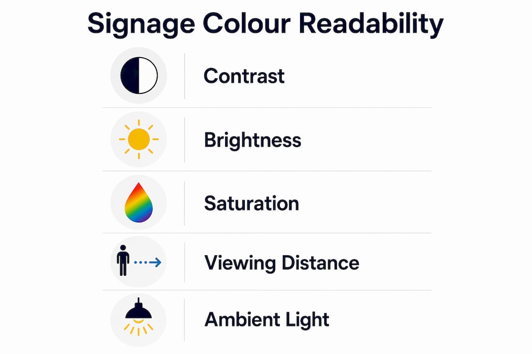
The table below illustrates how common colour combinations perform across key visibility criteria.
| Colour combination | Contrast level | Readability at distance | Recommended use |
|---|---|---|---|
| Black on yellow | Very high | Excellent | Directional, warning, promotional |
| White on dark blue | High | Very good | Corporate, retail fascia |
| White on black | High | Very good | Luxury, premium retail |
| Yellow on white | Low | Poor | Avoid for primary signage |
| Red on green | Very low | Very poor | Avoid entirely |
| Dark green on black | Very low | Poor | Avoid for outdoor use |
Saturation refers to the intensity of a colour. Highly saturated colours attract attention more effectively in outdoor environments where signage competes with surrounding visual noise. However, very high saturation combined with high brightness can cause eye fatigue, which works against dwell time on interior signage. The practical rule is to use high saturation for outdoor and promotional signs, and slightly lower saturation for interior environments where customers spend more time.
Brightness interacts with ambient lighting in ways that are easy to underestimate. A colour that reads clearly on a design screen may appear washed out in direct sunlight or too harsh under fluorescent interior lighting. This is why functional readability and emotional resonance must be balanced together. A sign that looks beautiful in a design file but is illegible on the street has failed its primary purpose.
Pro Tip: Always view a physical proof of your sign in the actual installation environment before approving production. Colour rendering on screen and in print under real-world lighting conditions can differ significantly, and this step prevents costly reprints.
How does cultural context shape effective colour choices in signage?
Colour symbolism is not universal. White symbolises purity in Western cultures but is associated with mourning in several East Asian cultures. Red signals luck and prosperity in Chinese culture but danger or aggression in others. For businesses operating in diverse urban markets, including London, this is a practical concern rather than an academic one.
The following industries each carry strong colour conventions that consumers have been conditioned to expect:
- Food and beverage: Red and yellow dominate because they stimulate appetite and signal speed and value. Premium restaurants break this convention deliberately, using black, deep green, or gold to signal a different price point.
- Healthcare and pharmacy: Blue and green are standard because they communicate calm, cleanliness, and clinical reliability. Bright red or orange in this context can feel alarming rather than welcoming.
- Finance and professional services: Dark blue, navy, and dark green project stability and trustworthiness. These sectors use colour conservatively because their customers are risk-averse by nature.
- Technology and creative agencies: Purple, teal, and gradient treatments signal innovation and forward-thinking positioning. These sectors have more latitude to experiment because their audiences expect it.
- Retail and fashion: Colour strategy varies by positioning. Discount retailers use red and orange to signal value. Premium and luxury retailers use black, white, and gold to signal exclusivity.
The risk of a colour mismatch is real and measurable. A financial services firm that uses bright orange signage may attract attention but simultaneously undermine the trust signals its customers need before committing to a product. A health food brand using red and yellow risks being read as a fast food outlet. Industry-specific colour strategies exist because they work, and deviating from them requires a clear strategic rationale, not just a desire to stand out.
For businesses serving multicultural communities across London, Essex, and Kent, it is worth conducting brief audience research before finalising signage colours. A colour that resonates strongly with one demographic may carry unintended connotations for another.
What practical strategies help businesses apply colour psychology effectively?
Translating colour psychology principles into a working signage design requires a structured approach. The following steps provide a practical framework.
-
Anchor your colour choices in brand identity. Your signage colours should align with your existing brand palette. Consistency across your shop front, window graphics, vehicle livery, and interior signage builds recognition over time. Brand consistency in signage is one of the most undervalued drivers of long-term customer recall.
-
Use a three-colour structure. Effective signage typically uses one dominant colour (60%), one secondary colour (30%), and one accent colour (10%). This prevents visual clutter while allowing contrast and hierarchy. The dominant colour sets the emotional tone; the accent colour draws attention to the most important element, such as your business name or a call to action.
-
Prioritise contrast over preference. Your brand colours may not produce the highest-contrast combination for your sign. In those cases, adjust the background or text colour to maintain readability without abandoning your palette entirely. A dark navy background with white lettering preserves a blue brand identity while delivering strong contrast.
-
Account for location and lighting. North-facing signs in the UK receive less direct sunlight and may benefit from brighter, more saturated colours. Signs under artificial lighting need to be tested under those specific conditions. Outdoor signage in high-footfall areas requires higher contrast and larger type than interior directional signs.
-
Avoid chasing colour trends without strategic grounding. Pantone’s Colour of the Year generates significant design interest, but adopting a trend colour for your signage without considering its psychological associations or fit with your brand is a common and costly mistake. Prioritising aesthetics over functional psychology produces signage that looks current but fails to convert.
-
Test before committing. Commission a physical mock-up or a large-format print proof and view it in situ at different times of day. Photograph it from the distance at which most customers will first see it. This step catches problems that no screen preview can reveal.
What we have learnt from designing colour-led signage
Working with businesses across retail, hospitality, and corporate sectors in London and beyond, one pattern stands out clearly. The businesses that get the most from their signage are not necessarily those with the most sophisticated colour palettes. They are the ones who treat colour as a functional tool first and an aesthetic choice second.
The most common mistake we see is a business presenting a brand colour that looks excellent on a website or business card, then expecting it to translate directly to a 3-metre fascia sign without adjustment. Screen-based colour and physical print colour behave differently. Illuminated signs introduce another variable entirely. What reads as a confident navy blue on a laptop screen can appear almost black on an unlit fascia in winter light.
The second pattern worth noting is the underestimation of cultural context in diverse urban markets. London is not a homogeneous audience. A colour combination that works brilliantly for a brand targeting one demographic may actively alienate another. This is not a reason to avoid bold colour choices. It is a reason to make them deliberately and with knowledge of your specific customer base.
The businesses that invest time in understanding the psychology of colour in marketing and apply those principles to their physical signage consistently outperform those that treat signage as a commodity purchase. Colour is not decoration. It is communication.
— Promo
How Promosigns can help you get colour right
At Promosigns, we design, manufacture, and install bespoke signage for businesses across London, Essex, and Kent, with colour strategy built into every project from the outset.
Whether you need a shop sign designed around a specific brand palette, an illuminated fascia that maintains colour accuracy after dark, or window graphics that use contrast to highlight offers, our team brings both design expertise and technical knowledge to every brief. We work with business owners, marketers, and architects to translate colour psychology principles into signage that performs in the real world, not just on a screen. Contact Promosigns today to discuss your signage requirements and find out how the right colour choices can make your business more visible, more trusted, and more memorable.
FAQ
What is colour psychology in signage?
Colour psychology in signage is the practice of selecting specific colours to trigger targeted emotional and behavioural responses in consumers. It operates subconsciously, shaping first impressions before a customer reads any text on the sign.
Which colours work best for retail signage?
Red and yellow are proven to stimulate appetite and urgency, making them effective for promotional and food retail signage. Premium retailers typically use black, white, or gold to signal exclusivity and higher price points.
How important is contrast in signage colour choices?
Contrast ratio is more critical than colour hue alone for signage readability. High-contrast combinations such as black-on-yellow or white-on-dark-blue deliver the strongest legibility at distance and in variable lighting conditions.
Do colour meanings differ across cultures?
Yes. White signals purity in Western markets but mourning in several East Asian cultures, and red carries luck in Chinese culture but danger in others. Businesses serving diverse urban audiences should research cultural colour associations before finalising their signage design.
Can the wrong colour choice damage my brand?
A colour mismatch between your signage and your industry’s expectations creates cognitive friction and can undermine consumer trust. A finance brand using bright orange, for example, may attract attention whilst simultaneously signalling the wrong values to risk-averse customers.
Recommended
- Wayfinding signs for customers: a practical guide – PromoSigns.co.uk
- How Lighting Affects Signage: Essential Guide for Businesses 2025 – PromoSigns.co.uk
- Highlight Retail Offers with Signage: Complete Guide UK
- Graphic Design Tips for Signage: 2025 Guide for London Businesses – PromoSigns.co.uk
