
Effective event wayfinding comes down to one principle: every attendee should know where to go next before they need to ask. The fastest way to achieve that is to map the full attendee journey, assign the right sign type to each decision point, and get physical signage ordered early enough to avoid rush charges. Here is the core planning sequence to follow for any UK event:
- Map the attendee journey from arrival to exit
- Decide which sign types cover each stage (identification, directional, informational, regulatory)
- Set placement rules: decision points, sightlines, mounting heights
- Lock in a consistent visual design with clear hierarchy
- Brief pre-event communications: website map, email, app, printed guide
- Audit for accessibility across all formats
- Walk the route on install day and sign off before doors open
Each step is covered in full below, with placement rules, design checklists, and production timelines tuned for UK events.
Table of Contents
Why good wayfinding is worth planning properly
Poor wayfinding costs you more than a few confused attendees. Congestion at unmarked junctions slows registration queues, increases staff queries, and creates bottlenecks that affect safety management. Sponsors placed in hard-to-find areas lose footfall. Attendees who feel lost at the start of an event carry that frustration into every session they attend.
The operational benefits of a well-planned system are concrete:
- Reduced pressure on front-of-house staff, who spend less time giving directions
- Faster crowd dispersal between sessions, cutting corridor congestion
- Improved sponsor and exhibitor visibility when routes are clearly signposted
- Stronger perceived event quality, because smooth navigation reads as professional organisation
- Safer emergency egress when regulatory signage is correctly placed and clearly visible
Planning event signage early also protects your budget. Artwork changes after print approval, last-minute sign additions, and expedited delivery all carry premium costs. The Association of Event Organisers (AEO) consistently highlights wayfinding as a core operational element, not an afterthought. Treating it as such from the outset prevents the kind of on-day scrambles that inflate spend and damage attendee experience.
Pro Tip: Lock in your signage brief at least four weeks before the event. Anything shorter than that and you are paying for urgency, not quality.
How to map the attendee journey and identify where signs are needed
Start with your attendees, not your floor plan. Different arrival scenarios produce different navigation needs: a delegate arriving by Tube at a London venue has different orientation cues than someone driving and parking at a conference centre in Essex or Kent.
Define your arrival personas
Consider at least three scenarios:
- Public transport arrivals — exiting a station or bus stop, often carrying bags, looking for the first directional cue within 20 metres of the exit
- Car and taxi arrivals — approaching from a car park or drop-off point, needing exterior directional signs before they reach the building
- Walk-in and returning attendees — already partially familiar with the site but still needing confirmation signs at key junctions
Build the journey map
Walk the route yourself before you brief anyone. Identify:
- All entrance points (main, accessible, staff, emergency)
- Registration and accreditation desks
- Primary destinations: main hall, breakout rooms, catering, toilets, exhibitor floor
- Transition zones: corridors, stairwells, escalator landings, foyers
- Natural pause points where attendees slow down and look around (foyer seating, coffee stations, lift lobbies)
- Congestion hot spots from previous events or site surveys
- Sightline blockers: exhibition stands, AV rigs, hanging banners, structural columns
Annotate your floor plan with each of these. The annotated map becomes your sign placement brief. A wayfinding signs guide for customers can help you translate that brief into a practical sign list.
Pro Tip: Do a physical walk-through during set-up, not just in planning. Stands and AV rigs that were not on the original floor plan regularly block sightlines that looked clear on paper.
What sign types do you need, and what should each one do?
There are four primary sign roles at any event. Each serves a distinct function, and all four work together as a system rather than independently.
| Sign type | Primary function | Typical placement | Sample copy |
|---|---|---|---|
| Identification | Names a space or destination | Entrance to each room, zone or area | “Main Hall”, “Registration”, “Exhibitor Hall B” |
| Directional | Points the way to a destination | Junctions, corridor branches, stairwells | “Main Hall →”, “Toilets ↑ Level 2”, “Exit ←” |
| Informational | Provides context or schedule detail | Foyers, registration desks, entrance boards | “Session 2 starts at 14:00 in Hall A”, “Wi-Fi: EventGuest” |
| Regulatory | Communicates rules, safety or compliance | Fire exits, restricted areas, accessible routes | “Fire Exit”, “No Entry — Staff Only”, “Accessible Route →” |
A few practical points on each:
- Identification signs should be large enough to read from 10 metres and placed at or just above eye level on the door or entrance arch.
- Directional signs carry the heaviest navigation load. Keep copy to arrow + destination name, with distance or walking time only where the route is genuinely long. Overloaded directional signs slow readers down rather than helping them.
- Informational signs work best as A-boards or large-format printed boards at natural pause points. They are the right place for schedule summaries, sponsor acknowledgements, and event maps.
- Regulatory signs are non-negotiable. Fire exit and emergency route signage must comply with BS 5499 and the Regulatory Reform (Fire Safety) Order 2005. Do not treat these as design elements.
Pro Tip: Use consistent pictograms and colour coding across all four types. If your directional signs use blue arrows, every directional sign in the venue uses blue arrows. Inconsistency forces attendees to re-learn the system at every junction.
Where should you position signs for maximum effect?
Placement is where most event wayfinding fails. Signs positioned too late in a corridor, mounted too high, or hidden behind a stand are functionally invisible. The rule is simple: the next directional cue must be visible before the attendee reaches the decision point, not at it.
Placement checklist
- Decision points first — every junction, fork, or route choice needs a directional sign on the approach, not at the turn itself
- Approach sightlines — place signs so they are readable from at least 5 metres away for indoor events; 10–15 metres for large halls or outdoor sites
- Mounting height — 1.5–1.8 metres to the centre of the sign works for most standing adult audiences; lower for accessible routes and seated areas
- Natural pause points — foyers, coffee queues, and lift lobbies are ideal for informational boards and event maps
- Confirmation signs — once an attendee has followed a directional sign, place an identification sign at the destination to confirm arrival
- Sightline audit — after stands and AV equipment are installed, re-check every sign for obstructions
Avoid mounting signs flat against walls at the end of long corridors where they become readable only at close range. Projecting signs, suspended banners, and floor graphics all extend visibility in congested spaces. Floor graphics are particularly effective in busy foyers where wall space is limited.
Pro Tip: Think in pairs: a directional sign to guide, followed by an identification sign to confirm. Attendees who receive that confirmation feel oriented; those who do not start to doubt themselves and slow down.
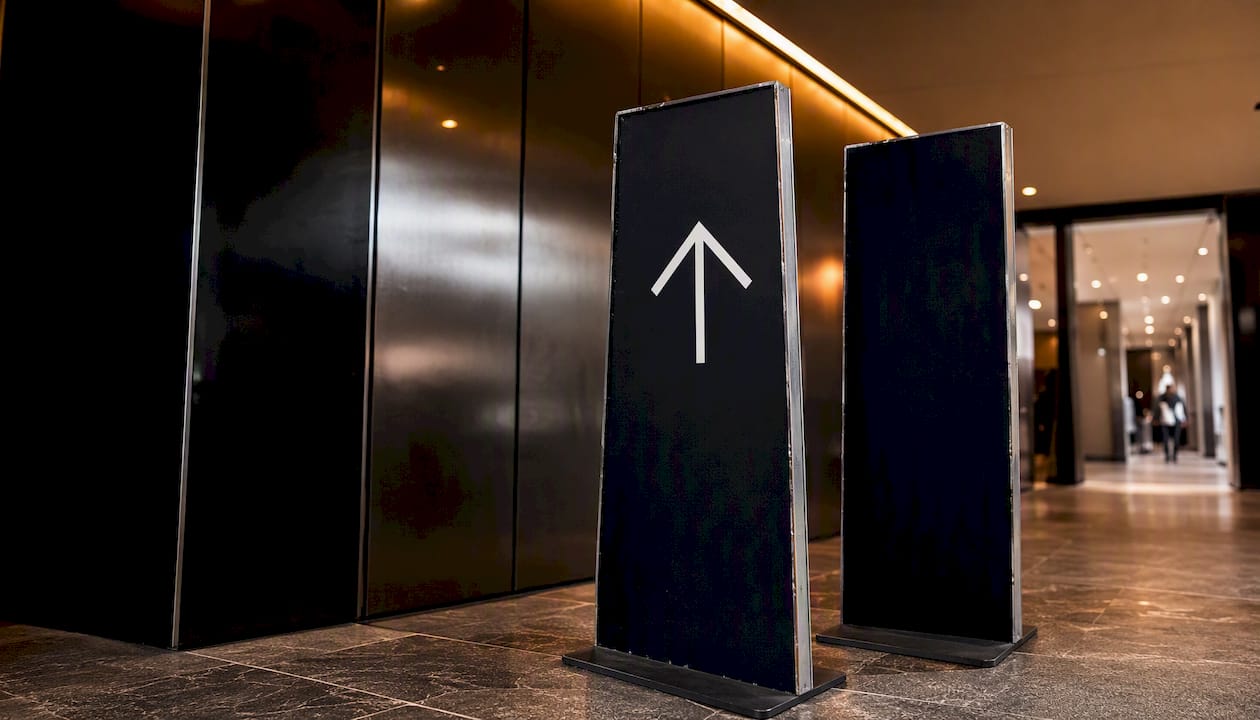
How to design signs that are legible and on-brand
Design decisions affect both readability and brand perception. The goal is a system that looks like your event and works for every attendee, including those with visual impairments or cognitive differences.
Design checklist
- Contrast — minimum 4.5:1 contrast ratio between text and background for standard text; 3:1 for large text (18pt+ or 14pt bold+). Dark text on a light background or light text on a dark background both work; mid-tone combinations rarely do
- Type size — minimum 24pt for directional signs viewed from 3 metres; scale up proportionally for longer viewing distances
- Font choice — use a sans-serif typeface (Arial, Helvetica, or a brand-approved equivalent). Decorative or script fonts reduce legibility at speed
- Visual hierarchy — primary destination in the largest type, secondary destinations smaller, supplementary information (floor, room number) smallest
- Iconography — use universally recognised pictograms (ISO 7010 for safety; standard toilet, accessibility, and directional symbols for navigation)
- Spacing — generous white space around text and icons; crowded signs are read more slowly and remembered less accurately
- Consistency — every sign in the system uses the same typeface, colour palette, and icon set
A sample visual hierarchy for a directional sign: MAIN HALL (large, bold) → Breakout Rooms B1–B4 (medium) → Level 2 via Lift (small). The attendee reads the most important destination first and can stop reading the moment they have what they need.
For a deeper look at balancing brand identity with navigation clarity, the Promosigns guide on wayfinding signage and branding covers the practical trade-offs in detail.
Pre-event and on-site communications: maps, apps, and ambassadors
Physical signs alone are not enough. Giving attendees a mental map of the venue before they arrive significantly reduces confusion on the day. Pre-event communications should include wayfinding details across every channel your audience uses, from your website through to the confirmation email.
Channel checklist
- Event website — publish a venue map with key destinations labelled; include transport links and parking instructions
- Pre-event email — include a downloadable PDF map and a brief written description of the arrival route
- Event app — if you are using one, embed an interactive map with room listings and schedule integration
- Printed visitor guide — a pocket-sized folded map handed out at registration covers attendees who are not using their phones
- On-site entrance boards — large-format printed maps at every entrance give arriving attendees an immediate overview
For smaller events (under 200 attendees), a well-designed printed guide and clear physical signage are usually sufficient. Larger, multi-hall events benefit from an app with real-time updates for room changes.
Briefing wayfinding ambassadors
Ambassadors are your human fallback. Brief them on:
- The full venue layout and all key destinations
- Accessible routes and lift locations
- Any last-minute room changes or schedule updates
- How to direct attendees to the nearest information board if they cannot answer a question directly
Position ambassadors at the main entrance, registration desk, and the first major junction inside the venue. Station them for the initial period of the event when most navigation queries arise.
Pro Tip: Use the same language and symbols across every channel. If your signs say “Hall A”, your app, email, and printed guide all say “Hall A” — not “Main Auditorium” or “The Big Room”. Inconsistent naming is one of the most common causes of attendee confusion.
Accessibility and inclusivity: designing wayfinding for every attendee
Accessible wayfinding is not a separate system bolted on at the end. It is a design requirement that shapes every decision from font size to route planning. Promosigns’ accessible signage guide for UK events sets out the practical requirements in full.
Accessibility checklist
- Font size — minimum 16pt for close-reading signs; 28pt+ for signs read from 2 metres or more
- Contrast — meet or exceed the 4.5:1 ratio for all body text; use matte finishes to reduce glare
- Tactile markers — Braille and raised lettering on permanent room identification signs; tactile floor strips on accessible routes where feasible
- Accessible routing — mark lift locations, step-free routes, and accessible toilet positions on all maps and signs
- Clear pictograms — use the International Symbol of Access consistently; avoid ambiguous custom icons
- Audio and digital alternatives — QR codes linking to an audio map or screen-reader-compatible digital map serve attendees with partial sight
- Neurodiversity considerations — avoid busy backgrounds behind text, use consistent layouts across all signs, and keep copy short and literal (avoid idioms or abstract phrasing)
When writing accessibility statements for event materials, keep them factual and specific: “Step-free access via the East Entrance. Accessible toilets on Level 1 and Level 2. Large-print maps available at registration.” Vague statements (“we are committed to accessibility”) tell attendees nothing they can act on.
Pro Tip: Assign an accessibility champion during load-in. Give them a checklist and authority to move or replace signs that fail the contrast or height requirements before doors open. One person with a clear remit catches far more issues than a general instruction to “check accessibility”.
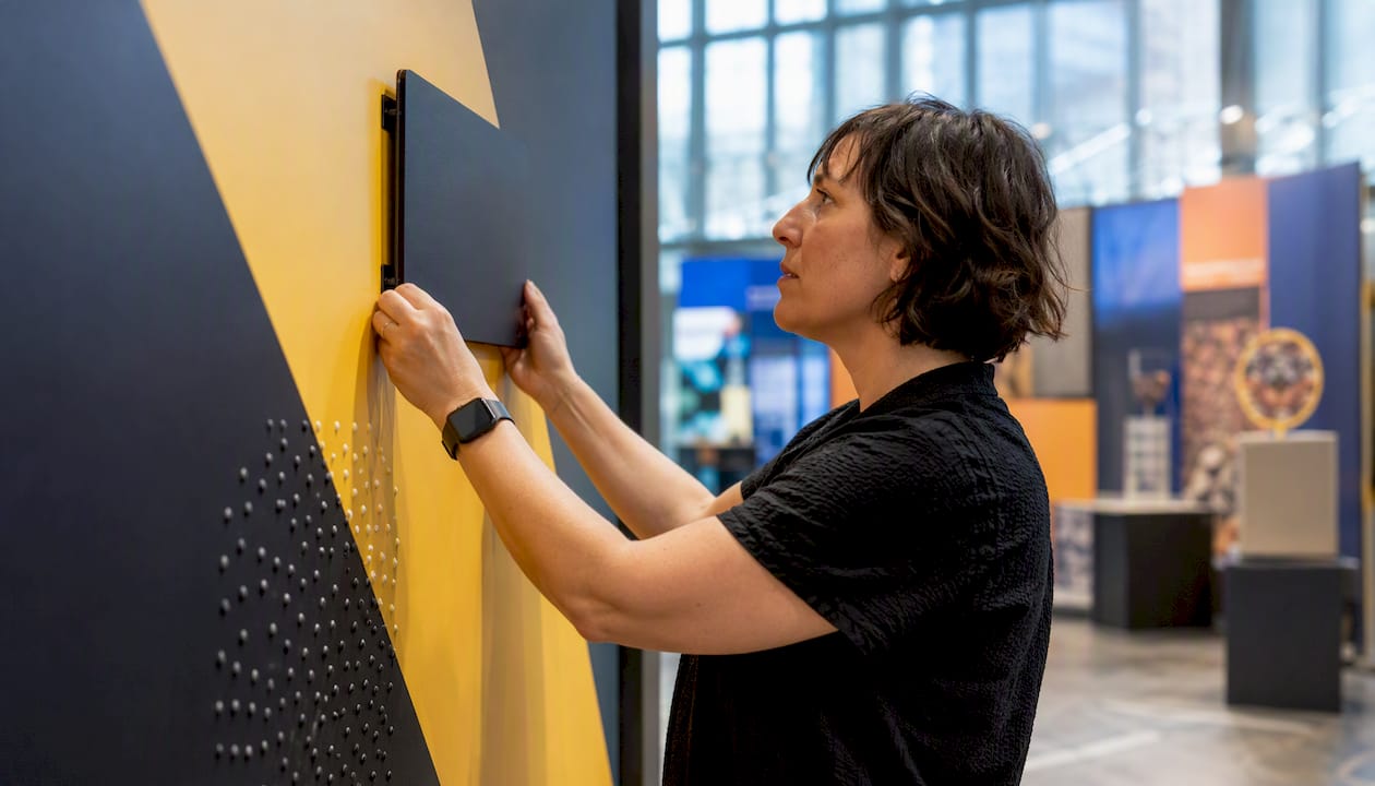
Digital wayfinding: when it helps and how to implement it well
Digital tools add flexibility that static signs cannot match, particularly for multi-day events where rooms change between sessions. A hybrid approach combining static signage with digital handoffs is the most reliable system for busy UK events.
Pros and cons at a glance
- Interactive maps (kiosks) — high visibility, no phone required, but expensive to hire and need power; best for venues with 500+ attendees
- QR-linked maps — low cost, easy to update, but depend on attendees having a charged phone and mobile data or venue Wi-Fi
- Event apps — best for multi-day conferences; allow real-time room updates but require attendees to download and use the app
- Static printed maps — reliable, no technology dependency, cannot be updated once printed
Digital wayfinding adds flexibility and personalisation but works best when paired with static signage for continuity. A QR code on a printed map board gives attendees the option to pull up a live version on their phone without removing the static fallback for those who prefer it.
Implementation tips
- Place QR codes at eye level, 1.5–1.6 metres from the floor, on high-traffic information boards
- Always include a short URL beneath the QR code as a fallback for attendees who cannot scan
- For kiosks, keep the interface to three taps maximum to reach any destination
- Test every QR code and digital link 24 hours before the event opens
Pro Tip: Always provide a static fallback. A phone battery dies, Wi-Fi drops, and apps crash. A well-placed printed map board never does.
Production lead times, scheduling, and cost considerations
Physical signage has fixed production timelines. Compressing them costs money and reduces quality. Printed collateral needs lead time for design, approval, and manufacture, and late changes after artwork approval typically incur reprint charges.
Cost brackets
- Budget — digitally printed foam board or PVC banner signs, self-install; suitable for small events with simple layouts
- Mid-range — printed aluminium composite or correx panels, professional installation, consistent branded design across all sign types
- Premium — illuminated signs, 3D lettering, bespoke fabricated structures, full installation and aftercare; appropriate for flagship conferences, exhibitions, and branded corporate events
Order slightly more units than your sign count requires to cover damage and last-minute changes. Spares cover damage during installation, last-minute additions, and replacements for signs that are moved or lost on the day.
Pro Tip: Build a 48–72 hour contingency window between delivery and installation. That buffer absorbs courier delays, venue access restrictions, and any reprints needed after a final artwork check.
Install day checklist and on-site testing protocol
Installation day is where the plan meets reality. Work through this checklist before attendees arrive:
- Placement verification — confirm every sign is in the position marked on your placement plan; check against the annotated floor plan
- Mounting safety — verify all fixings are secure; suspended signs must meet venue load requirements
- Lighting and readability — check each sign under the actual event lighting conditions, not just ambient daylight; spotlights and uplighters can create glare that washes out text
- Sightline re-check — walk each route after all stands, furniture, and AV equipment are in position
- Accessible route confirmation — physically walk every accessible route to confirm it is clear and correctly signed
- Regulatory sign audit — confirm all fire exit, emergency, and safety signs are unobstructed and correctly positioned
Walk-through test
Ask someone unfamiliar with the venue to walk in as a first-time attendee. Give them a destination and watch where they hesitate. Hesitation points are missing or misplaced signs. Do this for at least two arrival scenarios (public transport and car park).
Keep on hand: spare fixings, double-sided tape, cable ties, a spare set of printed maps, and two or three blank sign panels with a marker for emergency additions.
Sign-off authority should sit with the event manager or a designated wayfinding lead, not split across multiple people. One decision-maker prevents conflicting last-minute changes.
Troubleshooting common wayfinding mistakes
| Problem | Likely cause | Fix |
|---|---|---|
| Attendees clustering at a junction | Missing or obscured directional sign | Add a projecting sign or floor graphic at the approach |
| Complaints about inconsistent branding | Multiple suppliers or unapproved artwork edits | Enforce a single master design file; brief all suppliers from it |
| Signs ignored or missed | Mounted too high or at the end of a corridor | Reposition to eye level; add a suspended or projecting version |
| Information overload on a single sign | Too many destinations listed | Split into two signs; use a map board for complex information |
| Room change confusion mid-event | No update mechanism | Place A-boards with printed inserts at affected junctions; update app and screens |
| Accessible route unclear | Accessible signs missing or poorly placed | Add floor strips and re-position accessible route signs to the start of each route |
Run a rapid feedback loop during the first two hours after doors open. Station one team member at the main entrance to observe navigation behaviour and collect verbal queries. Patterns in those queries tell you exactly which signs are failing.
Pro Tip: The first 30 minutes of an event generates the highest volume of navigation queries. Have a team member walking the main routes during that window, not stationed at a desk.
When does it make sense to hire a professional signage supplier?
For events with more than three or four sign types, multiple zones, or any illuminated or fabricated elements, a professional supplier reduces risk and typically saves money compared with last-minute DIY solutions.
Supplier briefing checklist
- Full sign count and types required
- Venue floor plan with proposed placement positions marked
- Brand guidelines (fonts, colours, logo files in vector format)
- Installation access times and any venue restrictions
- Deadline for artwork approval and delivery date required
- Any regulatory requirements specific to the venue (fire safety, listed building restrictions)
Questions to ask a supplier
- What materials do you recommend for the venue type and duration of the event?
- Do you offer on-site installation and removal?
- What are your lead times for standard and express production?
- Can you provide illuminated options for low-light areas?
- What happens if a sign is damaged during installation?
Benefits of working with a specialist
- Consistent quality across every sign in the system
- Regulatory assurance on fire safety and accessibility compliance
- Reduced on-site risk through professional installation
- Access to a broader range of materials, finishes, and illumination options
- Single point of contact for design, manufacture, and install
Promosigns manufactures and installs a full range of event signage for UK clients, including temporary event signs, exhibition signage, illuminated signs, and bespoke fabricated structures. The team covers London, Essex, and Kent with professional installation and fast turnaround times.
A perspective on event wayfinding from Promosigns
The most consistent mistake we see during event installs is not poor design. It is late design. Organisers who brief their signage supplier with two weeks to go are already working against the production timeline, and the compromises that follow — fewer sign types, smaller formats, no illumination — are visible to every attendee on the day.
The second recurring issue is treating wayfinding as a single sign type rather than a system. A well-designed identification sign at a room entrance does nothing for the attendee who took a wrong turn two corridors back. The system only works when every stage of the journey is covered, from the car park to the seat.
What we find works consistently well is a simple rule: design for the most disoriented attendee in the room. That person has never been to the venue, is carrying bags, and is looking at their phone. If your signage guides them confidently from the entrance to their seat without a single query to staff, it works for everyone else too.
Promosigns can handle your event signage end to end
For event organisers who want professional signage without the production headache, Promosigns delivers a complete end-to-end service: site survey, artwork checking, print, fabrication, installation, and aftercare. Whether you need a full wayfinding system for a flagship conference or a targeted set of directional signs for a one-day exhibition, the team works to your timeline and your brief.
Core services for event organisers:
- Site survey and placement planning
- Artwork review and design support
- Print and fabrication across all sign types
- Illuminated signage options for low-light venues and premium events
- Professional installation and removal
- Aftercare and replacement panels
Get in touch with Promosigns to discuss your event signage requirements and receive a tailored quote for your next UK event.
Internal resources to help you plan your event signage
These Promosigns guides give you the detail behind each planning stage:
- Temporary event signage guide — covers production lead times, material choices, and install checklists for UK events
- Wayfinding signs for customers — practical placement and design guidance for customer-facing sign systems
- Accessible signage requirements — minimum standards and practical adjustments for inclusive wayfinding at UK events
- Exhibition signage basics — focused guide for exhibition and trade show organisers covering stand signs, directional systems, and branding
- Floor graphics for businesses — how to use floor-applied graphics for wayfinding in busy corridors and foyers
- Wayfinding signage and branding — how to balance brand identity with navigation clarity across a full sign system
Recommended
- What is wayfinding? A practical guide for UK businesses – PromoSigns.co.uk
- Wayfinding signs for customers: a practical guide – PromoSigns.co.uk
- Wayfinding signage explained: Enhance navigation and branding – PromoSigns.co.uk
- Wayfinding signs explained for business owners – PromoSigns.co.uk
