
TL;DR:
- Proper sign placement is crucial for attracting customers, as incorrect positioning results in wasted investment and reduced visibility. Understanding customer approach angles, regulatory requirements, and environmental factors ensures signage is effective and compliant in London. Strategic, professional planning maximizes signage impact, drives foot traffic, and enhances brand recognition.
The right sign in the wrong location is money wasted. 76% of consumers have entered a store solely because a sign caught their attention, yet most business owners treat sign placement as an afterthought. Effective sign placement strategies determine whether your signage pulls customers through the door or goes completely unnoticed. This guide covers the core principles of sign positioning for impact, the regulatory realities of operating in London, how to align placement with customer behaviour, and the material and installation decisions that affect long-term performance.
Table of Contents
Key principles of effective sign placement
Where your sign sits in space is just as important as what it says. Get the position wrong and even the most beautifully designed sign fails to deliver.
The starting point for any signage placement strategy is understanding how people physically encounter your sign. Pedestrians scan at roughly 1.5 to 1.7 metres from the ground. Drivers read signs in split seconds as they pass. These are not the same viewing experience, and your sign position needs to account for which audience it is targeting.
Here are the core principles to apply:
- Eye-level positioning. Place signs at eye level or slightly above to maximise pedestrian visibility without creating an awkward viewing angle. Signs mounted too high force people to crane their necks and are often ignored.
- Clear sightlines. Parked vehicles, bins, trees, and competitor signage all create obstructions. Walk your frontage at different times of day and observe what physically blocks the view of your sign.
- High contrast design. High contrast and correct lighting are not aesthetic choices. They are functional requirements, particularly on busy urban streets where signs compete with visual noise.
- Accounting for motion. A sign read from a moving vehicle needs larger lettering and simpler content than one designed for a pedestrian standing still. Viewing speed and environmental context directly shape what works.
- Lighting alignment. If your sign is in shadow for most of the day or has no illumination for evening visibility, its effective hours of operation are severely limited.
Pro Tip: When assessing sign size, stand at the furthest point a customer could reasonably see your sign from and read it aloud. If you hesitate on any word, the lettering is too small or the contrast too weak.
The balance between sign size and readability is frequently misjudged. Bigger is not always better. An oversized sign crammed with text is harder to read than a modestly sized sign with a single clear message.
Regulations and permits in London
London’s signage environment is governed by a layered set of rules that catch many business owners off guard. Displayed advertisements on commercial premises fall under the Town and Country Planning (Control of Advertisements) Regulations 2007, which the relevant local planning authority enforces. In practice, this means what is permitted in one borough may require formal consent in another.
Key regulatory points to be aware of include:
- Advertisement consent. Most illuminated signs, projecting signs, and signs above a certain size require advertisement consent from your local borough. This is a separate process from building regulation approval.
- Conservation areas. Many parts of London sit within designated conservation areas where restrictions are significantly tighter. Permitted development rights for signage are reduced or removed entirely.
- Listed buildings. If your premises are listed, any external signage alteration requires listed building consent in addition to advertisement consent.
- Spacing and coordination. Permit applications require a site plan that shows existing signs on your premises and neighbouring signage. Failure to account for how your sign interacts with adjacent signs is one of the most common reasons for permit denial.
- Accessibility standards. Tactile signage, used particularly for room identification and wayfinding in commercial interiors, must meet specific mounting requirements. Tactile signs must be mounted at 48 to 60 inches above floor level on the latch side of the door. The principle of accessibility-compliant placement extends to all signage that serves a wayfinding function.
You can also consult signage safety considerations to understand the statutory framework that applies to safety-related signage in commercial premises.
Pro Tip: Engage a professional signage company before submitting any planning application. An experienced installer will know the specific requirements of your borough and can prepare compliant drawings that support your application, reducing the risk of refusal.
Failing to comply with advertising regulations does not just risk enforcement action. It can result in a requirement to remove signage at your own cost, which effectively doubles the investment lost.
Aligning placement with customer behaviour
Strategic signage locations work best when they are designed around how your customers actually move, not how you imagine they might. This is where most business owners make their biggest placement errors.

Understanding approach angles matters enormously. A sign facing a main road is useless to customers who arrive from a side street. A window graphic visible only from directly in front provides no guidance to someone approaching from 45 degrees. Customer viewing patterns are shaped by walking routes, transport stops, car park exits, and local landmarks.
Each sign in your business should serve a specific role in the customer journey. Assigning that role clearly prevents clutter and makes placement decisions logical rather than instinctive.
| Sign type | Placement | Primary purpose |
|---|---|---|
| Fascia sign | Above shopfront at eye level or above | Brand identity and business identification |
| Window graphics | Lower to mid window pane | Promotions, hours, products, atmosphere |
| Projecting sign | Perpendicular to building face | Visibility along the pavement from distance |
| Directional sign | Key decision points (junctions, car parks) | Wayfinding and footfall guidance |
| A-board | Pavement directly outside premises | Last-metre conversion and daily offers |
| Hoarding or banner | Building exterior during works or events | Awareness and temporary promotion |
The principle of avoiding clutter is often stated but rarely practised. The discipline required is to give each sign one job. A fascia sign identifies your business. A window graphic communicates an offer. A directional sign tells people where to go. When a single sign tries to do all three, it does none of them well.
For retail and hospitality businesses, the sequence matters. Awareness at distance, interest at approach, and confirmation at the threshold. Each sign placement along that sequence should answer a specific question the customer has at that moment.
Material and installation factors
Material selection and installation quality directly affect whether your sign remains visible and structurally sound over time. A poorly installed sign that shifts, fades, or fails within two years is not a cheaper option. It is a more expensive one when replacement costs are factored in.
Key considerations for outdoor sign placement include:
- Material suitability for exposure. Signs placed on south-facing elevations receive significantly more UV exposure than those on shaded walls. Reviewing outdoor sign materials suited to specific weather and directional exposure helps avoid premature degradation.
- Building substrate and fixing points. Masonry, timber, cladding, and glazed surfaces each require different fixing methods. The architecture of your building determines what installation approach is structurally appropriate and what is not.
- Weather and environmental loading. Signs in exposed positions, particularly above ground floor level, are subject to wind loading that must be accounted for in the installation design.
- Illumination integration. LED illuminated signs require electrical access and weatherproofed housing. The placement of a sign must account for cable routing and the practicality of maintenance access.
Proper installation practices, including secure mounting, stable footing, and correct positioning relative to the building, are not just about aesthetics. They determine whether your sign remains safely in place and continues to perform its visual function over its intended lifespan.
Material choice also influences how a sign reads in different lighting conditions. Brushed aluminium 3D letters catch natural light differently from a flat vinyl fascia. Illuminated channel letters remain readable at night when flat printed signs become invisible. Matching material properties to the specific placement environment is part of what separates a sign that performs from one that simply exists.
Common mistakes and how to avoid them
Many of the most expensive sign placement mistakes are avoidable with a straightforward checklist approach. The pitfalls below appear repeatedly across retail, hospitality, and corporate settings.
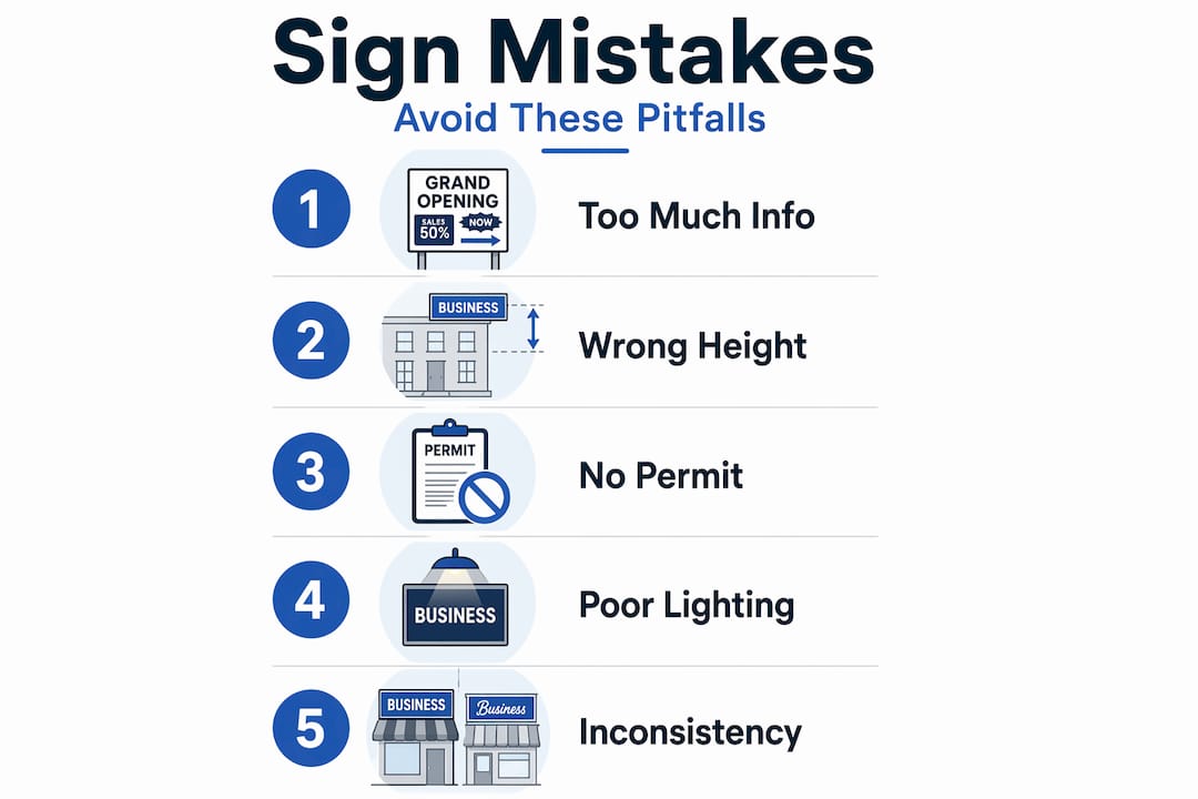
Overloading the sign with information. Sign clarity drops sharply when a sign tries to communicate too many messages at once. Business name, tagline, telephone number, website, social handles, and a promotional offer on one sign produce a result that communicates nothing clearly.
Ignoring permit requirements. Skipping the consent process is a common shortcut that creates significant liability. Enforcement notices are a matter of public record, and removal orders can damage your premises as well as your reputation.
Poor height and obstruction assessment. Many business owners assess sign visibility from the pavement directly in front of the premises. The customers who most need to see your sign are often those approaching from 20 to 50 metres away, where parked vans or street furniture may obscure it entirely.
Neglecting evening visibility. If your business trades into the evening, a sign without illumination is functionally invisible after dusk. This is a placement consideration as much as a design one, since the decision to illuminate a sign must be made before fixing positions are confirmed.
Pro Tip: Before finalising any sign placement, photograph the intended location from the customer’s approach angle at the time of day when footfall is highest. Review that image critically. If you would not notice the sign in the photo, neither will your customers.
Consistency across all your signage also matters. A professionally finished fascia sign paired with a faded or misaligned window graphic creates a disjointed impression. Treat your signage as a system, not a collection of individual decisions.
My perspective on strategic sign placement
I have seen businesses invest thousands in beautifully crafted signs that generate almost no return, not because the design was wrong, but because nobody thought seriously about where the sign would actually be seen from.
What I have found consistently is that business owners underestimate how much the customer’s approach angle changes everything. A sign perfectly positioned for someone walking from the left does almost nothing for someone approaching from the right. The businesses that get this right walk their own premises from every plausible direction before committing to a position.
The regulation piece genuinely surprises people. London boroughs vary considerably in how they interpret permitted development rights for signage. I have seen compliance issues arise not from ignorance of the rules, but from assuming that what worked for a neighbouring business would work for them. Each application needs to be assessed on its own merits.
My honest view is that sign placement is worth treating as a professional discipline rather than a practical afterthought. The businesses I have seen maximise their return on signage investment are the ones who plan placement with the same rigour they apply to the sign’s design. That means understanding the customer journey, respecting the regulatory environment, and choosing materials that will hold up over time. Getting that sequence right is where real value is created.
— Promo
Get expert sign placement right with Promosigns
Knowing the principles of effective sign placement is one thing. Applying them correctly to your specific premises, location, and customer base requires professional expertise that covers design, compliance, and installation.
Promosigns works with retail, hospitality, and corporate clients across London to deliver bespoke signage solutions that are positioned for maximum visibility from day one. Whether you need shop signs in Barnet, high-impact outdoor signs to attract customers, or custom LED signage for a Kings Cross location, our end-to-end service covers design, manufacturing, planning support, and professional installation. We help you choose the right materials for your environment and position every sign to perform. Talk to the Promosigns team about your project and get signage that works as hard as your business does.
Frequently asked questions
What height should a shop sign be placed at?
Shop signs for pedestrian visibility should be positioned at eye level or slightly above, typically between 1.5 and 2 metres from the ground for fascia signs aimed at foot traffic. Signs targeting drivers need to be visible from a greater distance and may be positioned higher.
Do I need planning permission for a sign in London?
Most illuminated signs and signs above a standard size require advertisement consent from your local borough council. Conservation areas and listed buildings carry additional restrictions, so it is advisable to confirm requirements before installation.
How does customer approach angle affect sign placement?
Viewing patterns vary depending on whether customers arrive on foot, by vehicle, or from public transport. A sign should be positioned to face the primary direction of customer approach rather than simply facing outward from the building.
How many messages should a sign communicate?
One clear message per sign is the standard to aim for. Overloading a sign with multiple messages reduces comprehension and diminishes the impact of each individual piece of information.
What is the most common sign placement mistake?
Failing to assess visibility from the customer’s actual approach angle is the most frequent error. Business owners typically view their signage from directly in front, but most customers see it from an angle and at a distance where obstructions and poor contrast become significant problems.
Recommended
- Understanding Logo Placement on Signage: Key Insights – PromoSigns.co.uk
- Double Sided Signage: Retail Applications Guide UK
- Blog Business Signs Work | Promo Signs LTD
- Signage Placement Best Practices for Maximum Impact – PromoSigns.co.uk
