
The single most effective thing you can do this week is place a pavement A-board with a clear, daily-changed headline directly in your pedestrian sightline, add a one-sentence hero strip to your window, and put a decision-point sign at your entry threshold. This three-step sequence addresses the moments when a passing shopper decides whether to walk in or walk past. Industry research shows that 76% of consumers enter stores they have never visited before because of their signage, and the same data indicates on-premises signs can lift sales by an average of 7.7%.
Before you change anything, record your baseline: count daily footfall manually or with a door counter for five to seven days, note peak hours, and log current conversion rate from your point-of-sale system. That number is your benchmark.
Priority order for immediate action:
- Fix kerb appeal: clean, repaint or replace your fascia so the building itself signals quality.
- Add a daily-change pavement sign with a fresh headline every morning.
- Place one decision-point sign inside the entry, visible from the pavement, that tells shoppers what to do next.
Safety and council rules: a pavement A-board must leave a minimum clear pedestrian width of 1.5 metres on the footway. Some London boroughs require a temporary display licence for signs on the public highway. Check with your local council before deploying.
Table of Contents
What customer footfall is and why signage moves it
Footfall is the number of people who physically enter your premises over a given period. The three KPIs that matter most are unique visits (raw count), dwell time (how long they stay), and conversion rate (visits that become purchases). Footfall is the top of that funnel; without it, dwell time and conversion are irrelevant.
Signage influences footfall through three behavioural mechanisms. First, peripheral recognition: a well-placed sign catches attention before a shopper has consciously decided to look at your shop. Second, micro-permission: a clear, relevant message gives the shopper a reason to pause without feeling pressured. Third, cognitive processing time: a moving observer has roughly 1.5 seconds to read and act on exterior signage, so the sign must communicate its single idea within that window or it fails entirely.
The practical implication is that complexity is the enemy. A sign that requires the reader to decode three competing messages will be ignored by the majority of passers-by, regardless of how well it is printed.
Sign types that reliably increase footfall and when to use each
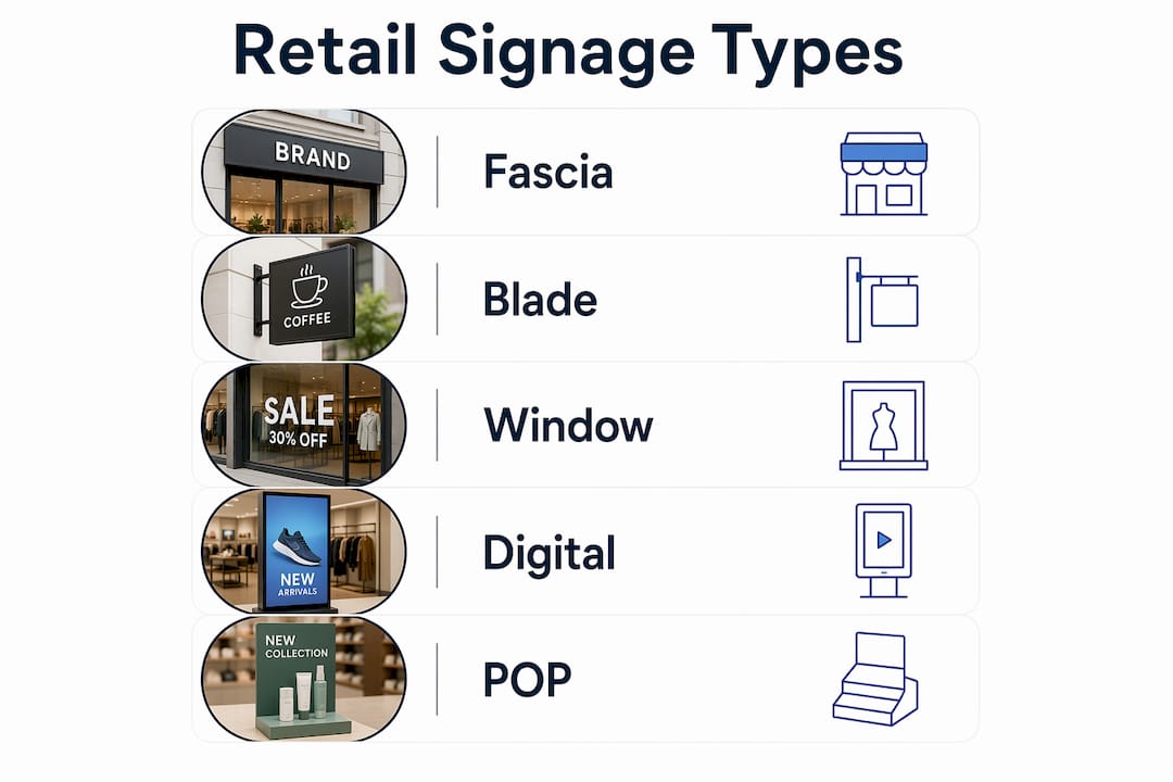
Different sign formats serve different stages of the customer journey. The table below maps each type to its primary use case and typical location.
| Sign type | Primary function | Best location | Best for |
|---|---|---|---|
| Fascia / shopfront sign | Brand identity and recognition | Above entrance | All retail and hospitality |
| Blade / projecting sign | Visibility along the street | Side of building | High-street shops with foot traffic |
| Illuminated LED fascia | 24-hour visibility | Above entrance | Evening-trade venues, food, services |
| Pavement A-board | Daily offers and directional prompts | Footway in front of shop | Cafés, independents, high-street retail |
| Flags and forecourt banners | Large-scale attention from distance | Forecourt or car park | Retail parks, garden centres, showrooms |
| Window graphics and vinyl | Promotions, seasonal messaging | Shopfront glazing | All retail |
| Digital / in-window screen | Flexible, time-sensitive content | Window or interior | Food, fashion, estate agents |
| Wayfinding and POP signs | Navigation and purchase prompts | Interior | Larger retail, multi-department stores |
| Floor graphics | Directional cues and promotions | Sales floor | Supermarkets, pharmacies, fashion |
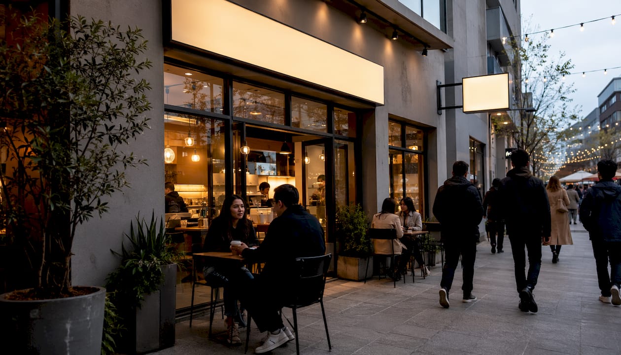
Exterior essentials. A fascia sign establishes your brand from 30 metres away. A blade sign adds visibility for pedestrians walking parallel to your frontage. Illuminated fascia options extend that visibility into evening hours, which is particularly valuable for food and hospitality businesses. Pavement A-boards are the fastest-to-deploy and most cost-effective option for daily messaging.
Window graphics. A hero headline strip across the lower third of your window stops pedestrians at close range. Seasonal vinyl wraps refresh the frontage without structural work. Product teasers with a price point convert browsers who are already slowing down.
Digital and hybrid. Outdoor digital screens offer flexibility but can produce screen fatigue on busy high streets. A hybrid print and digital approach performs better in most UK city-centre locations: static, tactile elements carry the brand identity while a selective digital layer handles time-sensitive content such as daily specials or event countdowns. E-Ink panels are a lower-energy middle ground worth considering for independent retailers.
Internal navigation and POP. Wayfinding signs reduce confusion and increase dwell time. Point-of-purchase (POP) signs placed at decision points, such as beside a product display or at the end of an aisle, increase basket value when the message is specific and contextual.
Pro Tip: Use narrowcasting on interior POP signs: write copy that speaks to the specific moment and location (“Grab one for the journey home” at a checkout, not a generic brand message). Contextual copy reduces cognitive load and converts faster.
Design and messaging rules that make signs legible and persuasive
Legibility comes first. A beautifully designed sign that cannot be read from the approach distance is wasted spend. Start with the Rule of 10: for every 10 feet (approximately 3 metres) of viewing distance, your headline letter height should be at least 1 inch (approximately 25mm). A sign read from 9 metres needs letters at least 75mm tall.
Core design rules:
- Contrast: aim for a minimum LRV contrast of around 70% between your text and background. Dark text on a pale ground, or reversed white on a deep colour, both work. Mid-tone combinations fail at distance.
- Negative space: keep at least 60% of the sign area clear. Visual crowding forces the eye to work harder and slows processing below the 1.5-second threshold.
- Hierarchy: headline first, supporting detail second, CTA third. Never more than three tiers.
- Copy length: 3–8 words for pavement signs; one line for window headlines. Every additional word costs you a percentage of readers.
- Typeface: high-legibility sans-serifs (such as Gill Sans, Helvetica, or similar geometric faces) and slab serifs both perform well at distance. Avoid decorative scripts for primary messages.
Pro Tip: Add a pictogram or icon alongside your primary message. Icons reduce decoding time for neurodivergent shoppers and speed recognition for everyone in a busy environment. A coffee cup icon on a café A-board communicates faster than the word “coffee” alone.
A call-to-action on every customer-facing sign is non-negotiable. “Step inside,” “Order here,” or “Ask us today” each give the shopper a single, measurable next action. Vague messages (“Quality you can trust”) produce no behavioural response.
Where to place signs for maximum visibility and what UK rules apply
Place every sign in the line of approach, before the decision point, not behind it. A sign inside your window that faces inward is visible only to people already committed to entering. The sign that changes behaviour is the one a shopper sees while still on the pavement, 5–15 metres away.
Placement principles:
- Position exterior signs so they are visible from both directions of pedestrian travel.
- For wayfinding signs inside the store, mount at approximately 1.5 metres from floor level, which sits within the natural eye-line range for most adults.
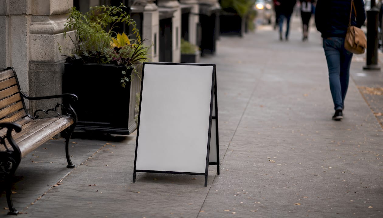
- Angle pavement A-boards at 45 degrees to the kerb so they are readable from the approach, not just head-on.
- Ensure illuminated signs are readable in both daylight and after dark; halo or indirect illumination avoids the glare that makes backlit signs unreadable in direct sunlight.
For maximising footfall in London specifically, sightlines are often compressed by narrow pavements and street furniture. A blade sign projecting from the building face can recover visibility that a flat fascia loses.
UK permissions to check: pavement A-boards on the public highway require the footway to remain at least 1.5 metres clear. Illuminated signs and projecting signs typically require advertisement consent from your local planning authority. If your premises are in a conservation area or a listed building, additional restrictions apply. Always confirm with your local council before installation.
Pro Tip: Before finalising any placement, stand at the three most common pedestrian approach points at your busiest trading hour and photograph what you actually see. Most placement errors are discovered in under five minutes using this method.
Materials, durability and maintenance: keeping signs effective
The right material for the right environment prevents the “neglect signal” — a faded, peeling, or broken sign that actively damages brand perception.
Material selection by environment:
- Exterior fascia and blade signs: powder-coated aluminium composite (ACM) or dibond panels resist corrosion and hold print quality for several years outdoors.
- Window graphics: cast vinyl with UV-resistant laminate maintains colour for 3–5 years in direct sun; calendered vinyl suits shorter-term seasonal campaigns.
- Pavement A-boards: choose a weighted, wind-resistant base for UK weather. Waterproof poster inserts or snap frames with sealed edges prevent water ingress.
- Illuminated signs: LED modules require an annual service check; illuminated signage maintenance should include checking driver units and seals, not just the visible face.
- Interior POP and floor graphics: anti-slip laminate on floor graphics is a legal requirement in public spaces; replace when edges begin to lift.
Maintenance schedule:
- Daily: visual check of pavement signs and window graphics for damage, dirt, or displacement.
- Weekly: swap poster inserts in A-boards and snap frames; update chalkboard or liquid chalk messages.
- Monthly: clean all exterior sign faces with a non-abrasive solution; check fixings and brackets.
- Seasonally: reprint or replace vinyl window graphics; update promotional messaging.
- Annually: full service of all illuminated fixtures; inspect electrical connections and weatherproof seals.
Pro Tip: Keep a simple signage log — a shared spreadsheet works — recording installation dates, last clean, and next scheduled reprint. It takes two minutes to update and prevents the gradual degradation that turns good signage into a liability.
Top 10 sign ideas and quick wins you can implement this week
These are ranked by speed-to-impact and ease of deployment.
-
A-board headline swap. Change your pavement sign headline every morning with a specific, time-sensitive message (“Fresh batch in at 8am” or “Last 3 in stock”). Takes five minutes; pavement signs deliver strong ROI as a one-off purchase with minimal ongoing cost. Deploy: same day.
-
Window hero strip. Apply a single bold vinyl strip across the lower third of your window with your strongest offer or brand statement. Stops pedestrians at close range. Deploy: 24–48 hours with a local printer. Cost band: low.
-
Double-sided pavement sign. Replace a single-face board with a double-sided A-board so your message is visible from both directions of foot traffic. Deploy: 1–2 days. Cost band: low to mid.
-
Sandwich board with daily special. A chalkboard or liquid chalk sandwich board lets you change messaging without reprinting. Particularly effective for cafés, food retailers and service businesses. Deploy: same day. Cost band: very low.
-
Illuminated entry halo. A backlit or halo-lit fascia sign above your entrance extends your visibility into evening hours and signals permanence. Deploy: 2–4 weeks including installation. Cost band: mid to high.
-
Vinyl door sticker with CTA. A simple cut-vinyl sticker on your door glass (“Push for today’s menu” or “Tap to see today’s offers” with a QR code) converts hesitant passers-by at the threshold. Deploy: 24 hours. Cost band: very low.
-
In-store POP for a single product. Rather than signing everything, pick your highest-margin product and give it a dedicated POP display with a specific, benefit-led message. POP signs at decision points increase basket value when the copy is contextual. Deploy: 1–2 days. Cost band: low.
-
Floor directional graphics. Arrow or footprint floor graphics guide shoppers from the entrance to a specific product area or promotion. Particularly effective in larger retail spaces. Deploy: 1–3 days. Cost band: low to mid.
-
QR code for click-to-menu or deals. Add a QR code to your window or A-board linking to your current menu, offer page, or booking form. Use UTM parameters to track scans. Deploy: same day (digital); 24 hours (printed). Cost band: negligible.
-
Timed digital content for peak windows. If you have an in-window screen, schedule different content for morning, lunchtime and evening peaks. A breakfast offer at 7:30am and a dinner deal at 5pm outperform a single static message running all day. Deploy: same day (content scheduling). Cost band: nil if screen exists.
For creative shop sign ideas beyond this list, the range of formats available to independent retailers is broader than most owners realise.
Typical UK costs and lead times for common signage
The cheapest and fastest option is always a pavement A-board with a printed or chalk insert. The highest cost and longest lead time is an illuminated fascia with bespoke engineering. Everything else sits between those two poles.
| Sign type | Ballpark cost range | Typical lead time | Key variables |
|---|---|---|---|
| Pavement A-board (standard) | — | Same day to 3 days | Size, material, double-sided |
| Vinyl window graphics (per panel) | — | 2–5 days | Size, complexity, installation |
| Printed foam/dibond panel | — | 2–5 days | Size, quantity, finish |
| Illuminated fascia (LED) | — | 2–6 weeks | Size, engineering, electrical work |
| Digital in-window screen | — | 1–4 weeks | Screen size, content management |
| Flags and forecourt banners | — | 3–7 days | Size, hardware, quantity |
| Floor graphics | — | 2–5 days | Area, anti-slip laminate spec |
Variables that push costs up: bespoke engineering, conservation area planning consent, restricted installation access (scaffolding, cherry picker), electrical first-fix work, and content or creative production. Variables that reduce costs: standard sizes, repeat orders, and combining multiple sign types in a single production run.
For rapid deployment, simple printed posters and snap-frame inserts can be produced and installed within 48–72 hours. A full shopfront project involving new fascia, illuminated signage, and window graphics typically runs 2–8 weeks from briefing to installation.
How to measure footfall uplift and calculate sign ROI
Pick one to three metrics and track them consistently before and after any signage change. Measuring everything produces noise; measuring nothing means you cannot justify the next investment.
Measurement checklist:
- Footfall counters: infrared or video-based door counters give daily and hourly counts. Manual tally counters work for a short baseline period.
- POS sales by hour: correlate your till data with footfall peaks to identify whether new signs are converting visitors, not just attracting them.
- QR scans with UTM parameters: QR codes with UTM tracking on temporary signs give rapid digital attribution without any footfall counter hardware.
- Short customer intercepts: asking five customers per day “How did you find us today?” takes under ten minutes and surfaces attribution data no counter can provide.
- A/B placement testing: run the same sign in two different positions on alternate weeks and compare footfall counts.
Simple ROI calculation:
- Record average daily sales for the two weeks before the sign change (baseline).
- Record average daily sales for the four weeks after.
- Calculate incremental daily sales lift (post minus pre).
- Multiply by 30 to get monthly uplift.
- Divide monthly uplift by sign cost to get ROI multiple.
If a £150 A-board produces an average £12 incremental daily sales lift, the monthly uplift is approximately £360, and the sign pays back in under two weeks.
Pro Tip: Place a unique QR code on each new sign and track scans weekly in Google Analytics or a URL shortener with analytics. Even a low scan rate tells you the sign is being noticed; a zero scan rate after two weeks suggests a placement or messaging problem.
Treating signage as architecture, not decoration
Signage succeeds when it is integrated with sightlines, lighting and shopper flow from the outset, not when it is applied as an afterthought to a finished shopfront.
The architectural framing of retail signage is the most consistent finding across current retail design research. Signs placed without reference to the building’s geometry, the pedestrian approach angle, or the ambient light conditions underperform regardless of print quality. A sign in the wrong position with the right message still fails.
The 1.5-second cognitive processing rule means that every design decision, from typeface weight to the amount of negative space, is ultimately a time management decision. An LRV contrast of 70% and a minimum 60% clear space are not aesthetic preferences; they are the conditions under which a moving observer can read and act on a sign before the moment passes.
For a practical audit, stand at your three main approach points and ask: Can I read the headline in under two seconds? Is the CTA visible without stepping closer? Does the sign tell me what to do next? If the answer to any of those is no, the sign needs to change before the print quality or the colour palette.
Pro Tip: Treat a signage audit as a five-minute walk, not a boardroom exercise. Take your phone, photograph what you see from 15 metres, 5 metres and 1 metre, and compare. The camera is more honest than memory.
How signage works alongside other local marketing tactics
Signage is most effective when it reinforces messages the customer has already seen elsewhere. A promotion running on your social media channels should appear on your window and your A-board with identical wording. Consistency across touchpoints reduces the cognitive effort required to connect the message to your brand, and it increases the likelihood that a shopper who saw your Instagram post will recognise and act on the physical sign.
Google Business Profile is the most direct complement to physical signage. A customer who sees your A-board and then searches your name on their phone should find the same offer, the same opening hours, and a clear call to action. Discrepancies between your physical and digital presence erode trust quickly.
Local leaflet drops and door-to-door distribution work well when timed to coincide with a new sign installation or a seasonal window change. The leaflet creates awareness; the sign confirms it when the recipient walks past. Event-based tactics, such as hosting a product launch or an in-store demonstration, generate footfall spikes that your signage can then sustain by converting curious passers-by who arrive after the event is over.
Loyalty scheme messaging on your exterior signs is a low-cost way to differentiate from nearby competitors. “Join our loyalty card — ask inside” on a pavement board costs nothing to add and gives existing customers a reason to mention you to others.
Common mistakes to avoid when using signage for footfall growth
Overloading the message. The most frequent error is trying to communicate too much on a single sign. Three competing headlines, two phone numbers, a logo, a social handle, and a promotional offer produce a sign that communicates nothing. One message per sign, always.
Ignoring the approach angle. A sign designed to be read head-on but placed on a wall that pedestrians approach at 90 degrees is effectively invisible. Always design for the actual viewing angle, not the ideal one.
Neglecting maintenance. A faded, peeling, or dirty sign signals neglect to every person who passes. Research consistently identifies the “neglect signal” as one of the fastest ways to reduce footfall rather than increase it. A clean, well-maintained modest sign outperforms an expensive neglected one.
Choosing style over legibility. Decorative typefaces, low-contrast colour combinations, and oversized logos at the expense of readable copy are common in owner-designed signage. The sign is not a piece of art; it is a sales tool. Legibility at distance takes priority over every other design consideration.
Skipping the baseline. Installing new signage without recording a pre-installation footfall baseline makes it impossible to measure impact or justify further investment. Five days of manual counts before any change costs nothing and provides the data you need.
Placing signs after the decision point. A sign inside your window that faces inward, or a promotional display visible only to customers already at the till, does not increase footfall. It may increase basket size, but it cannot convert a passer-by who has not yet entered.
A step-by-step plan to increase footfall using signage
This plan is structured by speed-to-impact. Complete each phase before moving to the next.
Phase 1: Baseline and quick wins (Week 1)
- Record daily footfall for five days using a manual counter or existing door sensor data.
- Photograph your frontage from the three main pedestrian approach points.
- Deploy or update your pavement A-board with a specific, daily-changed headline.
- Add or refresh a window hero strip with your strongest current offer.
- Place a decision-point sign at the entry threshold with a single CTA.
Phase 2: Design and materials audit (Weeks 2–3)
- Check all existing signs against the Rule of 10 for letter height and the 70% LRV contrast standard.
- Identify any signs with more than three tiers of information and simplify them.
- Replace any faded, peeling, or damaged graphics.
- Add QR codes with UTM parameters to at least two customer-facing signs.
Phase 3: Structural improvements (Weeks 4–8)
- Commission a retail signage design review for your fascia and any blade or projecting signs.
- Obtain quotes for illuminated fascia if your trading hours extend into the evening.
- Install wayfinding and POP signs at interior decision points.
- Check planning and advertisement consent requirements with your local council.
Phase 4: Measure and iterate (Ongoing)
- Compare post-installation footfall against your baseline after 30 days.
- Calculate ROI using the incremental sales lift formula.
- Rotate window graphics and A-board messaging seasonally.
- Run an annual signage audit, including illumination service and structural checks.
Promosigns: bespoke signage for London retailers, designed to drive footfall
Promosigns designs, manufactures, and installs retail and exterior signage across London, Essex, and Kent, with projects completed in locations from Barnet to Old Street. For business owners who want results without managing multiple suppliers, Promosigns provides an end-to-end service: design, production, and professional installation under one roof.
The services most relevant to footfall growth include illuminated fascia and shopfront signs, pavement A-boards, window graphics and vinyl, 3D letters, hoardings, and interior wayfinding. For quick wins, Promosigns offers express window vinyl swaps and fast-turnaround A-board production. For structural projects, the team handles advertisement consent advice, bespoke engineering, and full installation.
If you are ready to audit your current signage or commission new work, request a quote directly from Promosigns. A site visit and written proposal are the fastest way to identify which sign types will deliver the greatest footfall uplift for your specific location and trading hours.
Recommended
- Enhancing foot traffic with signage: strategies for 2026 – PromoSigns.co.uk
- Understanding How Signage Increases Footfall Effectively – PromoSigns.co.uk
- Maximising Footfall with Signage in London – PromoSigns.co.uk
- Optimising Signage for Foot Traffic Impact UK – PromoSigns.co.uk
