
TL;DR:
- Effective wayfinding signage guides visitors through physical spaces, reducing confusion and frustration.
- Inclusion of accessibility features like braille, tactile text, and high contrast is essential for compliance and usability.
- Proper planning, early integration, and professional installation ensure a seamless navigation system that enhances brand and safety.
Research consistently shows that people make navigation decisions within seconds of entering an unfamiliar building. Yet most businesses invest heavily in interior design and branding while overlooking the one system that determines whether visitors actually reach their destination: wayfinding signage. Poor navigation creates frustrated customers, missed appointments, and a damaged first impression that no amount of stylish décor can repair. This guide covers what wayfinding signage is, why it matters more than most business owners realise, how its core types work together, what accessibility standards require, and how to implement a system that genuinely improves the experience of everyone who walks through your doors.
Table of Contents
Key Takeaways
| Point | Details |
|---|---|
| Wayfinding systems matter | Effective wayfinding signage streamlines navigation and boosts user satisfaction in busy facilities. |
| Accessibility is essential | Accessible design, including tactile and clear icons, ensures everyone can navigate spaces safely. |
| Hybrid solutions work best | Combining static and digital signs creates adaptable, branded environments ready for the future. |
| Regular audits prevent confusion | Routine signage reviews and user testing help avoid inconsistency and information overload. |
Defining wayfinding signage: The basics
Wayfinding signage refers to a coordinated system of visual cues that guide people through physical environments, from the moment they arrive to the moment they reach their destination. It is not simply a collection of arrows on walls. A wayfinding system is “a system of visual cues including directional, identification, informational, and regulatory signs that guide people through physical environments.”
The best wayfinding is almost invisible. When it works well, users simply feel confident. They move through a space without hesitation, without doubling back, and without asking for help. That seamless experience is the result of careful planning, not luck.
Effective wayfinding answers four fundamental questions every visitor has:
- Where am I? Identification signs confirm location, such as floor numbers, room names, and building entrances.
- Where do I want to go? Informational signs provide context, maps, and directories.
- How do I get there? Directional signs use arrows, symbols, and text to guide movement.
- What are the rules here? Regulatory signs communicate restrictions, safety requirements, and legal obligations.
Think of these as essential wayfinding signs working in concert. Remove one category and the whole system develops gaps. A hospital with excellent directional signs but no room identification leaves patients confused at the final step. An office building with clear identification but no directional flow leaves visitors stranded in corridors.
For architects and project managers, understanding this framework early in a project prevents costly retrofits. For business owners, it clarifies why a single sign on the front door is rarely enough. Good wayfinding is a system, and it deserves to be treated as one. Professional office signs London specialists can ensure your system meets current UK standards from the outset.
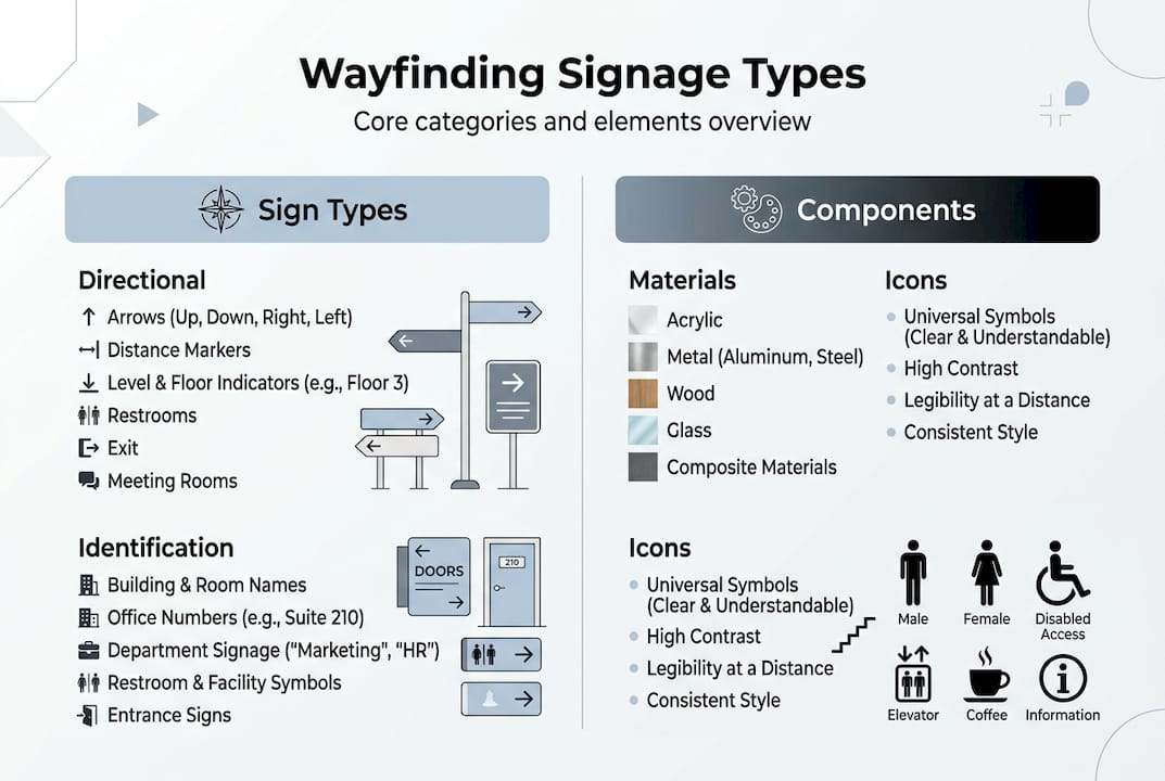
| Sign type | Primary function | UK example |
|---|---|---|
| Directional | Guides movement between locations | Arrows to wards in an NHS hospital |
| Identification | Confirms a specific location or space | Room numbers in a corporate office |
| Informational | Provides context, maps, or schedules | Directory boards in shopping centres |
| Regulatory | Communicates rules, restrictions, or safety | Fire exit signs, no-entry notices |
Components matter as much as categories. Materials affect durability and tone. Brushed aluminium reads as corporate and premium. Foamex signs printing London with LED backlighting suits modern retail environments. Timber finishes work well in hospitality settings. Icons reduce language barriers and speed up comprehension, which is why signage for office buildings in diverse urban areas like London often relies on internationally recognised symbols.
Mounting position is equally important. Overhead hanging signs work well in busy, crowded spaces where wall-mounted signs might be obscured. Illuminated signs improve legibility in low-light areas and are essential for emergency routes.
A typical user journey through a well-designed facility looks like this:
- Arrival at the main entrance, greeted by a building directory or site map.
- Orientation using a floor plan or overview sign to identify the target floor or zone.
- Navigation along corridors guided by directional arrows at every decision point.
- Confirmation via identification signs at the destination room or area.
- Compliance with regulatory signs for fire exits, accessible routes, and restricted zones.
Each step requires a different sign type. Skipping any stage breaks the chain and forces users to improvise, which is where confusion and frustration set in.

Accessibility and inclusivity: Meeting modern standards
In a vibrant city like London, signage must cater to everyone, including those with accessibility needs. Accessible wayfinding is not simply an ethical consideration. In many public and commercial buildings, it is a legal requirement under the Equality Act 2010.
Tactile and braille elements, consistent icons to reduce cognitive load for neurodiverse users, and overhead hanging signs that improve evacuation outcomes in emergencies are not optional enhancements. They are baseline expectations for any responsible signage system.
| Accessibility feature | Requirement |
|---|---|
| Mounting height | 1,400mm to 1,600mm from floor for key signs |
| Braille and tactile text | Required on room identification signs in public buildings |
| Colour contrast | Minimum 70% luminance contrast between text and background |
| Icon consistency | Standardised symbols used throughout the entire system |
Best practices for inclusive wayfinding design include:
- Use high-contrast colour combinations, avoiding red/green pairings that affect colour-blind users.
- Apply consistent iconography across every sign in the system, not just selected locations.
- Ensure braille is positioned correctly and accurately translated, not simply added as an afterthought.
- Install illuminated signs on all emergency and evacuation routes.
- Consider audio wayfinding integration for visually impaired visitors in larger facilities.
Pro Tip: Before signing off on a new wayfinding system, arrange a structured walkthrough with a small group that includes neurodiverse individuals and wheelchair users. Their feedback will identify gaps that even experienced designers miss.
You can review our accessible signage guide and UK accessibility signage guidelines for detailed compliance information relevant to your specific building type.
Branding, compliance, and integration with digital systems
Beyond the basics, modern wayfinding systems bring together branding, compliance, and technological innovation in ways that were not possible even a decade ago.
Branding through wayfinding is a genuine opportunity. Colour palettes, typography, and material choices can all reflect your corporate identity without compromising clarity. A well-branded wayfinding system reinforces who you are at every touchpoint, from the car park to the boardroom. This is especially valuable in client-facing environments such as retail showrooms, hotel lobbies, and corporate headquarters.
Compliance with UK building regulations and accessibility standards is non-negotiable. Prioritising hybrid signage systems that integrate static signs for compliance and branding alongside digital displays for adaptability is increasingly recognised as best practice for dynamic facilities.
Statistic: LED edge lighting cuts energy consumption by 75% compared to standard lighting, making illuminated wayfinding signs both practical and cost-efficient over the long term.
Key steps for integrating wayfinding into your workspace:
- Audit all decision points in the building before specifying any signs.
- Define brand guidelines for colour, font, and material before production begins.
- Choose static signs for permanent locations and digital displays for areas that change frequently.
- Ensure all digital displays meet WCAG accessibility standards for contrast and text size.
- Measure the impact of your system through visitor feedback and, where possible, footfall data.
Pro Tip: Engage a specialist signage companies London team early in the planning process to conduct a strategic audit. Inconsistency across a large facility is one of the most common and costly mistakes, and it is far cheaper to prevent than to correct after installation.
Explore futureproof signage strategies and our signage planning process for practical guidance, or review our large format printing London options for material and production choices suited to large-scale wayfinding installations.
Implementing effective wayfinding: Steps and pitfalls
With an understanding of what makes signage effective, here is how to put it into practice for your business.
Implementation follows a logical sequence, and cutting corners at any stage tends to create problems that become visible only after installation, when they are expensive to fix.
- Audit decision points. Walk every route a visitor might take and mark every location where a person must choose a direction. These are your primary sign locations.
- Map user journeys. Identify the most common destinations in your facility and trace the routes from arrival to each one.
- Define the sign schedule. List every sign required, its type, location, size, and content.
- Develop design standards. Agree on typography, colour, materials, and icon set before any production begins.
- Prototype and test. Produce sample signs and conduct walkthroughs with real users before committing to full production.
- Install and review. After installation, conduct a formal review with staff and a sample of visitors to identify any remaining gaps.
- Plan for updates. Build a maintenance and update schedule into the project from the start.
Common mistakes include visual clutter, where too much information on a single sign overwhelms users rather than helping them. Expert audits consistently identify inconsistency and information overload as the leading causes of wayfinding failure. Poor maintenance is another frequent issue. Signs that are damaged, faded, or out of date actively mislead people and undermine trust in your brand.
Pro Tip: Engage end users in a structured walkthrough before approving the final sign schedule. Observing real people navigate your space reveals blind spots that no amount of desk-based planning will uncover.
When you are ready to move forward, our guides on ordering custom signs and the sign design process will help you understand what to expect at each stage.
Our perspective: Why wayfinding deserves board-level attention
In our experience working with businesses across London, Essex, and Kent, wayfinding signage is almost always treated as a finishing touch. It appears at the end of a fit-out budget, after the furniture, the lighting, and the branding have been finalised. That approach is a mistake, and it is one we see repeated across sectors.
Wayfinding belongs in the brief from day one. When it is added late, it gets compromised. Signs end up in awkward positions because the ideal mounting points were not considered during construction. Branding feels inconsistent because the sign schedule was not aligned with the wider identity guidelines. Emergency routes get overlooked because no one with safety expertise was involved early enough.
The businesses that get this right treat wayfinding as part of the customer experience strategy, not the facilities management checklist. They understand that a confused visitor is a lost opportunity, and that a frustrated patient or client reflects directly on the organisation’s professionalism.
Reviewing wayfinding must-haves before a project begins rather than after is one of the simplest ways to protect both your budget and your reputation. The organisations that do this consistently report better visitor satisfaction and fewer operational complaints. That is not a coincidence.
Next steps: Unlock better navigation and branding
For businesses ready to act, the right partners and solutions are within reach. A professionally designed and installed wayfinding system ensures consistency across every touchpoint, compliance with UK accessibility standards, and a clear expression of your brand identity from the entrance onwards.
At PromoSigns, we work with business owners, architects, and project managers to deliver bespoke wayfinding solutions that are built to last. Whether you need shop signs London for a retail environment, outdoor signs to improve external navigation, or a complete interior system using our large format printing capabilities, we offer an end-to-end service from design through to professional installation. Get in touch to discuss your project and find out how we can help you create a space that works for everyone.
Frequently asked questions
How does wayfinding signage differ from simple directional signs?
Wayfinding signage is a coordinated system of visual cues that includes identification, informational, and regulatory elements alongside directional arrows, making it far broader than a single sign type.
What is the most common mistake in implementing wayfinding signage?
Inconsistency and information overload are the most frequent pitfalls. Expert audits show these issues confuse users rather than guiding them, and they are best addressed before production begins.
Are illuminated signs important for wayfinding?
Yes. Illuminated signs are essential for emergency and evacuation routes, and LED edge lighting reduces energy use by 75% compared to standard options, making them practical as well as effective.
How do you make wayfinding signage accessible for everyone?
Incorporate tactile and braille elements, maintain high colour contrast, use consistent icons throughout, and test the system with users of diverse abilities before final sign-off.
Who should design and install wayfinding signage?
A professional signage company with expertise in compliance, branding, and user experience should handle both design and installation to ensure the system is safe, consistent, and fit for purpose.
Recommended
- 7 Essential Wayfinding Signs Every Business Needs UK
- Enhancing Branding With Signage: The Definitive Guide – PromoSigns.co.uk
- Directional Signage Benefits: UK Retail Guide 2026
- Highlight Retail Offers with Signage: Complete Guide UK
