
TL;DR:
- Wayfinding involves using environmental cues to help people navigate and locate destinations effectively. Poor systems increase frustration and costs, while well-designed ones reduce cognitive load and improve user experience.
Wayfinding is the process of using spatial and environmental information to navigate to a destination, helping people determine where they are, where they want to go, and how to get there. As ScienceDirect summarises it, effective wayfinding improves situational awareness, reduces stress, and directly affects how people experience a building or place. Poor wayfinding costs businesses real money in lost visitors, frustrated customers, and staff time spent giving directions. Researchers Kevin Lynch and Romedi Passini laid the theoretical groundwork; Promosigns applies those principles daily for clients across London, Essex, and Kent.
At its core, wayfinding rests on three elements:
- Orientation — knowing where you are right now
- Route decision — choosing the correct path to your destination
- Recognition — confirming you have arrived
Table of Contents
What does wayfinding mean, and how does it differ from navigation and signage?
Wayfinding and navigation are often used interchangeably, but they describe different things. Navigation is the act of moving from A to B. Wayfinding is the broader cognitive and environmental system that makes that movement possible, encompassing perception, decision-making, and the physical cues that support both.
Signage is just one component of a wayfinding system, not the whole thing. A UK government health guidance document makes this distinction plainly:
The practical scope of wayfinding extends well beyond printed arrows. It includes urban design, architecture, landmarks, lighting, floor finishes, landscaping, and digital information systems. All of these elements work together to make an environment legible, or fail to, when they are designed without coordination.
Where did wayfinding theory come from?
The field has two foundational figures, and understanding what each contributed helps explain why modern wayfinding systems are designed the way they are.
- Kevin Lynch published The Image of the City in 1960, introducing the idea that people build mental maps of urban environments using five recurring elements: paths, edges, districts, nodes, and landmarks. His framework remains the standard reference for urban designers and signage consultants.
- Romedi Passini extended Lynch’s work in Wayfinding in Architecture (1984), shifting focus from the environment to the person moving through it. Passini identified the cognitive stages a person goes through when navigating: forming a plan, executing it, monitoring progress, and recognising the destination.
- Healthcare and transport sectors later developed sector-specific guidance. Network Rail’s wayfinding guidance describes how naming conventions, colour coding, numbering hierarchies, and small environmental cues work together to code complex station environments. NHS trusts have produced their own commissioning frameworks, treating wayfinding as a patient safety issue rather than a cosmetic one.
The through-line from Lynch to today’s practice is consistent: legible environments reduce cognitive load, and that reduction has measurable benefits for the people using them.
How does wayfinding actually work when someone moves through a space?
The process is sequential, and each stage requires different information. Understanding this sequence is what separates a well-designed system from a collection of signs bolted to walls.
Pre-visit — Before arriving, people consult websites, maps, or booking confirmations. Healthcare guidance stresses that pre-visit information (parking instructions, entrance locations, public transport options) should link directly to on-site signage so users arrive oriented rather than confused.
Arrival and orientation — At the entrance, a person needs to confirm they are in the right place and get a broad sense of the layout. A building directory, a site map, or a clear reception sign performs this function.
Route decision — At every junction or level change, the person needs enough information to choose correctly. This is the most critical stage. A missed turn here compounds into significant frustration, particularly in hospitals, large retail centres, or transport hubs.
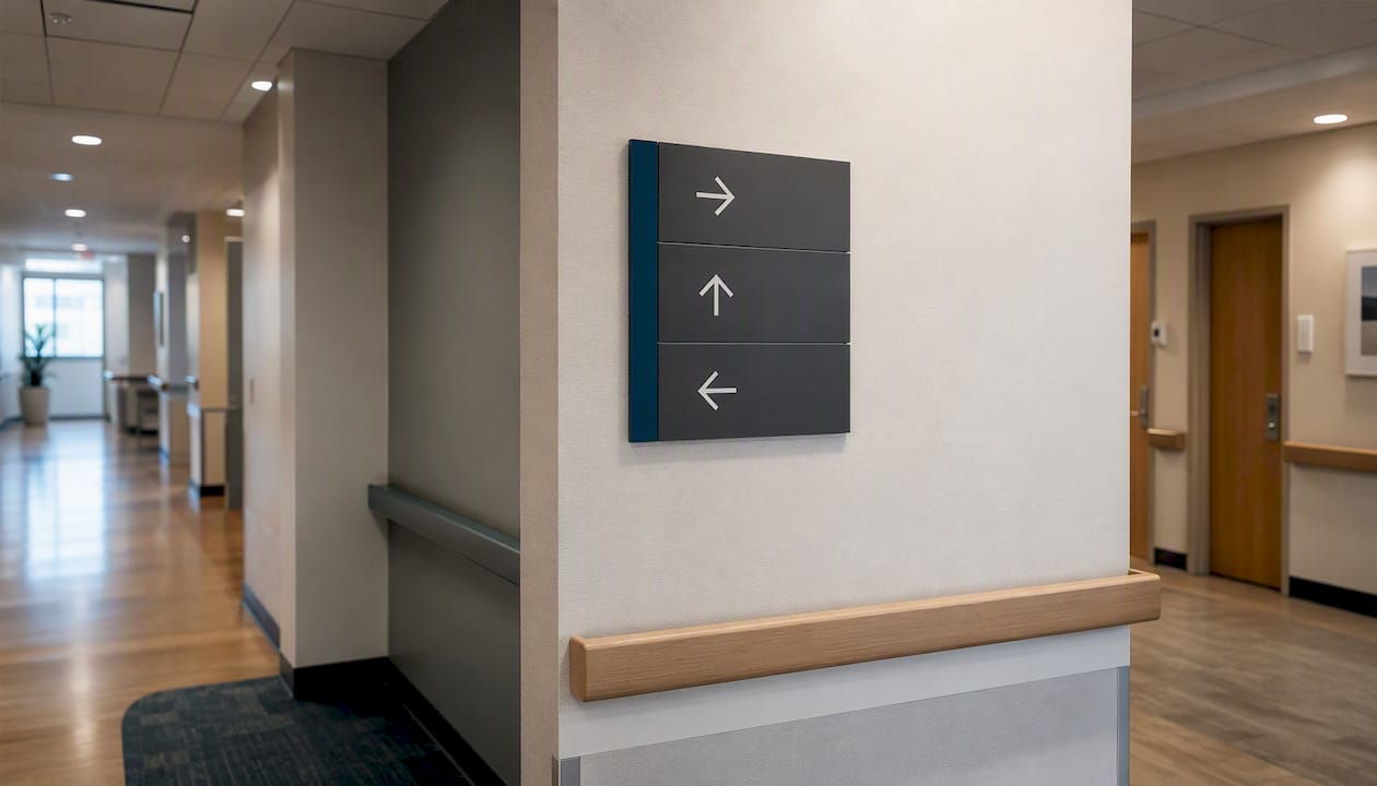
Route monitoring — Between decision points, people need reassurance that they are still on the correct path. Reassurance signs (sometimes called confirmation signs) serve this purpose.
Destination recognition — The person needs to know they have arrived. An identification sign on the door or space closes the loop.
Exit — Often overlooked, exit wayfinding matters as much as arrival. A visitor who cannot find the exit quickly forms a negative impression of the entire experience.
Pro Tip: Walk your site as a first-time visitor before briefing any supplier. Note every point where you hesitate or look around for information. Those hesitation points are your decision-point map, and they are the starting point for any honest wayfinding brief.
Lynch’s five elements and how they shape legible environments
Lynch’s framework gives designers a shared vocabulary for describing how people read environments. Each element plays a distinct role.
- Paths are the routes people travel: streets, corridors, walkways. They are the primary structuring element of any mental map, and their clarity (width, lighting, continuity) directly affects confidence.
- Edges are linear boundaries that are not paths: a river, a wall, a change in floor material. They define zones and help people understand where one area ends and another begins.
- Districts are areas with a recognisable character. In a shopping centre, distinct zones (food court, fashion, electronics) help people locate themselves within the whole.
- Nodes are focal points: a central atrium, a ticket hall, a reception desk. They act as reference points and natural gathering places where directional information is most effective.
- Landmarks are distinctive objects used for orientation: a clock tower, a sculpture, a brightly coloured lift bank. Landmarks are particularly powerful because people remember them and use them to give and receive directions.
| Element | Urban example | Indoor example | Design application |
|---|---|---|---|
| Path | High street | Corridor | Ensure continuity; avoid dead ends |
| Edge | River embankment | Glass partition | Use to define zones, not to block sightlines |
| District | Cultural quarter | Food court | Consistent colour or material palette per zone |
| Node | Town square | Reception atrium | Place primary directional signs here |
| Landmark | Church spire | Signature artwork | Reference in directions; make it memorable |
Modern sign strategies lean heavily on landmarks and nodes. Placing a primary directory sign at the main node, then referencing a landmark in subsequent directional signs (“turn left at the red sculpture”), reduces cognitive load and makes directions feel intuitive rather than mechanical.
What settings does wayfinding apply to, and what changes between them?
The principles stay constant; the constraints change significantly depending on context.
| Setting | Principal constraint | Key design consideration |
|---|---|---|
| Urban / public realm | Planning permission, highways consent | Scale, weather resistance, accessibility |
| Indoor (retail, office, healthcare) | Sightlines, ceiling height, acoustics | Hierarchy, lighting, material durability |
| Transport (stations, airports) | High footfall, multilingual users, speed | Legibility at distance, pictograms, real-time integration |
| Events (temporary) | Short installation window, removal | Modular systems, floor graphics, temporary fixings |
| Digital / experiential | Screen glare, power supply, content management | Contrast ratios, update frequency, accessibility |
Network Rail’s guidance notes that transport environments require wayfinding to be considered at the design stage, not retrofitted. The same principle applies to any large-scale development: a hospital or campus that plans wayfinding from the outset spends far less on remedial signage later.
Events present a specific challenge. Temporary wayfinding needs to be installed quickly, withstand heavy foot traffic, and be removed without damaging the host venue. Floor graphics are particularly effective here: they guide movement along natural sightlines, require no fixings, and can be removed cleanly.

What design principles make a wayfinding system effective?
Good wayfinding design is not about aesthetics first. It is about reducing the cognitive effort required to navigate, then making the result look good.
- Consistency — Use the same name for the same place everywhere, from the website to the car park sign to the internal directory. Inconsistent nomenclature (calling the same room “Conference Suite A” on one sign and “Meeting Room 1” on another) is one of the most common and damaging errors.
- Clarity — Limit the information on any single sign to what is needed at that decision point. Progressive disclosure means giving people exactly what they need, when they need it, rather than listing every destination on every sign.
- Legibility — Font size, contrast ratio, and viewing distance must be calculated, not guessed. A sign readable at 5 metres is useless if the decision point is 15 metres away.
- Hierarchy — Primary destinations get prominence; secondary destinations are subordinate. A visitor should be able to identify the most important information within two seconds of seeing a sign.
- Accessibility — Wayfinding must work for people with visual, cognitive, and mobility impairments. This is a legal requirement under UK building regulations, not an optional enhancement.
- Behavioural awareness — Design guidance notes that people do not navigate by signs alone. They ask other people, follow crowds, and use landmarks instinctively. A system that ignores social navigation behaviours will fail in practice, regardless of how well the signs are designed.
The RSM (Royal Society of Medicine) framing adds a useful behavioural layer: effective wayfinding delivers certainty (the user always knows where they are), variety (the environment is interesting enough to stay alert), and delight (moments of unexpected clarity or beauty that make the experience memorable).
Pro Tip: Before ordering a single sign, conduct a confusion audit. Walk the site as a stranger would, map every decision point, and record what information you needed but did not have. That audit is your brief. Buying more signs without one often makes confusion worse, not better.
What are the four main sign types and what makes each one effective?
Every wayfinding system uses four functional sign types, each serving a distinct purpose.
1. Identification signs confirm that a place is what it says it is. A room name plate, a building fascia, a department header. They close the loop at the destination recognition stage.
2. Directional signs tell people which way to go before they arrive. Overhead hanging signs, wall-mounted arrows, and floor graphics all fall into this category. Placement is critical: a directional sign must be visible from the decision point it serves, not from two metres past it.
3. Informational signs provide context: opening hours, maps, rules of use, emergency procedures. They support decision-making without directing movement.
4. Regulatory signs are mandatory and legally distinct from the other three types. Fire exit signs, safety colour coding, and emergency evacuation routes are governed by UK building regulations and must conform to specific standards regardless of the wider design scheme.
Design checklist for any sign type:
- Contrast ratio — minimum 70% contrast between text and background for legibility
- Font choice — sans-serif typefaces (such as Johnston or Helvetica) at appropriate weights
- Mounting height — eye level for pedestrians (approximately 1,500mm to centre) unless the sign is designed for distance reading
- Sightlines — confirm the sign is visible from the decision point, not obstructed by doors, displays, or columns
- Lighting — consider ambient light levels; illuminated signage performs significantly better in low-light or high-glare environments
- Materials — for UK outdoor conditions, specify UV-stable, weatherproof substrates; aluminium composite, powder-coated steel, and high-density polyethylene all offer strong durability
How do you design wayfinding that works for everyone?
Inclusive wayfinding is not a specialist add-on. Under the Equality Act 2010 and UK building regulations (specifically Approved Document M), environments open to the public must be accessible to people with disabilities. Wayfinding is part of that obligation.
- Tactile surfaces — tactile paving and tactile floor indicators guide people with visual impairments at decision points and hazard zones
- High-contrast signs — minimum contrast ratios apply; dark text on light backgrounds (or vice versa) with no patterned backgrounds
- Braille and raised lettering — required on key identification signs in accessible buildings
- Audible cues — lift announcements, audible pedestrian signals, and digital audio guides extend wayfinding to people who cannot read signs
- Simple language — plain English, short sentences, and consistent terminology reduce cognitive load for people with learning disabilities or those navigating in a second language
- Consistent nomenclature — using the same name for the same place across all media (digital, print, verbal) is particularly important for people with cognitive impairments who rely on exact matches to confirm location
- Adequate lighting — poorly lit signs fail everyone, but disproportionately affect people with low vision
Pro Tip: Test your wayfinding system with real users before installation, including people with visual impairments, wheelchair users, and older visitors. A 30-minute accompanied walk-through will surface problems that no desk review will catch.
Why does good wayfinding matter for your business?
The commercial case for investing in wayfinding is straightforward. Industry commentary connects legible, well-connected environments directly to increased footfall, longer dwell time, and stronger economic performance. When people can find what they are looking for without effort, they stay longer and spend more.
The operational benefits are equally concrete:
- Fewer enquiries directed to reception or customer service staff, freeing them for higher-value tasks
- Reduced incidents caused by visitors entering restricted or hazardous areas
- Faster evacuation in emergencies, because people already understand the building’s layout
- Stronger brand perception, because a well-signed environment signals professionalism and care
- Improved compliance with health and safety obligations, particularly in healthcare, hospitality, and construction settings
In retail, the relationship between wayfinding and commercial performance is particularly direct. A customer who cannot find a product category leaves without buying. A customer who navigates confidently explores more of the store. Wayfinding signage for businesses is therefore not a cost centre but a revenue-supporting investment.
How to commission wayfinding signage in the UK: a step-by-step checklist
This process applies whether you are fitting out a new premises or auditing an existing one.
- Conduct a confusion audit — walk the site as a first-time visitor, map every decision point, and record what information is missing or misleading at each one.
- Define your user groups — who uses this space? Customers, staff, delivery drivers, emergency services? Each group may have different routes and different information needs.
- Map decision points — identify every location where a user must choose a direction. These are the locations where signs are needed, not everywhere.
- Write a wayfinding brief — document the site, the user groups, the decision points, the destinations, and the brand guidelines. A clear brief produces accurate quotes and better design.
- Establish a naming convention — agree on canonical names for all spaces and use them consistently across all media before any design work begins.
- Check planning and permissions — external signs in England require advertisement consent under the Town and Country Planning (Control of Advertisements) (England) Regulations 2007. Signs on listed buildings or in conservation areas require additional consent. Highways consent is needed for signs on or near the public highway.
- Specify materials — for outdoor UK conditions, specify weatherproof, UV-stable substrates. For durable sign materials, aluminium composite and powder-coated steel are reliable choices for long-term installations.
- Request samples and prototypes — always ask a supplier for material samples and, where budget allows, a prototype of a key sign type before full production.
- Plan installation — agree a programme that minimises disruption. For occupied buildings, out-of-hours installation is often necessary.
- Schedule maintenance — agree a maintenance plan at the outset. Signs degrade, businesses change, and a wayfinding system that is not maintained becomes a liability.
Procurement questions to ask any supplier:
- What materials do you recommend for this environment, and why?
- Can you provide samples and a prototype before production?
- What is your installation programme, and do you work out of hours?
- What warranty do you offer on materials and fixings?
- Do you handle planning consent applications, or does the client manage that?
Cost guidance: Wayfinding projects in the UK vary enormously in scope. A small retail fit-out with ten to fifteen signs will cost significantly less than a multi-building campus system. Budget ranges depend on materials, quantity, complexity of installation, and whether planning applications are required. Get itemised quotes and compare like for like.
Common wayfinding mistakes and how to spot them
Poor wayfinding is easy to recognise once you know what to look for. These are the most frequent errors, and their consequences.
- Ad hoc signs — handwritten or printed-and-laminated signs taped to walls are a reliable indicator that the original system failed. They undermine brand credibility and rarely solve the underlying problem.
- Inconsistent nomenclature — calling the same room by different names on different signs forces users to guess. In a hospital or large office, this causes genuine distress.
- Ignoring sightlines — a sign placed where it cannot be seen from the decision point it serves is useless. Always check visibility before fixing.
- Overreliance on text — long text blocks on directional signs slow reading speed and increase cognitive load. Pictograms and arrows communicate faster and work across language barriers.
- No confusion audit — ordering new signs without first understanding where and why people get lost usually results in more signs in the wrong places.
- Neglecting exit wayfinding — most systems focus on arrival. Visitors who cannot find the exit quickly, or who cannot find their car, leave with a negative final impression.
- Ignoring maintenance — faded, damaged, or outdated signs erode trust. A sign pointing to a department that no longer exists is worse than no sign at all.
Quick corrective checklist before ordering new signage:
- Walk the site as a stranger and log every hesitation point
- Check that every sign uses the agreed naming convention
- Verify that every directional sign is visible from its decision point
- Confirm that regulatory signs meet current UK standards
- Remove or replace any ad hoc signs before the new system goes in
Promosigns’s perspective on wayfinding projects
Wayfinding is one of those disciplines where the gap between what looks good on a mood board and what actually works in a building is surprisingly wide. The most common mistake we see is clients who arrive with a list of signs they want made, rather than a map of the problems they need to solve. The signs themselves are the last step, not the first.
What actually works is starting with the user’s journey. Where do they arrive? Where do they hesitate? What do they need to know at that exact moment, and in what format? Answer those questions honestly, and the sign schedule writes itself. Skip them, and you end up with a beautiful set of signs that still leaves visitors lost.
The other thing worth saying plainly: a wayfinding system is only as good as its maintenance. A sign that pointed to the right place three years ago and now points to a storage cupboard is actively harmful. Build a review cycle into the brief from day one.
At Promosigns, we work with business owners, architects, and property developers across London to design and install wayfinding signage that is durable, legible, and genuinely fit for purpose. Our process starts with understanding the site and the user, not with a catalogue of standard products.
Promosigns can help you get wayfinding right in London
Promosigns designs, manufactures, and installs bespoke wayfinding signage for retail, hospitality, corporate, and construction clients across London, Essex, and Kent. Whether you need a full system from audit to installation or a targeted refresh of a failing element, we handle the entire process in-house, from design and material specification through to professional installation and aftercare.
Before you get in touch, it helps to have the following ready:
- Site plans or floor plans (even rough sketches are useful)
- A list of destinations and the user groups who need to reach them
- Photos of current decision points and any existing signage
- A note on planning constraints (listed building, conservation area, leasehold)
- A broad budget range
With that information, we can give you an accurate, itemised quote and a clear project timeline. To discuss your wayfinding project, visit our shop signs page or get in touch directly. We work fast, and we get it right.
Recommended
- Wayfinding signs for customers: a practical guide – PromoSigns.co.uk
- Wayfinding signs explained for business owners – PromoSigns.co.uk
- Wayfinding signage explained: Enhance navigation and branding – PromoSigns.co.uk
- Signage Accessibility Guidelines: A Practical Guide for UK Businesses – PromoSigns.co.uk
