
Signage in London is more than just a name above the door. Businesses are now embracing dynamic signs that catch up to 77 percent more attention than static ones. Oddly, most shop owners still pour their efforts into fancy typefaces without realising that placement and contrast are what actually bring customers through the door.
Table of Contents
Table of Contents
- Understanding Modern Signage Design Principles
- Best Practices For London’s Shopfront And Office Signs
- Using Signage To Enhance Events And Exhibitions
- Common Mistakes To Avoid In Signage Design
Quick Summary
| Takeaway | Explanation |
|---|---|
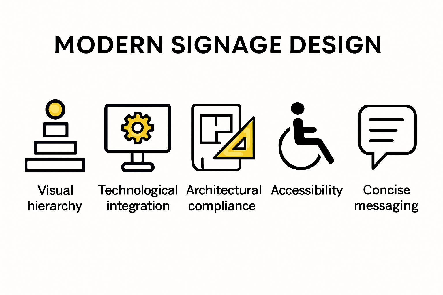
| Emphasise Visual Hierarchy | Use typography, colour contrast, and spatial arrangement to guide viewer attention and improve message clarity. |
| Incorporate Technological Elements | Embrace digital technologies and interactive designs to create adaptive signage that engages viewers and collects analytics. |
| Ensure Architectural and Historical Compliance | Design signage that harmonises with existing architecture and respects the unique character of different London neighbourhoods. |
| Prioritise Accessibility | Create inclusive signage that accommodates diverse populations through clear typography, high contrast designs, and multilingual support. |
| Avoid Overloading Information | Maintain strategic, concise messaging by prioritising essential content and utilising white space to enhance readability. |
Understanding Modern Signage Design Principles
Signage design has evolved dramatically, transforming from simple informational displays to sophisticated communication tools that blend aesthetics, functionality, and brand storytelling. Modern signage design principles require businesses to think beyond traditional approaches and embrace innovative strategies that capture attention and communicate effectively.
Visual Hierarchy and Information Architecture
Effective signage design begins with understanding visual hierarchy. Research from The Design Journal emphasizes that typeface characteristics critically impact legibility and viewer comprehension. Businesses must strategically arrange information, using size, colour, and placement to guide the viewer’s eye and communicate the most important messages instantly.
Key elements of visual hierarchy include:
- Typography Selection: Choosing fonts that are readable from different distances and angles
- Colour Contrast: Creating visual separation and highlighting critical information
- Spatial Arrangement: Organizing content to create a natural reading flow
Technological Integration and Interactive Design
Modern signage is no longer static. Advanced neural network research suggests that design principles can be algorithmically analyzed and optimized. Businesses are increasingly incorporating digital technologies, interactive elements, and adaptive displays that respond to viewer proximity or environmental conditions.
Emergent technologies are enabling signs to:
- Adapt in Real Time: Change content based on audience demographics
- Provide Interactive Experiences: Allow direct engagement through touchscreens
- Collect Usage Analytics: Understand viewer interaction patterns
Contextual and Sustainable Design Considerations
Contemporary signage design principles extend beyond visual appeal. Design prediction models demonstrate the importance of understanding spatial and temporal viewer engagement. Businesses must consider environmental context, sustainability, and brand consistency when developing signage solutions.
This holistic approach involves:
- Material Selection: Using eco-friendly and durable materials
- Energy Efficiency: Incorporating LED and low-power display technologies
- Brand Alignment: Ensuring signage reflects the company’s visual identity
For businesses seeking deeper insights into modern signage strategies, explore our comprehensive guide on innovative design solutions.
By embracing these principles, London businesses can create signage that is not just informative, but engaging, technologically advanced, and aligned with contemporary design standards.
Here is a table that summarises the three core modern signage design principles and their key focus areas, making it easier to compare their respective elements:
| Principle | Key Focus Areas |
|---|---|
| Visual Hierarchy and Information Architecture | Typography, Colour Contrast, Spatial Arrangement |
| Technological Integration and Interactive Design | Real Time Adaptation, Interactive Touchpoints, Usage Analytics |
| Contextual and Sustainable Design Considerations | Material Selection, Energy Efficiency, Brand Alignment |
Best Practices for London’s Shopfront and Office Signs
Designing effective signage for London’s diverse business environments requires a nuanced approach that balances aesthetic appeal, regulatory compliance, and strategic communication. Businesses must navigate complex architectural landscapes while creating signs that not only attract attention but also respect the city’s rich visual heritage.
Architectural Harmony and Regulatory Compliance
The UK Government’s National Design Guide emphasizes the critical importance of shopfront designs that respect existing architectural character. London’s businesses must carefully consider how their signage integrates with surrounding buildings, ensuring that new additions enhance rather than disrupt the visual environment.
Key considerations for architectural alignment include:
- Material Selection: Choosing materials that complement the building’s original facade
- Proportional Design: Ensuring signage scales appropriately with the building’s architectural features
- Historical Context: Respecting the unique character of different London neighbourhoods
Accessibility and Inclusive Design
The Government Workplace Design Guide highlights the critical importance of creating signs that meet accessibility standards. Imperial College London’s Wayfinding Guidelines underscore the need for a consistent visual language that supports navigation for all users.
Essential accessibility principles include:
- High Contrast Designs: Ensuring readability for individuals with visual impairments
- Clear Typography: Using fonts that are legible from multiple distances
- Multilingual Considerations: Accommodating London’s diverse population
Strategic Visibility and Brand Communication
Effective signage goes beyond mere information delivery. It serves as a powerful brand communication tool that must capture attention in a competitive urban environment. Our comprehensive guide on shop sign strategies provides deeper insights into creating impactful visual presentations.
Strategic visibility approaches include:
- Lighting Techniques: Utilizing innovative illumination to enhance nighttime visibility
- Placement Optimization: Positioning signs for maximum viewer engagement
- Dynamic Design Elements: Incorporating movement or interactive features to attract attention
By embracing these best practices, London businesses can create signage that is not just functional, but a compelling visual statement that respects architectural traditions while communicating brand identity with precision and creativity.
To help businesses quickly review the best-practice areas for London signage, the following table summarises the essential considerations for each practice category:
| Best Practice Area | Key Considerations |
|---|---|
| Architectural Harmony & Compliance | Material Selection, Proportional Design, Historical Context |
| Accessibility & Inclusive Design | High Contrast, Clear Typography, Multilingual Support |
| Strategic Visibility & Branding | Lighting Techniques, Placement Optimisation, Dynamic/Interactive Elements |
Using Signage to Enhance Events and Exhibitions
Signage plays a crucial role in transforming events and exhibitions from mere spatial gatherings into immersive, navigable, and engaging experiences. In 2025, successful event organisers understand that strategic signage is not just about direction, but about creating a comprehensive communication ecosystem that guides, informs, and inspires attendees.
Dynamic Engagement and Visitor Experience
Research demonstrating the impact of dynamic signage reveals a striking statistic: dynamic signs capture 77% more attention compared to static displays, with only 38% of participants noticing traditional signage. This highlights the critical importance of creating interactive, movement-driven signage solutions that capture and maintain audience interest.
Key strategies for dynamic signage engagement include:
- Interactive Touchpoints: Incorporating digital interfaces that respond to visitor interactions
- Real Time Information Updates: Displaying changing content that reflects current event status
- Multimedia Integration: Combining visual, audio, and potentially tactile elements
Accessibility and Inclusive Wayfinding
A comprehensive study on museum visitor experiences emphasizes that effective signage systems are fundamental in creating inclusive environments. This principle extends beyond museums to all events and exhibitions, where clear, considerate wayfinding can significantly enhance visitor comfort and participation.
Critical accessibility considerations involve:
- Multi Language Support: Providing information in multiple languages
- High Contrast Design: Ensuring readability for visitors with visual impairments
- Clear Symbolic Representations: Using universal symbols alongside text
Strategic Placement and Visibility Optimization
Research on observation angles and sign legibility indicates that sign effectiveness dramatically decreases as viewing angles change. Event organisers must strategically position signage to maintain maximum visibility and comprehension.
Placement strategies include:
- Height Variation: Positioning signs at multiple levels for different audience perspectives
- Directional Clarity: Creating logical navigation paths
- Contextual Integration: Ensuring signs blend seamlessly with event aesthetics
For a deeper exploration of exhibition signage techniques, businesses can reference our comprehensive guide that breaks down advanced signage strategies.
By understanding and implementing these sophisticated signage principles, event organisers can transform their spaces from mere venues into dynamic, accessible, and memorable experiences that engage and inspire attendees.
Common Mistakes to Avoid in Signage Design
In the competitive business landscape of London, signage design can make or break a company’s visual communication strategy. Businesses frequently encounter design pitfalls that undermine their brand messaging and potential customer engagement. Understanding and avoiding these common mistakes is crucial for creating effective, impactful signage.
Typography and Readability Challenges
One of the most critical errors businesses make is neglecting typography and readability. Poor font choices can render even the most well-intentioned signage ineffective. Small text, overly decorative fonts, and inadequate contrast can significantly reduce a sign’s legibility and impact.
Common typographic mistakes include:
- Font Complexity: Using intricate or overly stylized fonts that compromise readability
- Size Inconsistency: Creating text that cannot be easily read from standard viewing distances
- Colour Contrast Issues: Selecting colour combinations that reduce text visibility
Information Density and Visual Clutter
Many businesses fall into the trap of overcrowding their signage with excessive information. Our guide on design myths highlights the importance of strategic, concise messaging. The human brain processes visual information quickly, and overwhelming signs can lead to cognitive dissonance and reduced message retention.
Key principles for managing information density:
- Minimal Text: Prioritizing essential information
- White Space: Creating visual breathing room
- Hierarchical Information: Structuring content for quick comprehension
Neglecting Brand Consistency and Context
Another significant mistake is designing signage in isolation, without considering broader brand identity and environmental context. Signs should not only communicate information but also reflect the unique personality and values of the business.
Contextual design considerations include:
- Architectural Harmony: Ensuring signs complement the building’s aesthetic
- Brand Colour Palette: Maintaining consistent visual branding
- Material Selection: Choosing materials that reflect brand quality
For businesses seeking deeper insights into creating exceptional signage, explore our comprehensive guide on crafting impactful shop signs.
By recognizing and proactively addressing these common design mistakes, London businesses can create signage that not only communicates effectively but also enhances brand perception and customer engagement. Thoughtful, strategic design transforms signs from mere informational tools to powerful communication assets.
Frequently Asked Questions
What are the key principles of modern signage design in London?
Modern signage design in London focuses on visual hierarchy, technological integration, and contextual sustainable design. Businesses should use effective typography, contrast, and proper placement to enhance readability and engagement, while also embracing interactive elements and eco-friendly materials.
How can businesses ensure their signage complies with architectural regulations in London?
To comply with architectural regulations, businesses should review the UK Government’s National Design Guide, choose materials that harmonise with existing structures, and ensure their signage respects the historical context of the area.
Why is accessibility important in signage design for London businesses?
Accessibility in signage design ensures that all individuals, including those with visual impairments, can easily read and understand signs. Key aspects include using high contrast, clear typography, and multilingual support, which fosters an inclusive environment for diverse populations.
What common mistakes should London businesses avoid in signage design?
Common mistakes include using overly complex typography that compromises readability, overcrowding signs with excessive information leading to visual clutter, and neglecting brand consistency with regards to colour and materials. Avoiding these pitfalls can enhance the effectiveness and impact of signage.
Take Your Signage from Ordinary to Unmissable in London
Are you worried that your current signage is failing to capture attention, align with your brand, or meet modern standards? As discussed in our look at 2025 signage design, success now depends on more than clever fonts. Your signs must use clear visual hierarchy, smart contrast, and integrated technology to truly stand out on busy London streets. Factors such as brand consistency, accessibility, and regulatory compliance are no longer optional. Without these elements, you risk blending in with the crowd or even losing valuable footfall to competitors.
Now is the moment to make a lasting impression. At PromoSigns we design, produce and install custom shop signs, illuminated signage, and large format printing for businesses across London, Essex, and Kent. Explore our solutions and see how our expertise with modern principles can help you attract more customers and communicate your brand more effectively. Ready to upgrade your signage in line with the best practices for 2025? Visit the PromoSigns homepage or read more about creating standout visual statements with our tailored shop sign strategies.
Recommended
- Retail Sign Design Tips 2025: Essential Guide for London Businesses – PromoSigns.co.uk
- Office Signage Ideas for London Businesses and Events: 2025 Trends – PromoSigns.co.uk
- Signage for Office Interiors: 2025 Guide for London Businesses – PromoSigns.co.uk
- Shop Sign Types Explained for UK Businesses in 2025 – PromoSigns.co.uk
- Signage for Interior Designers: Trends and Solutions 2025 – PromoSigns.co.uk
- Signage and Brand Recognition: Boost Your London Business in 2025 – PromoSigns.co.uk
