
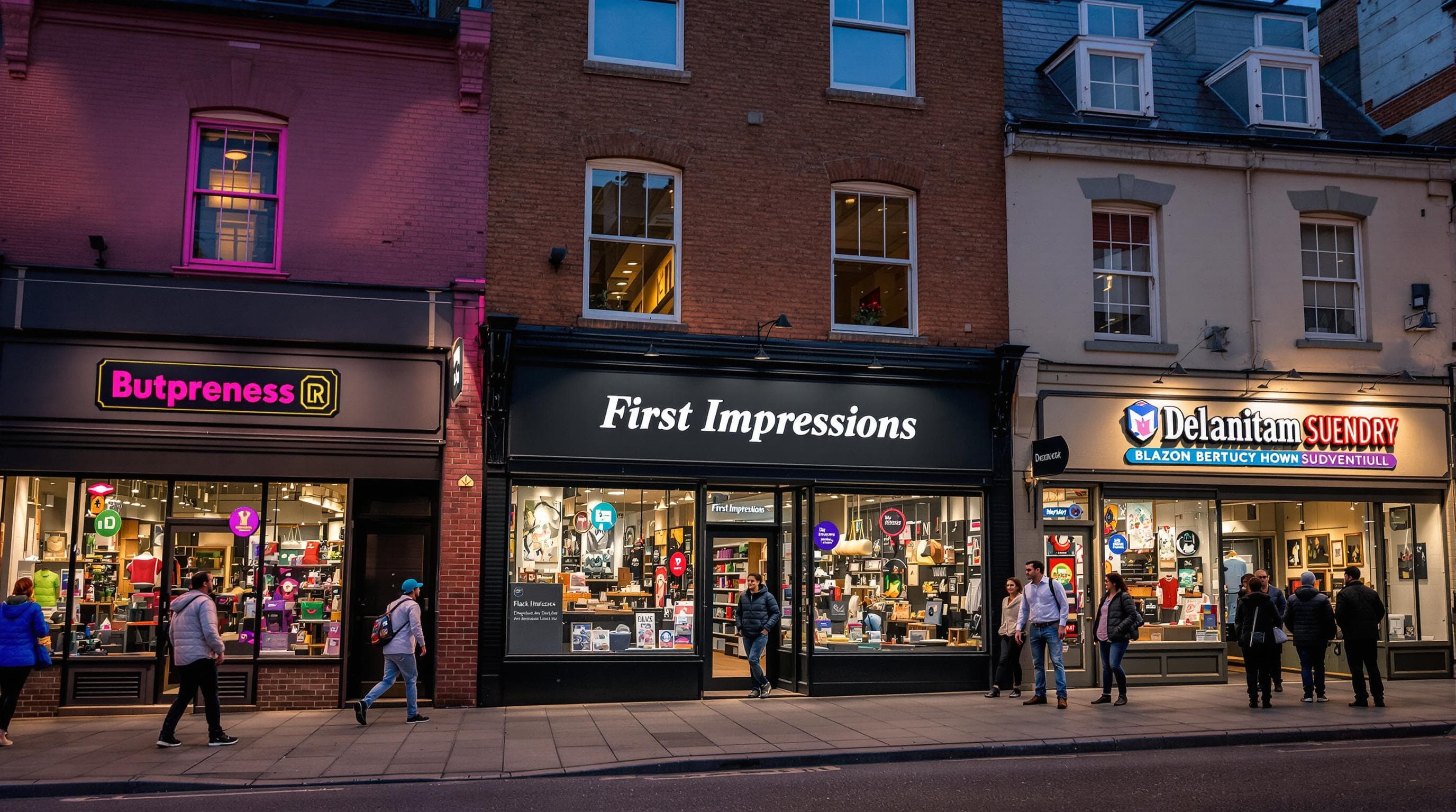
Every shop owner wants the kind of sign that draws eyes and delivers a strong first impression. A clever splash of colour or a bold font can make all the difference. But here is something most people miss. Adding strategic colour and images can actually increase sign effectiveness by 78 percent. This is not just about being noticed. It is about shaping how people feel before they ever walk through your door.
Table of Contents
Table of Contents
- Choosing The Right Style For Your Shop Sign
- Essential Design Elements For Effective Signage
- Legal And Location Rules For London Businesses
- Tips To Make Shop Signs Stand Out In 2025
Quick Summary
| Takeaway | Explanation |
|---|---|
| Understanding Visual Communication | The style of your shop sign must enhance your building’s architecture and reflect your brand identity through thoughtful colour and design choices. |
| Prioritising Readability and Typography | Use clear, legible sans serif fonts, ensuring that the size and spacing contribute to easy visibility from a distance. Each 25mm of letter height provides approximately 3 metres of readability. |
| Navigating Legal Requirements | Be aware of local regulations around signage, including planning permissions and compliance standards, particularly in designated areas, to avoid fines and ensure your signage meets local guidelines. |
| Incorporating Colour Psychology | Select a colour palette that aligns with your brand identity and evokes the desired emotional response from your audience while maintaining consistency across all marketing materials. |
| Innovative Design Techniques | Explore the integration of digital graphics and interactive elements to enhance engagement and create memorable interactions for potential customers. |
Choosing the Right Style for Your Shop Sign
Designing the perfect shop sign requires a strategic approach that balances visual appeal, brand identity, and functional communication. Every business needs a sign that not only captures attention but also reflects its unique personality and professional ethos.
Understanding Visual Communication in Signage
The visual style of your shop sign serves as a critical first impression for potential customers. According to City of Pismo Beach Design Guidelines, signs should enhance a building’s architecture without overwhelming it. This means selecting colours, materials, and designs that complement your existing architectural style while maintaining a distinct brand message.
Consider the psychology of colour and design. Certain colour combinations can evoke specific emotional responses. Deep blues might communicate professionalism and trustworthiness, while warm oranges can suggest energy and creativity. The key is selecting a palette that resonates with your brand’s core values and target audience.
Typography and Readability Principles
Typography plays a crucial role in sign design effectiveness. California Design System emphasizes the importance of accessibility through clear visual hierarchies and legible font choices. When selecting fonts, prioritize readability from a distance. Avoid overly decorative scripts that might look appealing up close but become illegible when viewed from the street.
Choose fonts that are clean, bold, and proportionate to your sign’s dimensions. Sans serif fonts often work well for modern businesses, offering crisp lines and excellent visibility. Serif fonts can communicate tradition and reliability for more established brands. The thickness of letters, spacing, and overall weight contribute significantly to how easily potential customers can read and understand your sign.
Material Selection and Design Harmony
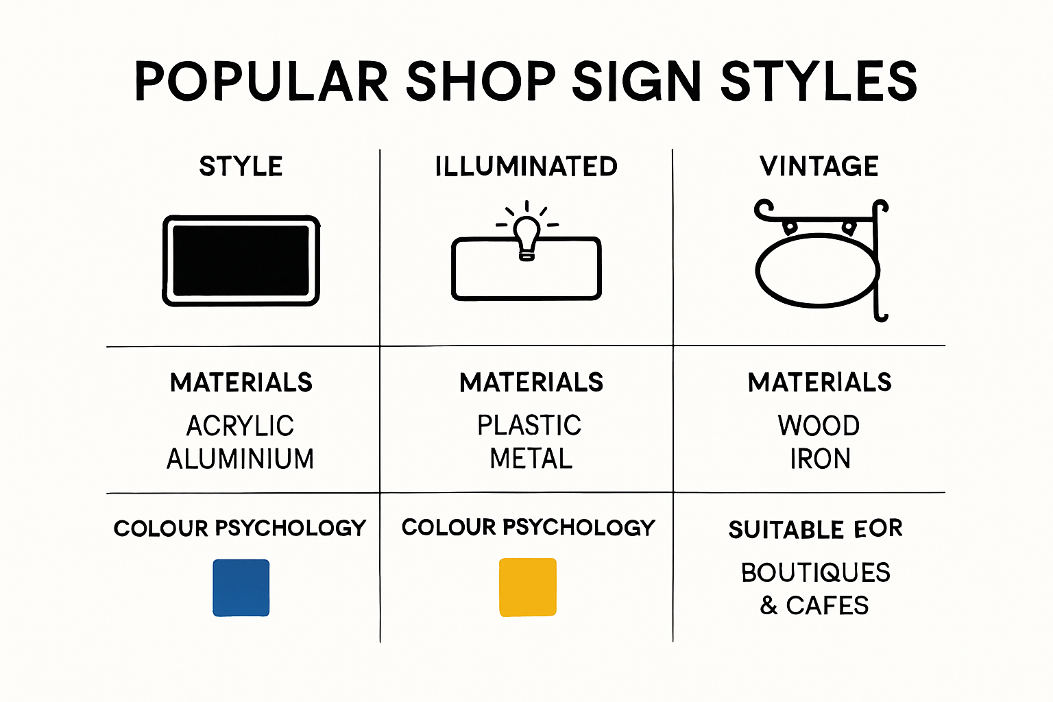
The materials you choose for your shop sign dramatically impact its overall aesthetic and durability. Wood might communicate craftsmanship and warmth, while metal signs suggest modernity and precision. Acrylic offers versatility and can be illuminated for enhanced nighttime visibility. Check out our guide on commercial sign selection for more in-depth insights into material choices.
Consider environmental factors like sunlight exposure, local weather conditions, and the architectural context of your location. A sign that looks stunning in your design mockup must also withstand real-world conditions while maintaining its visual integrity.
Remember that your shop sign is more than just a piece of marketing material. It is a visual ambassador for your brand, communicating your business’s personality, professionalism, and unique value proposition in a single glance. Thoughtful design transforms a simple sign into a powerful communication tool that attracts and engages potential customers.
Here is a table comparing common shop sign materials, their visual impact, and typical advantages as discussed above:
| Material | Visual Appeal | Key Benefits |
|---|---|---|
| Wood | Craftsmanship, Warmth | Traditional look, eco-friendly, customisable |
| Metal | Modernity, Precision | Durable, weather-resistant, sleek finish |
| Acrylic | Versatility, Vibrant colours | Allows illumination, lightweight, bold colour options |
| Aluminium | Contemporary, Lightweight | Rust-resistant, sturdy, low maintenance |
Essential Design Elements for Effective Signage
Creating an impactful shop sign involves more than aesthetic appeal. It requires a strategic approach that considers multiple design elements working together to communicate your brand message effectively and attract potential customers.
Visual Hierarchy and Information Clarity
The fundamental principle of effective signage is clarity. According to research published in the International Journal of Environmental Research and Public Health, successful signage depends on precise factors like font size, color contrast, and simple layout. These elements determine how quickly and easily viewers can comprehend your message.

Design your sign with a clear visual hierarchy. The most crucial information should be largest and most prominent. Your business name or primary message must be immediately visible, with secondary details like taglines or contact information positioned subordinately. This approach guides the viewer’s eye naturally through the sign’s content, ensuring key information is absorbed quickly.
Colour Psychology and Brand Consistency
Colour selection goes beyond aesthetic preference. Each colour communicates specific psychological signals that can influence customer perception. Blue tones often suggest professionalism and reliability, while warm colours like orange or red can indicate energy and excitement. Your sign’s colour palette should align seamlessly with your broader brand identity.
Consistent colour usage across all marketing materials reinforces brand recognition. When your shop sign’s colours match your website, business cards, and other promotional materials, you create a cohesive visual experience that strengthens brand memory. Learn more about signage design principles for modern businesses.
Technical Considerations and Readability
Technical design elements are crucial for creating a sign that performs effectively in real-world conditions. Consider factors like viewing distance, lighting conditions, and potential environmental challenges. A sign that looks perfect in a design studio might become illegible when viewed from the street or under different lighting conditions.
Font selection plays a critical role in readability. Sans serif fonts typically offer clean lines and excellent visibility from a distance. Avoid overly decorative or thin fonts that might become difficult to read. The ideal font size depends on your sign’s location and typical viewing distance. As a general rule, each 25mm of letter height provides approximately 3 metres of readability.
Material choice also impacts your sign’s effectiveness. Different materials offer varying levels of durability, weight, and visual appeal. Aluminium provides a modern, lightweight option with excellent weather resistance. Acrylic can offer vibrant colour reproduction and the potential for illumination. Wooden signs might communicate warmth and craftsmanship.
Remember that your shop sign is more than a decorative element. It is a strategic communication tool that represents your brand’s identity, professionalism, and unique value proposition. Every design decision should serve the ultimate goal of attracting and engaging potential customers, transforming a simple sign into a powerful marketing asset.
The following table summarises basic sign readability guidelines, including recommended letter sizes for typical viewing distances as described above:
| Letter Height (mm) | Approx. Readable Distance (metres) | Ideal Use Case |
|---|---|---|
| 25 | 3 | Store fronts, indoor signage |
| 50 | 6 | Pavement/sidewalk visibility |
| 150 | 18 | Roadside, car park signage |
| 300 | 36 | Large building exteriors |
Legal and Location Rules for London Businesses
Navigating the legal landscape of shop signage requires careful attention to local regulations, planning permissions, and compliance standards. For London businesses, understanding these requirements is crucial to avoid potential fines and ensure your signage meets official guidelines.
Planning Permission and Advertisement Consent
According to UK Government Guidance on Advertisements, businesses must obtain specific permissions before installing or modifying shop signs. Not all signs require formal consent, but many do. The regulations depend on several factors, including the sign’s size, location, and potential visual impact on the surrounding environment.
Most shop signs fall under two primary categories. Some qualify for deemed consent, which means they can be displayed without explicit permission if they meet specific criteria. Others require a formal advertisement consent application through the local planning authority. The distinction often hinges on factors like sign dimensions, illumination, and proximity to heritage sites or conservation areas.
Location-Specific Considerations
The City of London’s official guidelines provide comprehensive details about shop front installations. These regulations are particularly stringent in historic or architecturally significant areas. Businesses must consider how their signage interacts with the existing streetscape, ensuring it respects the character of the surrounding buildings.
Key location-specific factors include:
- Proximity to listed buildings
- Conservation area restrictions
- Visibility from public spaces
- Impact on pedestrian and traffic sightlines
Some areas have additional restrictions on sign materials, colours, and illumination levels. Check out our detailed retail signage compliance guide for more in-depth insights into these nuanced requirements.
Compliance and Technical Regulations
VisitBritain’s business advice highlights the importance of understanding technical compliance beyond basic planning permissions. This includes considerations for illuminated signs, which have additional regulatory requirements.
Illuminated signs must comply with specific electrical safety standards and light pollution regulations. Brightness levels, operating hours, and potential impact on surrounding properties are carefully scrutinised. Businesses must ensure their signs do not create glare or disturbance for neighbouring properties or traffic routes.
Additionally, signs must be structurally secure and professionally installed. This means using appropriate mounting techniques, considering wind loading, and ensuring the sign can withstand environmental conditions without posing any safety risks.
Failing to comply with these regulations can result in significant consequences. Local authorities may issue enforcement notices requiring sign removal or modification, and businesses could face substantial financial penalties. Proactive research and consultation with local planning departments can help navigate these complex requirements effectively.
For London businesses, understanding and implementing these legal and location rules is not just about avoiding penalties. It is about creating signage that respects the city’s architectural heritage, contributes positively to the urban environment, and effectively communicates your brand’s identity within a complex regulatory framework.
Tips to Make Shop Signs Stand Out in 2025
In the competitive business environment of 2025, creating a shop sign that captures attention and communicates your brand effectively is more crucial than ever. Standing out requires a strategic approach that combines creativity, technical design, and deep understanding of visual communication.
Strategic Visual Design and Color Psychology
Research from design innovation experts reveals that adding colour and strategic imagery can increase sign effectiveness by 78 percent. This statistic underscores the importance of thoughtful visual design.
Simplicity is key. According to Explorer Research design guidelines, communicate your message concisely, avoiding cluttered designs that compromise readability. Choose a colour scheme that creates visual contrast with the surrounding environment. Consistency in colour and aesthetic can create visual recognition, helping your brand break through the visual noise.
Typography and Readability Principles
Chameleon Signage research emphasises the critical importance of readability. A sign is only effective if it can be understood quickly and clearly. High contrast between text and background is essential. Dark text on light backgrounds (or vice versa) maximises visibility.
Choose fonts strategically. Sans-serif fonts like Arial, Helvetica, and Futura offer clean, professional appearances. The general rule is that each inch of letter height provides approximately 10 feet of readability. This means larger letters improve visibility, particularly for roadside or street-facing signs. Explore our comprehensive guide on creative outdoor sign ideas for more inspiration.
Innovative Signage Techniques for 2025
Beyond traditional design, consider incorporating innovative technologies and design approaches. Digital graphics and interactive elements can transform a static sign into an engaging brand experience. QR codes, augmented reality integrations, or dynamic lighting can create memorable interactions with potential customers.
Consider the entire customer journey when designing your sign. It should not only attract attention but also provide immediate value. Include essential information like your business name, primary service or product, and a compelling reason for customers to engage. Whether through a clever tagline, a unique visual element, or a clear value proposition, your sign should instantly communicate what makes your business special.
Remember that your shop sign is often the first point of contact between your business and potential customers. It represents more than just a name or location marker. It is a powerful communication tool that reflects your brand’s personality, professionalism, and unique value proposition. Invest time in designing a sign that not only stands out visually but also tells a compelling story about your business.
Frequently Asked Questions
What are the key elements to consider when designing a shop sign?
The key elements include visual communication, typography and readability, material selection, colour psychology, and legal regulations relevant to your location.
How important is colour choice in shop sign design?
Colour choice is crucial as it can evoke specific emotions and enhance brand recognition. A well-thought-out colour palette can increase sign effectiveness by up to 78%.
What typography should I use for my shop sign?
Use clear, legible sans serif fonts for modern appeal, ensuring that the size and spacing enhance visibility. Each 25mm of letter height offers approximately 3 metres of readability.
Do I need a permit for my shop sign in London?
Yes, many shop signs require planning permission or advertisement consent, especially in historic areas. Be sure to check local regulations to avoid fines.
Ready to Transform Your Shopfront in 2025?
Standing out with a truly effective shop sign is more complex than ever. The article above has outlined just how crucial visual clarity, colour psychology, and legal compliance are when attracting new customers. Struggling with readability issues, picking the right materials, or feeling overwhelmed by London’s signage regulations is common. These challenges can easily hold your business back from making a bold first impression and achieving the brand recognition you deserve.
Let us take all the worry out of your next signage project. At PromoSigns, our British experts specialise in custom shop signs, illuminated displays, and large format printing for businesses across London, Essex, and Kent. We blend strategic design principles with hands-on installation, ensuring your sign is visually captivating, perfectly readable, and fully compliant. Explore our full signage solutions now and see how easy it can be to elevate your business—get in touch today and unlock the benefits of professional shop signage before your competition does.
Recommended
- Shop Sign Types Explained for UK Businesses in 2025 – PromoSigns.co.uk
- What Makes A Great Shop Sign – PromoSigns.co.uk
- Retail Sign Design Tips 2025: Essential Guide for London Businesses – PromoSigns.co.uk
- Types of Shop Signage for Business Success in 2025 – PromoSigns.co.uk
- How To Design Effective Commercial Building Signs
