
Shop signs do far more than show your business name. They shape first impressions and can decide whether a potential customer takes a step inside or walks straight past. But the surprise is that letter height should be at least one inch for every twenty-five feet of viewing distance if you want your sign to be truly readable. Most shop owners focus only on looks, missing out on the simple science that makes signs work harder for their business.
Table of Contents
Table of Contents
- Key Principles For Designing Shop Signs
- Choosing Colours, Fonts, And Materials
- Maximising Visibility In London Locations
- Customising Shop Signs For Different Business Types
Quick Summary
| Takeaway | Explanation |
|---|---|
| Prioritise Visual Clarity and Readability | Use large, legible letters and contrast for effective communication. This ensures your sign is easily seen and understood from a distance. |
| Integrate Brand Personality into Design | Make sure your sign reflects your brand’s identity to resonate with potential customers. Thoughtfully chosen colours and typography communicate your business values. |
| Consider Strategic Placement for Visibility | Position signs effectively to capture attention in high foot traffic areas, using methods like projecting signs to stand out in urban environments. |
| Use Appropriate Colours and Fonts | Choose colours that evoke the right emotions and fonts that ensure legibility, enhancing the sign’s overall effectiveness and appeal. |
| Tailor Designs to Specific Business Types | Customise shop signs according to your industry. Different sectors call for unique designs to reflect their purpose and engage target audiences effectively. |
Key Principles for Designing Shop Signs
Designing effective shop signs requires a strategic approach that combines visual appeal, functionality, and brand communication. The right signage can transform a business’s visibility and attract potential customers, making it a critical element of your marketing strategy.
Visual Clarity and Readability
The foundation of an impactful shop sign lies in its ability to communicate quickly and clearly. Explore our expert design strategies to ensure your sign captures attention instantly. According to the International Sign Association, effective signage must be detectable, conspicuous, legible, and comprehensible.
Lettering plays a crucial role in sign readability. Experts recommend that letters should be at least one inch tall for every twenty-five feet of viewing distance. This ensures that your message remains clear and readable from a distance.
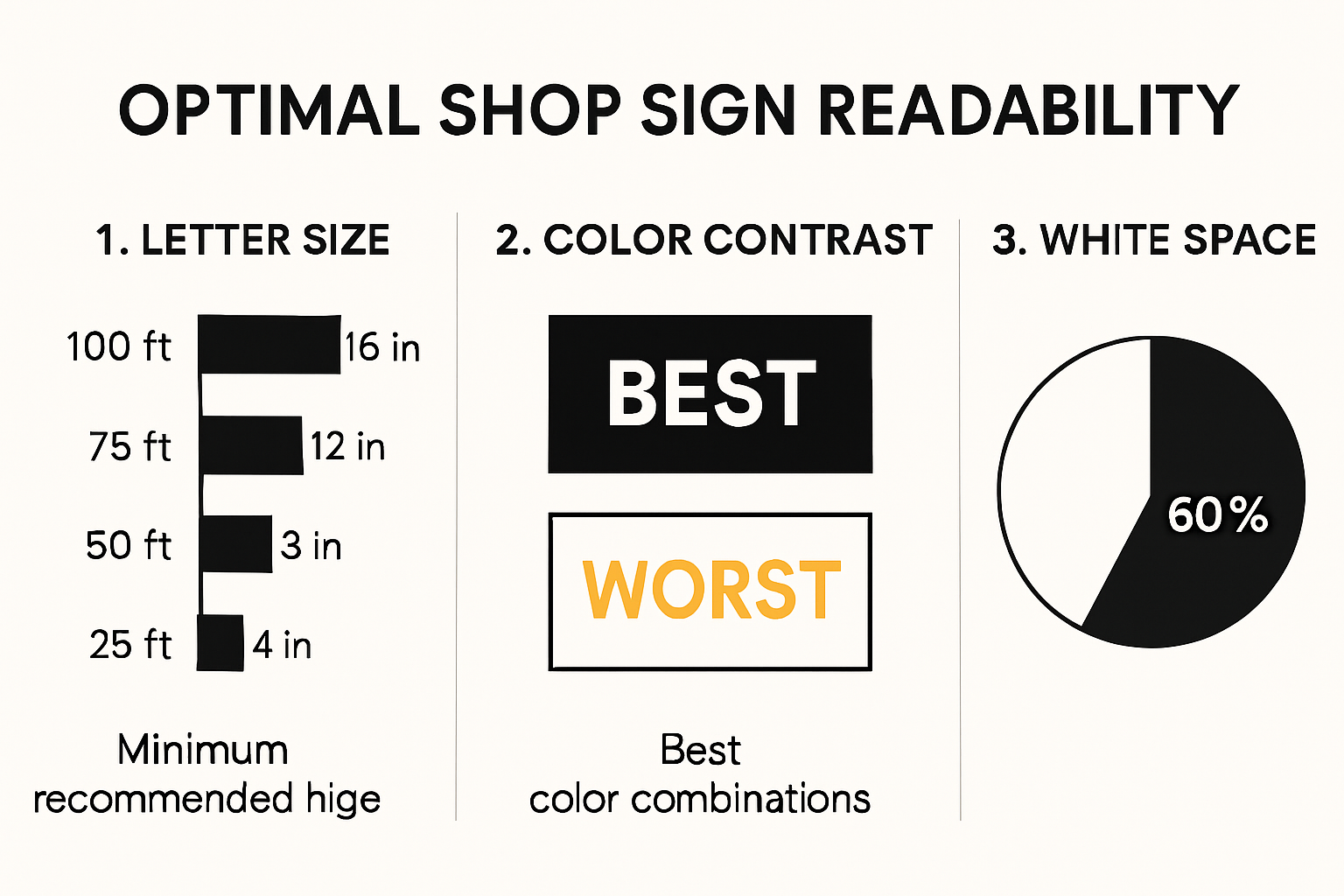
When selecting colours, research from the National Academies Press reveals that light letters on a dark background significantly improve legibility, with black-on-orange and white-on-green signs being particularly effective at capturing attention.
Strategic Design and Spatial Considerations
Beyond basic readability, professional sign design involves careful spatial planning. The City of Walnut Creek recommends dedicating 30% to 40% of your sign to white space, which helps prevent visual clutter and enhances overall comprehension. This principle ensures that your sign remains clean, professional, and easy to read.
colour selection is equally important. Your sign should not only reflect your brand identity but also complement its surrounding environment. Avoid light backgrounds that might create glare, especially for illuminated signs. Instead, choose a colour palette that stands out while maintaining a cohesive look with your storefront and brand aesthetic.
Brand Personality and Messaging
Your shop sign is more than just a directional tool – it’s a powerful communication medium that represents your brand’s personality. Learn more about crafting a memorable sign that speaks directly to your target audience. Each design element, from typography to colour scheme, should tell a story about your business.
Consider the psychological impact of your design choices. Bold, sharp fonts might convey professionalism and reliability, while softer, rounded typography could suggest approachability and friendliness. The goal is to create a sign that not only catches the eye but also resonates with your potential customers on an emotional level.

Remember, an exceptional shop sign is a blend of art and strategy. It requires careful consideration of visual principles, brand identity, and audience perception. By focusing on clarity, strategic design, and authentic brand representation, you can create a sign that not only attracts attention but also effectively communicates your business’s unique value proposition.
Choosing Colours, Fonts, and Materials
Selecting the right combination of colours, fonts, and materials is crucial in creating a compelling and effective shop sign that communicates your brand’s identity and attracts potential customers.
Colour Psychology and Impact
colour selection goes far beyond aesthetic appeal. Research from the Rochester Institute of Technology reveals that colour plays a pivotal role in visual communication and brand perception. Different colours evoke specific emotional responses and psychological reactions that can significantly influence customer engagement.
Warm colours like red and orange can create a sense of excitement and urgency, making them excellent for businesses wanting to convey energy and passion. Cool colours such as blue and green communicate professionalism, trust, and calmness, which are ideal for service-based industries or healthcare providers. Explore professional signage design techniques to understand how strategic colour choices can enhance your brand messaging.
When selecting colours, consider these key principles:
- Contrast is key: Ensure your text stands out against the background
- Brand consistency: Match colours with your existing brand palette
- Readability: Prioritize colours that enhance legibility
Typography and Font Selection
Font choice is equally critical in sign design. According to the Rochester Institute of Technology study, sans-serif fonts with larger sizes significantly improve readability. The typography you select communicates volumes about your brand’s personality before customers even read the content.
Serif fonts often convey tradition, reliability, and professionalism. They work exceptionally well for established businesses like law firms, financial institutions, and heritage brands. Sans-serif fonts, with their clean and modern appearance, suggest innovation, simplicity, and contemporary thinking. They are perfect for tech companies, creative agencies, and businesses targeting younger demographics.
Consider these font selection guidelines:
- Legibility: Choose fonts that are clear and easy to read from a distance
- Scalability: Ensure the font looks good at various sizes
- Personality: Select a font that reflects your brand’s core values
Material Considerations and Durability
The physical material of your sign is more than just a visual element. It represents your commitment to quality and impacts the sign’s longevity and performance. Different materials offer unique advantages depending on your business environment and aesthetic goals.
Acrylic signs provide a sleek, modern look and are resistant to weathering, making them ideal for both indoor and outdoor applications. Aluminium offers durability and a professional finish, particularly suitable for industrial and commercial settings. Wooden signs can create a warm, artisanal feel perfect for boutique businesses, cafes, and craft-oriented brands.
To help you select the most effective sign materials and understand their ideal applications, the table below summarises the properties, advantages, and best uses of commonly mentioned shop sign materials from the article.
| Material | Key Properties | Advantages | Ideal For |
|---|---|---|---|
| Acrylic | Modern, sleek, weather-resistant | Versatile, indoor/outdoor, durable | Most businesses, especially retail |
| Aluminium | Durable, professional finish | Long-lasting, low maintenance | Commercial/industrial settings |
| Wood | Warm, artisanal, natural | Unique appearance, customisable | Boutique, cafes, craft industries |
| Brass/Stone | Classic, solid, traditional | Conveys authority, high-end appearance | Law firms, financial & professional |
When selecting materials, consider:
- Environmental exposure: Choose materials that withstand local weather conditions
- Maintenance requirements: Select materials that are easy to clean and maintain
- Budget: Balance aesthetic desires with practical cost considerations
By thoughtfully integrating colours, fonts, and materials, you create a sign that is not just a visual marker, but a powerful communication tool that represents your brand’s unique identity and attracts your target audience.
Maximising Visibility in London Locations
In the competitive business environment of metropolitan areas, strategic sign placement and design become crucial for attracting potential customers. Maximising visibility requires a nuanced approach that considers architectural constraints, local regulations, and urban dynamics.
Strategic Positioning and Placement
Successful sign visibility starts with understanding the unique characteristics of your specific location. Explore advanced storefront sign strategies to transform your business’s street presence. The key is creating a sign that stands out while seamlessly integrating with the surrounding urban landscape.
Consider multiple placement options to ensure maximum exposure. Projecting signs, which extend perpendicular to your storefront, can capture attention from pedestrians approaching from different angles. These signs are particularly effective in areas with high foot traffic, where traditional flat signage might blend into the background. Mounting signs at eye level and ensuring they are unobstructed by street furniture, trees, or other architectural elements is essential for maintaining clear visibility.
Navigating Urban Design Challenges
Urban environments present unique challenges for sign design. Narrow shopfronts, historic building regulations, and dense architectural layouts require creative solutions. Learn about projecting sign benefits that can help your business stand out in crowded streetscapes.
Height and placement become critical factors. Signs positioned too high might be missed by pedestrians, while those too low can be obscured by passing crowds or street-level obstacles. The ideal placement balances visibility with aesthetic integration, creating a sign that feels like a natural extension of your storefront.
Lighting and Illumination Techniques
In urban environments with varying light conditions, illumination can dramatically enhance sign visibility. Consider multiple lighting strategies to ensure your sign remains prominent during different times of day and night. Backlit signs provide excellent visibility during evening hours, while LED edge lighting can create a modern, sophisticated appearance.
Dynamic lighting techniques can help your sign stand out without appearing garish. Soft, consistent illumination that maintains your brand’s colour palette can create a welcoming and professional impression. Consider the surrounding environment’s lighting to ensure your sign complements rather than competes with urban illumination.
Remember that visibility is not just about size or brightness, but about creating a strategic visual communication tool. Your sign should tell a story, represent your brand’s personality, and invite potential customers to engage with your business. By understanding the unique challenges and opportunities of urban signage, you can create a sign that not only captures attention but also becomes an integral part of the city’s visual landscape.
Customising Shop Signs for Different Business Types
Every business is unique, and so should be its signage. The design, style, and approach to shop signs vary dramatically across different industries, reflecting each sector’s specific characteristics, target audience, and brand identity.
Retail and Commercial Spaces
Retail environments demand signs that are not just informative but also engaging and visually appealing. Discover comprehensive signage solutions tailored to different business contexts. According to the Federal Highway Administration, the effectiveness of signage depends significantly on understanding the specific context of the business.
Fashion boutiques might opt for elegant, minimalist signs with sophisticated typography, using metallic or acrylic materials that reflect luxury. In contrast, electronics stores could benefit from more dynamic, tech-inspired designs with bold graphics and illuminated elements. Colour psychology plays a crucial role here – warm, inviting colours for clothing stores, and sleek, cool tones for technology retailers.
Service-Based and Professional Businesses
Service-oriented businesses require a different approach to signage that communicates professionalism, trustworthiness, and expertise. Law firms, medical practices, and financial institutions typically prefer more conservative, classic sign designs that emphasize reliability and competence.
Serif fonts, traditional colour palettes like navy blue, dark green, or burgundy, and materials such as brass or engraved stone can convey a sense of established authority. Architectural details like raised lettering or subtle dimensional elements can add a layer of sophistication. Learn more about signage for professional businesses to understand how design can reflect your professional brand.
Hospitality and Creative Industries
Restaurants, cafes, creative agencies, and entertainment venues have more flexibility to express personality through their signage. These businesses can experiment with more playful, innovative design approaches that capture their unique brand spirit.
The following table provides a comparison of recommended sign design choices for different business types, helping you quickly assess which styles, colours, and materials best suit your sector according to the article’s guidance.
| Business Type | Sign Style | Colour Palette | Typical Material(s) |
|---|---|---|---|
| Retail/Fashion Boutique | Elegant, minimalist | Warm/inviting, metallics | Acrylic, metallic |
| Electronics Store | Dynamic, bold | Sleek, cool tones | Illuminated elements, acrylic |
| Law/Finance/Medical | Conservative, classic | Navy, dark green, burgundy | Brass, engraved stone |
| Cafe/Brewery/Boutique | Playful, artisanal | Warm, natural, rustic | Wood, hand-painted |
| Creative Agency/Gallery | Sleek, modern | Minimalist, ample white | Acrylic, modern composites |
A craft brewery might use rustic wooden signs with hand-painted lettering, while a modern art gallery could opt for sleek, minimalist signage with ample white space. Restaurants might incorporate elements of their cuisine or cultural background into their sign design, using materials and colours that hint at their culinary identity.
Consider the customer’s first impression. Your sign is often the initial point of contact between your business and potential customers. It should not just be a marker of location, but a storytelling tool that communicates your brand’s essence, values, and personality.
Customisation is key. While there are general principles of good sign design, the most effective signs are those that are tailored specifically to the unique character of each business. By understanding your industry’s specific needs and your brand’s distinctive qualities, you can create a sign that not only attracts attention but also builds a meaningful connection with your target audience.
Frequently Asked Questions
What are the key principles for designing effective shop signs?
Effective shop signs should prioritise visual clarity and readability, integrate brand personality into the design, consider strategic placement for visibility, use appropriate colours and fonts, and tailor designs to specific business types.
How can I ensure my shop sign is readable from a distance?
To ensure readability, experts recommend that letter height should be at least one inch for every twenty-five feet of viewing distance. Additionally, using high-contrast colours helps improve legibility.
What role do colours play in shop sign design?
Colour selection is crucial in shop sign design as different colours evoke specific emotional responses and can influence customer engagement. For example, warm colours create excitement, while cool colours convey professionalism and trust.
What materials are suitable for outdoor shop signs?
Common materials for outdoor shop signs include acrylic for its weather resistance, aluminium for durability, and wood for an artisanal feel. The choice of material should consider environmental exposure and maintenance requirements.
Transform First Impressions into Lasting Results with Custom Shop Signs
Struggling to make your business stand out on a busy street or worried customers might overlook your shop because your signs blend in or are hard to read? As highlighted in the article, issues like poor visibility, unclear lettering, and ineffective placement can cost you footfall and make your brand forgettable. Whether your concern is letter height, colour contrast, or capturing your unique personality, these are not details to overlook — they are what decide if you win attention or lose a customer at first glance.
Ready to see your business in a new light? Our experts at PromoSigns specialise in designing, producing, and installing tailored shop signs across London, Essex, and Kent. Let us help you apply the proven design principles from the article, so your signage is not just noticed but remembered. Start by exploring our professional signage solutions for London businesses or dive deeper into how we can make your storefront work harder for you. Do not leave your first impression to chance — contact us today to unlock the full potential of your shop front.
Recommended
- How to Design Shop Signs: Expert Tips for 2025 – PromoSigns.co.uk
- How to Install Shop Signs: A Step-by-Step Guide for 2025 – PromoSigns.co.uk
- What Makes A Great Shop Sign – PromoSigns.co.uk
- Types of Shop Signage for Business Success in 2025 – PromoSigns.co.uk
